Stamp Community Family of Web Sites
Thousands of stamps, consistently graded, competitively priced and hundreds of in-depth blog posts to read


Stamp Community Forum
 
Username:
Password:
Save Password
Forgot your Password?

This page may contain links that result in small commissions to keep this free site up and running.

Welcome Guest! Registering and/or logging in will remove the anchor (bottom) ads. It's Free!

US 73 ? Broken "S" Top Left? Var? Cracked Plate? Regular?

 
To participate in the forum you must log in or register.
Author Previous TopicReplies: 7 / Views: 1,556Next Topic  
Valued Member
United States
293 Posts
Posted 01/10/2012   3:25 pm  Show Profile Bookmark this topic Add sirruspoe to your friends list Get a Link to this Message
Hello all,

First, someone please let me know I am not overstepping any rules by posting more than one item in the same section in the same day. I have read through the rules but did not see anything on this. I do not want to be breaking any rules. Thanks.

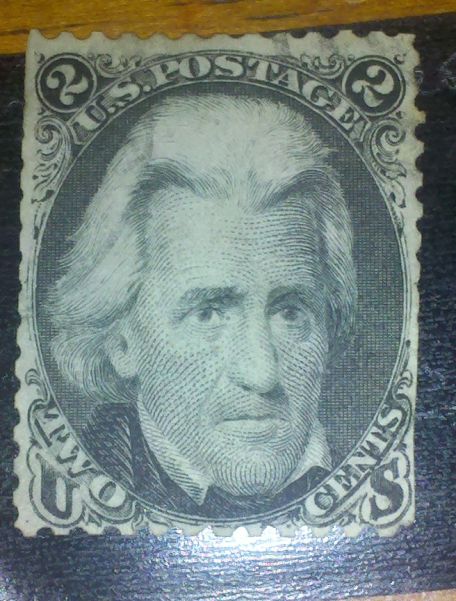
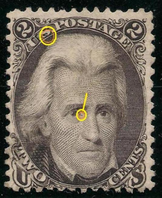
Okay, I think this is a 73 even-though the paper is quite hard and white, but the chances of it being a 103 a almost non-existent. I was looking over some of the older stamps I have while playing around the house and just noticed this little variation on this particular stamp.

Would this be normal for the 73, or is it a variation of the 73, or a cracked plate issue? I also noticed the extra dot of ink by the left eye on this one. I thought it might be a mold spot at first, or part of a cancel, but I am pretty sure it is not mold and also not part of a cancel as it is near the top right and left of the stamp.

Again any information on variations, or plate issues would be appreciated, or if this is a normal form of this particular stamp.

Thank you again in advance.


Send note to Staff

Pillar Of The Community
Canada
6525 Posts
Posted 01/10/2012   3:33 pm  Show Profile Bookmark this reply Add jamesw to your friends list  Get a Link to this Reply
Hi again sirrus.
Mine looks like that too. The thin strokes of the S are soooo thin they fill in. The black diagonal you're seeing is a 'shadow' of the S and so the white of the background really stands out.
That's what I think anyway.
Send note to Staff  Go to Top of Page
Valued Member
United States
293 Posts
Posted 01/10/2012   3:40 pm  Show Profile Bookmark this reply Add sirruspoe to your friends list  Get a Link to this Reply
Hey there again jamesw. Thank you for the quick reply. I was questioning it because the example in the Scott's cataloge did not have that particular "S" on it, but the pictures in the book are not always the best either: especially under magnification. You have been a lot of help on these posts of mine and I appreciate it a lot. One more question: as the second "S" does not show this is it because of the angle of the first "S" creating the shadow? Just some more information for the bank.
Send note to Staff  Go to Top of Page
Pillar Of The Community
Canada
6525 Posts
Posted 01/10/2012   3:45 pm  Show Profile Bookmark this reply Add jamesw to your friends list  Get a Link to this Reply
I think that's correct sirrus. Because the second S is angled differently, but the drop shadow is at the same angle as on the first S, the shadow fills in that space completely.
Send note to Staff  Go to Top of Page
Bedrock Of The Community
United States
12128 Posts
Posted 01/10/2012   3:50 pm  Show Profile Bookmark this reply Add wt1 to your friends list  Get a Link to this Reply
I agree with the previous posts. This is a close up copy of my #73 and I have highlighted the areas you questioned and they look pretty much the same:

Send note to Staff  Go to Top of Page
Valued Member
United States
293 Posts
Posted 01/10/2012   3:57 pm  Show Profile Bookmark this reply Add sirruspoe to your friends list  Get a Link to this Reply
wt1 thank you for the close up: yours is prettier than mine :) I also got another answer I did not ask answered by your post as well. I was wondering about the light coloring of the bottom "U" at the top, but yours looks nearly the same as well. I appreciate your post as I did not have another copy to compare to in my collection as of yet and seeing another one really helps filll in a lot of questions.

Edit:

I also meant to mention how closely the two are in centering.
Send note to Staff  Go to Top of Page
Edited by sirruspoe - 01/10/2012 3:59 pm
Pillar Of The Community
Canada
2277 Posts
Posted 01/10/2012   6:54 pm  Show Profile Bookmark this reply Add nitrolures to your friends list  Get a Link to this Reply
The centering is awesome on both copies. Read quite a bit on Black Jack and the portrait gives the sense that he could have been quite the mean S.O.B.
Send note to Staff  Go to Top of Page
Valued Member
United States
293 Posts
Posted 01/10/2012   7:15 pm  Show Profile Bookmark this reply Add sirruspoe to your friends list  Get a Link to this Reply
You are right he does look mean in a way. I need a better copy than this one as whoever cut the square got a bit close. This was one of my soakers.
Send note to Staff  Go to Top of Page
  Previous TopicReplies: 7 / Views: 1,556Next Topic  
 
To participate in the forum you must log in or register.

Go to Top of Page

Disclaimer: While a tremendous amount of effort goes into ensuring the accuracy of the information contained in this site, Stamp Community assumes no liability for errors. Copyright 2005 - 2026 Stamp Community Family - All rights reserved worldwide. Use of any images or content on this website without prior written permission of Stamp Community or the original lender is strictly prohibited.
Privacy Policy / Terms of Use    Advertise Here
Stamp Community Forum © 2007 - 2026 Stamp Community Forums
It took 0.31 seconds to lick this stamp. Powered By: Snitz Forums 2000 Version 3.4.05