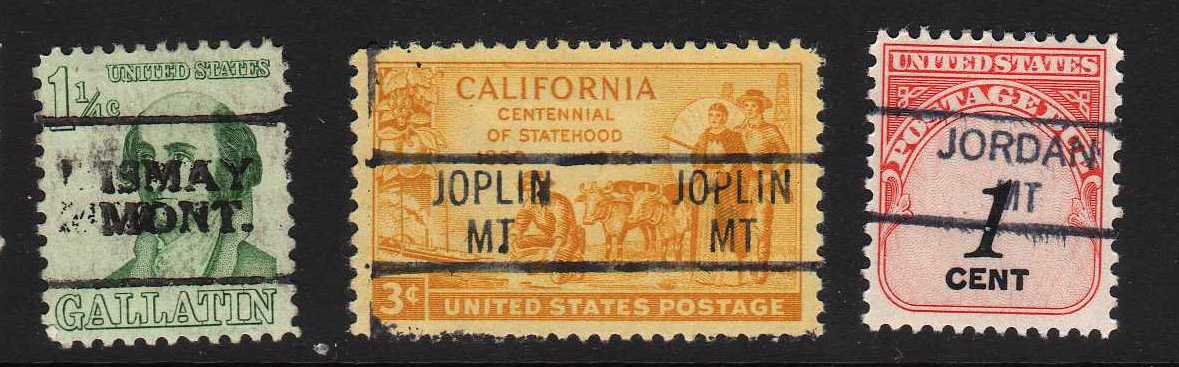
As long as you brought up the subject of Montana precancels, can someone help me with these two Great Falls, MT examples. I've always chalked them up to being Type 225's (as no other types even come close) yet there is a distinct difference in the typeface, especially noticeable in the "O" in "MONT" and in some of the other letters, too. Is it a visual deception because of over/under inking? Or are there varieties of Type 225 precancels for this city?
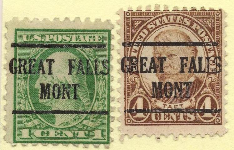
Any help will be appreciated.
Thanks.