| Author |
 Replies: 11 / Views: 1,676 Replies: 11 / Views: 1,676 |
|
|
Pillar Of The Community
Canada
2277 Posts |
|
|
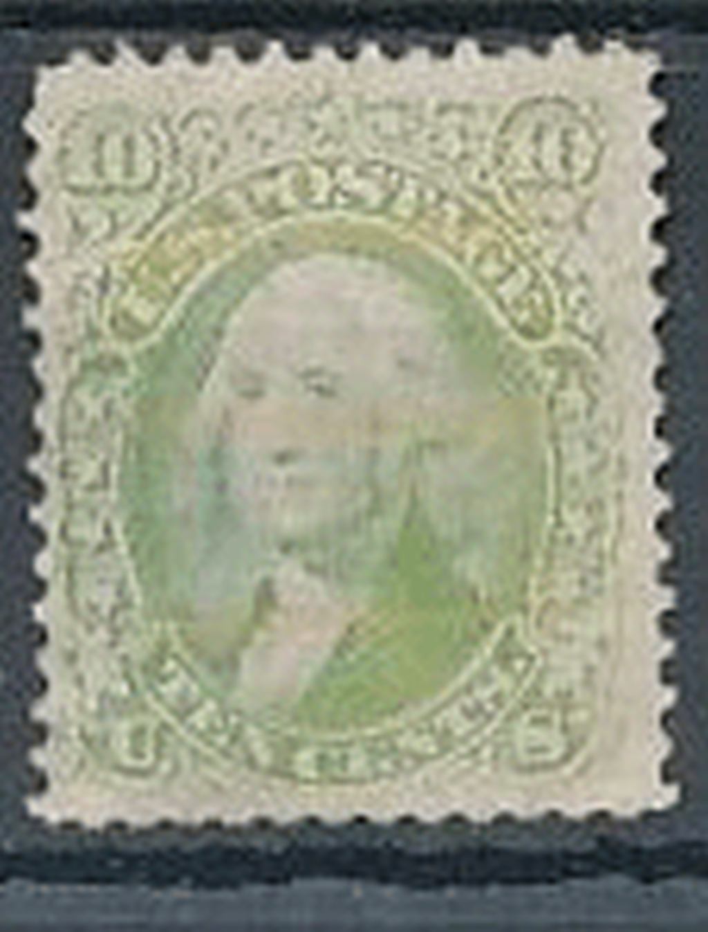
This isn't mine but really curious on the color. Apologise for the image size. Back side looks rather white comparitively to others in same period. I've never seen one from this series be so washed out to change color this much and still look respectable . You would think if it was from fading the overall image would look much worse. Any ideas?  |
|
Send note to Staff
|
|
|
|
|
Rest in Peace
United States
7097 Posts |
|
|
I seem to remember reading about the use of certain chemicals to accidentally/purposefully create a false stamp identification as there is an odd shade related to this design but, I forget the Scott number. I don't have my catalog handy. Maybe someone else will know and jog both our memories! |
Send note to Staff 
|
|
|
Bedrock Of The Community
United States
12128 Posts |
|
|
There are varieties of that stamp that were known in "yellow green" color. That, coupled with fading over the years, could have produced the example shown without any chemically enhanced alteration.
The stamp is also relatively well centered for its age.
The one thing I can't identify is the look of yellowing across the stamp right around the banner that reads "U.S. Postage". I'm not sure if it's from yellowing/foxing (due to age) or if it may be as a result of some intentional touch up.
Anyway, those are my thoughts. Unfortunately, I'm not well versed in these older US stamps so maybe someone with more expertise about the issue can chime in. |
|
Send note to Staff
|
|
|
Pillar Of The Community
Canada
2277 Posts |
|
|
I checked regular scotts 2007 (not specialized)and even the re issue just says plain green except with F grill says yellow green.There really is no signs of grill what so ever. However there looks to be 3 lines of more yellow which makes me think this may have been an attempt at a cancel wash way back when. If I decide to get it I will update with much better scans. |
|
Send note to Staff
|
|
|
Pillar Of The Community
United States
2480 Posts |
|
|
Pillar Of The Community
United States
4106 Posts |
|
|
Pillar Of The Community
Guatemala
1500 Posts |
|
|
Pillar Of The Community
United States
808 Posts |
|
|
After seeing the washout on the blowup, it is visible on the smaller picture. |
|
Send note to Staff
|
|
|
New Member
United States
3 Posts |
|
|
I recently ran into something similar. This #634 was in an old stock book stuck in with the 10c Franklins which color it most resembles.(The scan comes out somewhat duller than the actual color.) Obviously, it's not due to to any attempt to remove a cancel! Thoughts? 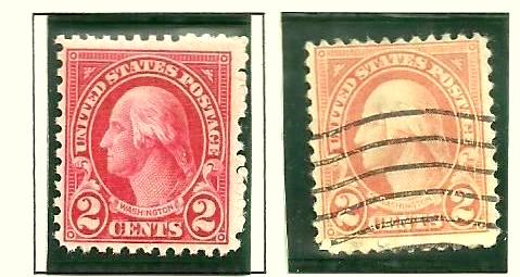 |
|
Send note to Staff
|
|
|
Valued Member
United States
146 Posts |
|
|
Could a cancel have been removed, then the stamp reused and the cancel shown in the photo is the second cancel? If this is possible, wouldn't the USPS catch this? |
|
Send note to Staff
|
|
|
Pillar Of The Community
Canada
2277 Posts |
|
|
The red ink on older stamps is the most unstable color there is. Exposure and even plain ole soaking can cause them to dull this much and more. However I am sure millions and millions of stamps have been washed and reused dating back to the earliest issues. |
|
Send note to Staff
|
|
|
Rest in Peace
United States
7097 Posts |
|
|
Yes an attempt at removing a postmark by the use of chlorine bleach. That is the "chemical" I was thinking of in my original post. It's most likely a semi-recent attempt to because if it was done in it's day it would have almost certainly been re-used because trying to make it resemble a more valuable stamp with a grill would kind of dumb. So I am inclined to agree with tomiseksj, stampvirgin and quigngt on this one. |
|
Send note to Staff
|
|
| |
Replies: 11 / Views: 1,676 |
|