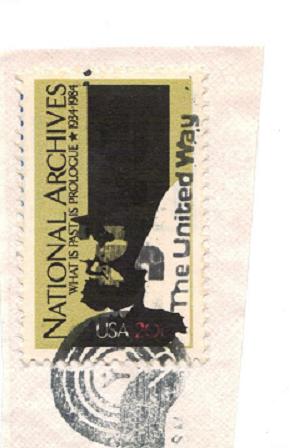
does this stamp look as it should? i know it is and impressionist type of stamp [art] but does not look right. should Lincoln be all eyebrows? it might just be the cancel.
Now that you mention it, it does. I think it just may be the cancel. The nose separation is hard to see because it is very very faint. The backside eyebrow really comes out just a little and would line up with the "S". The out side edge would go out no farther than the lips below the nose.
Of course yours goes out and touches the "S" then turns down to the "A". So if it is not a cancel then they ran a little extra ink somehow.
The slogan cancel is "give The United Way." The dot of the "i" in "give" is right over Lincoln's eyebrows. I can also see the "v" and "e" of "give" in Lincoln's top hat. The stamp appears normal.
Disclaimer: While a tremendous amount of effort goes into ensuring the accuracy of the information contained in this site, Stamp Community assumes no liability for errors. Copyright 2005 - 2026 Stamp Community Family - All rights reserved worldwide. Use of any images or content on this website without prior written permission of Stamp Community or the original lender is strictly prohibited. Privacy Policy / Terms of UseAdvertise Here