| Author |
 Replies: 14 / Views: 2,793 Replies: 14 / Views: 2,793 |
|
|
Pillar Of The Community

United States
856 Posts |
|
|
By "neat" I don't mean "cool," although I think it's that too. I'm referring to beautiful handwriting. I'm not sure if penmanship is even taught these days. My own used to be semi-OK but is seriously deteriorating with age.  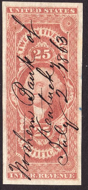 |
|
Send note to Staff
|
|
|
|
|
Bedrock Of The Community
United States
10600 Posts |
|
|
It was more than simply being taught penmanship. In those days there were professional calligraphers to write documents, and they sometimes cancelled the stamps too. |
Send note to Staff 
|
|
|
Bedrock Of The Community
United States
10600 Posts |
|
|
Notice the date, the second day of Gettysburg. And from a Border State to boot. |
|
Send note to Staff
|
|
|
Pillar Of The Community
United States
6430 Posts |
|
|
Valued Member
United States
102 Posts |
|
|
That is beautiful rustyc and cool too! I agree this is such a lost art. If I wrote that nice I would never print out album pages, but handwrite my own. Thank you for sharing. |
|
Send note to Staff
|
|
|
Bedrock Of The Community
United States
10600 Posts |
|
|
Bedrock Of The Community
United States
12128 Posts |
|
|
Did anyone notice that the writer of that manuscript cancel merged his "t" and "h" together when writing the word "Northern"? |
|
Send note to Staff
|
|
|
Pillar Of The Community
United States
3156 Posts |
|
|
No, I didn't notice the missing upward stroke of the t, saw the crossbar and imagined the rest. Good eye.  |
|
Send note to Staff
|
|
|
Pillar Of The Community
United States
6430 Posts |
|
|
Quote:
F-VF. The right margin keeps it from being XF. Respectfully disagree. There's not a dealer on the planet that would call this a F/VF. |
|
Send note to Staff
|
|
|
|
Pillar Of The Community
United States
856 Posts |
|
|
Thanks for "standing up" for my stamp, revenuecollector. I didn't want to say anything because I am obviously biased and didn't want to start an argument. I respect revcollector's opinion, and he obviously knows more about revenues than me, but I thought F-VF was a little harsh. F-VF would mean that it is in inferior condition to a Scott-listed R44a. In any event, it's one of my favorite stamps. |
|
Send note to Staff
|
|
|
Bedrock Of The Community
United States
10600 Posts |
|
|
I don't know where you got the idea that F-VF is an "inferior" condition. It's not, especially in revenues. And what Scott knows about revenues could be kept in a cigar box. OK on the basics like issue dates and rates, but they pay it as little attention as they can get away with. Some of it shows a complete lack of understanding with no interest in improving it.
Anything noticeable on the surface that does not belong and draws the eye reduces the quality. If it was ink from the cancel it would not matter, but these are small stains and it does.
Of course dealers would call it XF, they want to sell it for as much as possible. And too many collectors today think that centering is the be all and end all of every stamp, and it is not. There are other factors and this is one of them. It's still a pretty nice stamp, just not XF. |
|
Send note to Staff
|
|
|
Pillar Of The Community
United States
856 Posts |
|
|
<sigh> I was only referring to the fact that F-VF is inferior, by definition, to VF, which is the supposed condition of a Scott-listed stamp. But this is why I didn't say anything in the first place. I will simply conclude by saying that there is obviously a subjective element in stamp grading, even among experts. |
|
Send note to Staff
|
|
|
Pillar Of The Community
United States
1096 Posts |
|
|
OK, I get it now - I previously thought the statement "The right margin keeps it from being XF" meant that there was a margin problem/flaw, as I thought it was referring to the centering and size/balance of the margins. Now understanding that the statement was referring to the blue ink spots.
I definitely consider this to have XF or better margins, but can understand a lower overall "grade" due to other factors. |
|
Send note to Staff
|
|
|
Valued Member
United States
202 Posts |
|
|
"Neat manuscript cancel".
There was a lengthy address I had prepared for this thread, but I will keep it short:
"Neat manuscript cancel".
|
|
Send note to Staff
|
|
|
SCF Advertiser
Canada
362 Posts |
|
|
I really like these manuscript cancels but usually have only the Scott info for US stamps as I mostly deal with Canadian stamps as far as BOB's. Are there certain signatures or dates to look for? I have a lot of US revenues laying around that I would like to look through. Thanks |
|
Send note to Staff
|
|
| |
Replies: 14 / Views: 2,793 |
|