| Author |
 Replies: 31 / Views: 7,675 Replies: 31 / Views: 7,675 |
|
Pillar Of The Community
United States
1942 Posts |
|
|
Monitor limits notwithstanding, all four of these items were scanned together in a single image. One of them is certified as a #64 pink. Can you tell which one? (I have included a cover from Sept 1861 for an early comparative reference) Could there be more than one #64 here? 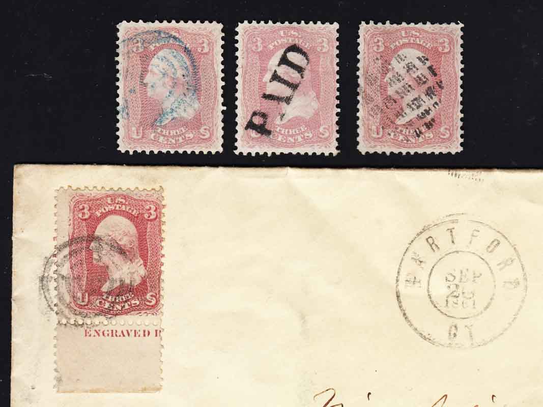 I am trying to find a good "touchstone" comparative reference for this kind of pink, but it seemed that a certified example is the only sure side-by-side comparison. But even with that it isn't easy to these old eyes. One online reference claimed that #248 gave a true "pink" for comparison. That seems like a stretch to me. Closer to the vintage of this stamp, the 6c American (#186) is listed as "pink" in Scott. Closer, but no cigar. Or I just not seeing it right? I will post a comparative pic of all those later. Anyone willing to spend a little more time on this one, with the goal of finding a good basis for comparison when a certified example is not available? |
|
Send note to Staff
|
|
|
|
|
Pillar Of The Community
United States
1942 Posts |
|
|
Here's another bunch, scanned together but separate from the first pic. This has the #186 and #248 for comparison. 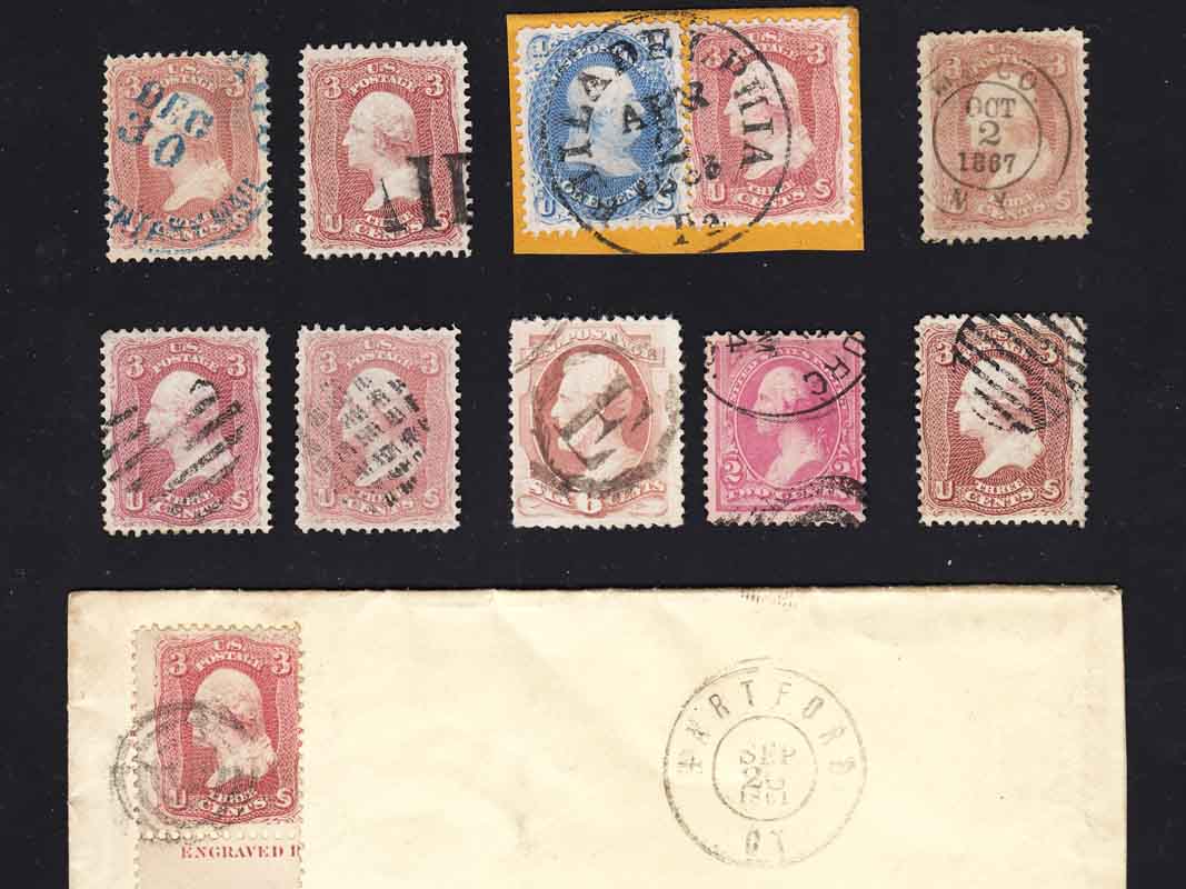 |
Send note to Staff 
|
|
|
Pillar Of The Community

United States
1270 Posts |
|
|
I'd say the middle stamp with the PAID cancel is probably the #64. The shading on the bottom curl of the top left "3" blends into the latticework background. I've been told that is a characteristic of #64. I've seen varying shades of pink in certified copies at shows. John Daley's web site, www.3cent1861,com , denotes some different pink shades. Mike McClung has some articles in the Chronicle of the USPCS Society. #144 has a good article on the pinks and #159,#166 and #165 also have discussions about shades for the issue. I don't know if there is another issue that can be use to compare the pinks to. I was once told that #814 was the closest, but I don't think it is that close IMO. I've many 3-cent 1861s, in a variety of shades, but no pink--still hoping to find one lurking out there without having to bite the bullet on a known, certified copy. If I'm wrong on my guess, it only shows just how much I don't know about the shades of that stamp!  |
|
Send note to Staff
|
| Edited by Al E. Gator - 12/23/2014 3:40 pm |
|
|
Pillar Of The Community
1849 Posts |
|
|
essayk....
I would say middle stamp also.
The left stamp -- the BLUE cancel makes it look more pinkish.
|
|
Send note to Staff
|
|
|
Pillar Of The Community
United States
2942 Posts |
|
|
Is it the far right one in your first scan?
Love the Hartford cover one.
|
|
Send note to Staff
|
|
|
Pillar Of The Community
United States
937 Posts |
|
|
Al E. Gator, I agree that the middle stamp is the #64 and that I am no expert either. I also agree that the #814 is not close. It is much more rose colored than my rose #65 stamps.
Unfortunatley John Daley's web site that you linked to is down at the moment. The hosting account had been suspended. Also your link has a comma instead of a period. Unfortunately the Internet Archive's Wayback Machine didn't save any of the images.
essayk, I have thought about this issue a lot. Identifying color shades that are very similar to each other without physical references requires a color corrected monitor and scanner. That costs at least hundreds of dollars and at least a few hours to setup. Then you need color corrected images of references. Then a color comparison could be made by software where a numeric threshold(s) would be the differentiator. That threshold would need to be found and agreed upon. Then you would have to consider other factors such as aging. It just isn't feasible until one's cost of expertisations well exceed the cost and time for the equipment. That limits it to a small subset of collectors. It's possible that expertisers already utilize a system like this to avoid the huge cost of reference collections. They could also be using the existing specialized equipment that is well outside of a collector's budget.
The use of a Scott #248 2c pink 1894 issue as a reference seems reasonable. It's much more "pink" than my rose #65 stamps. It's cheap and probably already in a collection when a collector is to the point of considering color shades of the 1861 series. It doesn't have to be the same shade as any of the true #64 pink variations. The eye could be trained that a suspect #64 shouldn't be less/more by a little/lot red/green/blue and darker/lighter than, etc.. The traits that make the difference would have to be established by someone like an expertiser or Mike McClung, the authority on 3c 1861 color. This wouldn't be foolproof, but could be the best that can be done without physical references or color corrected equipment. The color shade of #248 varies just as the #64 does, and is also susceptible to factors like aging. Even if done correctly, this won't remove the need for expertisation.
Bill Weiss seems to be noted for identifying the #64. However, I wouldn't blame him for not wanting to reveal a trade secret. Bill, if you're reading this, does your $5 ID service provide color ID as well? |
|
Send note to Staff
|
Ryan = HDNAC = DNA = HDC = Hysterical DNA Collector = Historical DNA Collector = me who just loves stamps :) |
| Edited by Historical DNA Collector - 12/23/2014 3:08 pm |
|
|
Rest in Peace
United States
1225 Posts |
|
|
Suggestion, get in touch with raymac "Ray MacIntire", he has made a study on this issue and may be able to provide help on this topic. But, I haven't seen him on here lately.
Art |
|
Send note to Staff
|
A well regulated Militia, being necessary to the security of a free State, the right of the people to keep and bear Arms, shall not be infringed. (The exact & entire wording of the 2nd Amendment to the U.S. Constitution) |
|
|
Pillar Of The Community
United States
937 Posts |
|
|
Another thought, a #248 could be utilized by scanning it alongside a suspect stamp. The comparison between the two by software isn't affected by calibration. It would take a lot of volunteers, but I believe that a threshold(s) could be found when looking at a survey of CMYK values. I know that Adobe Photoshop will display values. Maybe there is an already existing plugin for a freeware program like Paint.net or GIMP if it it doesn't already do so. Maybe a different issue in pink or rose is more consistent in colors throughout its production run. The #814 might be a better choice.
This would allow for anyone with a scanner and at least one common reference stamp to find how close their suspect is to a know range of values for certified/date confirmed examples of #64.
Don, this is right up your alley. Does this seem possible to you? |
|
Send note to Staff
|
Ryan = HDNAC = DNA = HDC = Hysterical DNA Collector = Historical DNA Collector = me who just loves stamps :) |
| Edited by Historical DNA Collector - 12/23/2014 3:33 pm |
|
|
Rest in Peace
United States
763 Posts |
|
|
The $5. ID service is only to ID by Scott number, but of course, if I ID a stamp as #64, then it is obviously pink. But honestly, I also don't mind if someone asks me what color a stamp is.
I agree with everyone else so far, that the stamp with the "PAID" is the pink, but I also think the one on cover dated in Sept, 1861 could at least be 64b, if not 64, but the color is notorious for being very susceptible to oxidation (sulphurization) and many stamps that were once pink, are now not!
There are no "secrets" to IDing "pink" and even experts (me included) use certified reference copies. Mine is a very strong pink and fairly close to pidgeon blood, but I sought the help of a more experienced person to tell me if mine was indeed BP, and that was Rich Drews who has a fantastic collection of the 1861 issue including many certified #64 and 64a.
My advice is simple; buy a certified "second" which can usually be had for $200/300. and use that as your benchmark copy. And the "pink" of other stamps in the Scott catalog, such as #186, #248 do NOT match the 1861 pinks. The 1894 stamp is usualy a much lighter color than than #64 and #186 isn't even remotely pink.
|
|
Send note to Staff
|
|
|
Pillar Of The Community
United States
1270 Posts |
|
|
Art, Ray is still lurking about. I talked to him a week or so ago. He does get on the site when he has time, but hasn't commented much lately. If he reads this posting he may well comment; he has spent a good deal of time and effort on the colors of this issue. |
|
Send note to Staff
|
|
|
Moderator

United States
12330 Posts |
|
|
Ryan,
Sounds reasonable to me but I concur that BillW and Raymac should be able to provide some great insight(s).
Don |
|
Send note to Staff
|
|
|
Pillar Of The Community
United States
1942 Posts |
|
|
Wow, you guys are good at this! Those who said the PAID cancel item is certified pink are spot on. How you can differentiate it from the one to the left of it I'll never know. That one was sold to me as a 64b. The item on right was described merely as a 65, but it is probably an early shade like these others.
My biggest problem is that I am not able to see the DIFFERENCES between close candidates, and part of that may be due to the color temperature of the light source I am using for viewing. I am finding that trying to judge colors by the light of a 60 watt CFL is useless. Too many frequencies are underrepresented or missing. The only light that is reliable is north daylight, when the sun is out, but I don't know if that is still a standard form of illumination for spotting these pinks. [edit: nah, that's all BS. You guys did it on the basis of SCANS - I just don't know the secrets, that's pretty much the problem.]
One thing I have been told is that a true pink is not dull - it is not the result of a faded deeper shade. Fortunately I have one reference example now, but no confidence that I could spot it if I held another. Thank God I don't really collect the series. That said, I have found what I think are the same shade of true pink on a Gibson starch paper essay and one of the C-grill points-up essays. I may post those so you can tell me if it's just my imagination.
Since I see Rich Drews fairly regularly, I may buttonhole him for a bit of comparative study. Maybe he can explain the logic of it to me. It's his field, after all, and he takes a decidedly Caltech approach to it. Thanks for the suggestion, Bill.
Anyway, thanks for the time you all took to ogle these. It has literally been an eye-opener. |
|
Send note to Staff
|
| Edited by essayk - 12/23/2014 4:22 pm |
|
|
Pillar Of The Community
1849 Posts |
|
|
Quote:
part of that may be due to the color temperature of the light source I am using for viewing. I am finding that trying to judge colors by the light of a 60 watt CFL is useless. Stamps should be viewed under a OTT-LITE This is the BEST light source for viewing. You could pick up a great one for about $60?? at Office Depot, etc... |
|
Send note to Staff
|
|
|
Pillar Of The Community
United States
937 Posts |
|
|
Quote:
But even with that it isn't easy to these old eyes. essayk, I understand your frustration. Some people's vision is better at color recognition than others. Color Vision Deficiency can result from aging or many diseases, medications, and even chemical exposure. To my eyes, the three are all distinctly different shades. The left stamp has more blue in it. The right stamp has more red in it. We can only compare colors on non-color corrected equipment. Even if I could see your stamps in person, I couldn't tell you which one is a #64 because I don't have a reference copy and I haven't even seen one in person. Having a method other than physical comparison would help for many reasons. Many can't justify spending $200/300 for a reference copy. Many don't have the vision capability to make an accurate comparison. I'm going to try some experiments with some common stamps that I have. If the results are encouraging, then I'll ask others for scans to help me refine a method using any common scanner. For now, this might help you. I copied the same area from the 3 stamps then pasted them next to each other. Can you see the shade differences now? 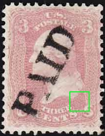 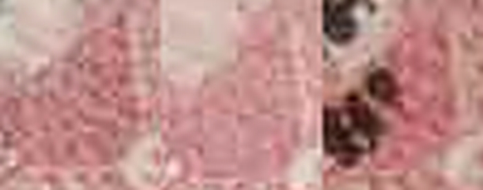 Post your essays, I'm curious to see them. Ryan |
|
Send note to Staff
|
Ryan = HDNAC = DNA = HDC = Hysterical DNA Collector = Historical DNA Collector = me who just loves stamps :) |
| Edited by Historical DNA Collector - 12/23/2014 5:26 pm |
|
|
Pillar Of The Community
United States
1942 Posts |
|
|
Thank you Ryan. Great suggestion. Zooming in does give a better comparative view, and now I can see the differences. Here is the corner around the spot you picked out, same sequence left to right, but without the pixelation: 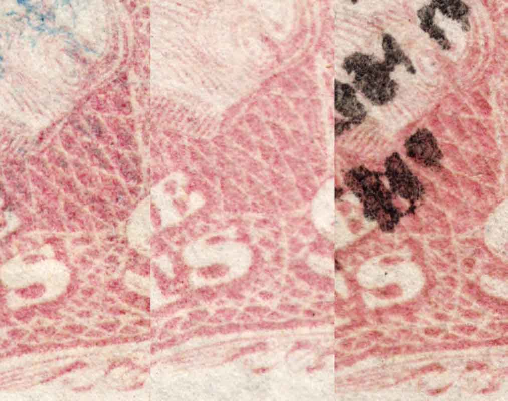 I will have to try this with a few more to see how consistent the colors are. And here are the essays added to the view, but now stamps are arranged in the reverse of the original. The essay bottom right is the Gibson starch paper, and left of it is the points up C-grill type. 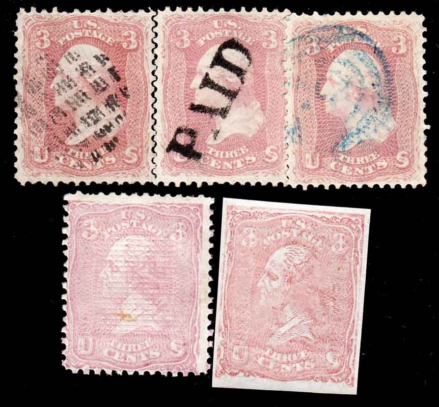 |
|
Send note to Staff
|
|
|
Pillar Of The Community
United States
937 Posts |
|
|
Great! It doesn't solve all of the issues at hand, but will at least help you and hopefully others. Try to pick an area with as much solid color as possible. Also try to pick an area free of cancellation, paper discoloration, and that seems to be the median color if it's not uniform. You don't have to choose the same area from each stamp. It's best to choose the same area, but isn't always possible due to things like cancellation placement. Pretty cool essays. Both seem more pink than the #64. The right one seems to be a bit more red and maybe a little bit more blue than the left. The left one is the pinkest of the group in terms of absolute color, not of #64 shades. For funsies, anyone can test their ability to detect color shades here: http://www.xrite.com/online-color-test-challenge |
|
Send note to Staff
|
Ryan = HDNAC = DNA = HDC = Hysterical DNA Collector = Historical DNA Collector = me who just loves stamps :) |
|
|
Replies: 31 / Views: 7,675 |
|


