TheSeal619,
Thank you. I did put a lot of thought and effort into the above posts. Unfortunately my meds can interfere with my ability to present my thoughts in a clear and concise manner.
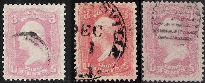
Which is a certified #64a? Good question that can only be answered with many caveats. First, compressed jpeg files loose a lot of color information and this image wasn't color calibrated to begin with. Second, what exactly distinguishes a Pigeon Blood Pink is not entirely known. Identification is typically made by comparison to a reference copy. They are often described as a pink with a bluish cast to them. Third, like any shade, there are many subtle sub-variations for any shade. Fourth, environmental effect such as time and exposure to light and humidity amongst other things can affect its color. Fifth and not the last, you didn't provide whether or not any of them are a certified #64a.
Even if I did have a color calibrated image with no compression, I couldn't tell definitively which is a #64a. Even if I saw the stamp physically in front of me I couldn't tell you. I'm still in the data gathering stage to determine what the quantitative thresholds are from color measurement.
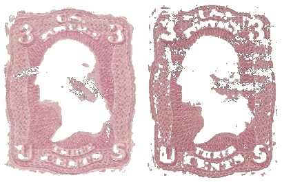
Let's give it a try regardless. First, it seems like some altering of the image you created by copying and pasting them next to each other did at least change their relative size. I shifted them so that the lower ornamental balls are all at the same height:
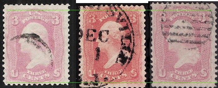
I'm going to ignore the middle stamp since it seems very different than a pink.
Now let's remove all of the color information that can alter our perception of the colored areas:
Let's place that above a neutral grey background which helps to see their difference in color even better:
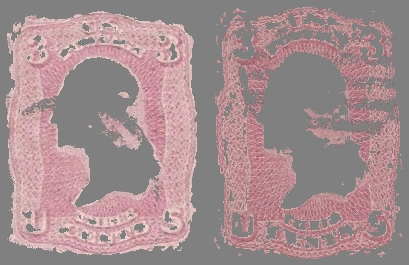
Both stamps now look much darker. The right one doesn't even appear pink at this point. I assure you that the colors are not altered. The surrounding areas change our perception of color that much. Neutral grey is utilized as a background for color comparison for this very reason.
So at this point I would have to say that IF any of them is #64a Pigeon Blood Pink, then it is the left one. However, we can take it even further. There are many methods of analyzing our well sampled color information of the images. I'm going to proceed using a graphical webtool that does a good job but that does compress the vertical axis to make prettier graphs/histograms. It's good enough for this demonstration's purpose:
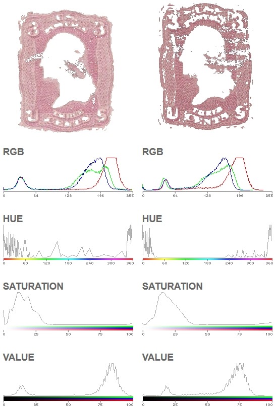
Looking at the RGB histograms we see flat tops on the red traces. This indicates that color information was "clipped" and was lost somewhere from scanning the stamps up to when you posted the image. This is another important reason for obtaining color calibrated and accurate images. It's not difficult to do so, it just takes a bit of learning. Also, the curves of an image with correct color information has smooth traces with one or a few peaks. This is an indicator of altered color information through image compression.
Even knowing that, let's still press forward. I don't have any data from a #64a to compare to, but I do have data from a few #64. Comparing them to your stamps, the left one is similar to a #64. That comparison is very inaccurate due to so much loss and corruption of color information, so my "guess" could very well be wrong.
I am by no means an expert color scientist. However, I am finding that a similar method of analysis does allow a stamp to be scanned, sampled, then accurately placed into a shade category. I need a lot more data before the quantitative thresholds can be determined, but for now we can at least utilize part of the method to create calibrated scans that we can compare with each other. This requires a $20 color calibration target and a few hours to set up. If you did so with your certified #64a and shared that image with the rest of us, then we could accurately compare our stamps to yours by just perceiving how similar or not that they appear. To take that further then we could compare histograms or pixel color values using an image editing software's eyedropper/color picker tool. The final step would be to use data analysis software and/or a spreadsheet to compare the data to a chart of shade thresholds. I'm still refining the last parts as I gather more data. In the end I hope to make all of this a somewhat easy and quick process.