Stamp Community Family of Web Sites
Thousands of stamps, consistently graded, competitively priced and hundreds of in-depth blog posts to read


Stamp Community Forum
 
Username:
Password:
Save Password
Forgot your Password?

This page may contain links that result in small commissions to keep this free site up and running.

Welcome Guest! Registering and/or logging in will remove the anchor (bottom) ads. It's Free!

Green Cancel, Is There A Particular Type?

Previous Page
 
To participate in the forum you must log in or register.
Author Previous TopicReplies: 23 / Views: 3,753Next Topic
Page: of 2
Pillar Of The Community
United States
1942 Posts
Posted 04/27/2015   11:07 am  Show Profile Bookmark this reply Add essayk to your friends list  Get a Link to this Reply
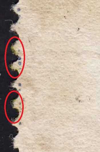
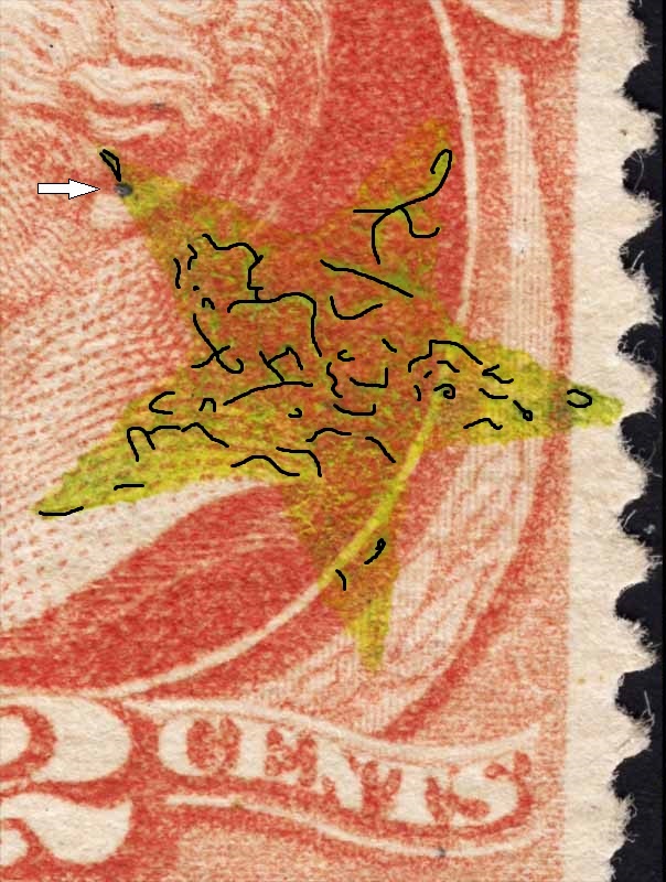
Thanks for flagging those yellow/olive green "cancels." They are now on my "suspicious" list. If I may, could we take a better look?

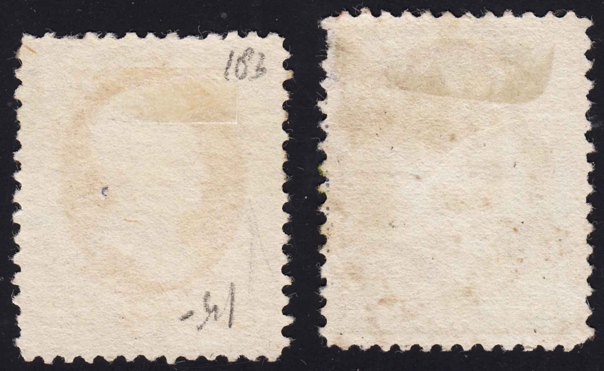
First to your question about "bleed-through." Here are the reverses, with the 2c vermilion on the left:


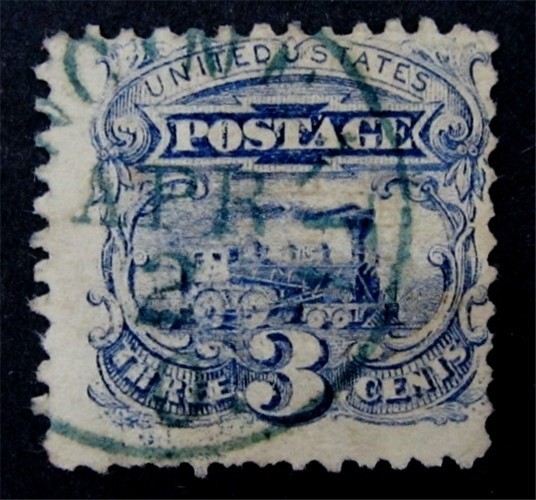
Here is a closer look at the 2c vermilion (#183) and the #212 1c of 1887.


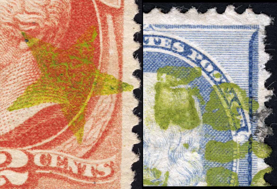
These were scanned side by side according to the same scale, and color adjusted to the same specs (uncalibrated system however). The color match for the cancelling ink is dead on to my eye. I cannot tell if the ink on both had the same viscosity, but it is "clumped up" on both stamps even though the effect is more pronounced on the vermilion example. I tried to select a spot on the 212 where the black cancellation, which is very fragmented, was able to be seen in proximity. I think the olive ink shows up as heavier in this image, but that may only be because I know it to be so.

I am a bit chagrinned by this since the two stamps were acquired 20 years apart and the earlier (#183) had been purchased from a reputable seller known to me circa 1991. Without validation I assumed the olive ink was unusual but okay, so when the #212 came along in 2011 from an ebay seller I went for it. Didn't notice the residual black cancel in the seller's pics.

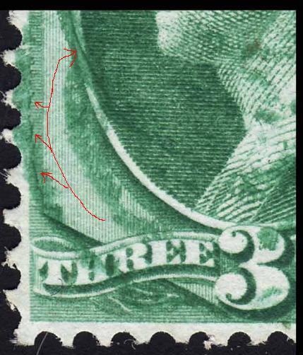
Now I'd like to ask your (group) opinion on another item I bought from Rich the same day that I bought the 2c vermilion. They have adjacent numbers in my old acquisitions database.


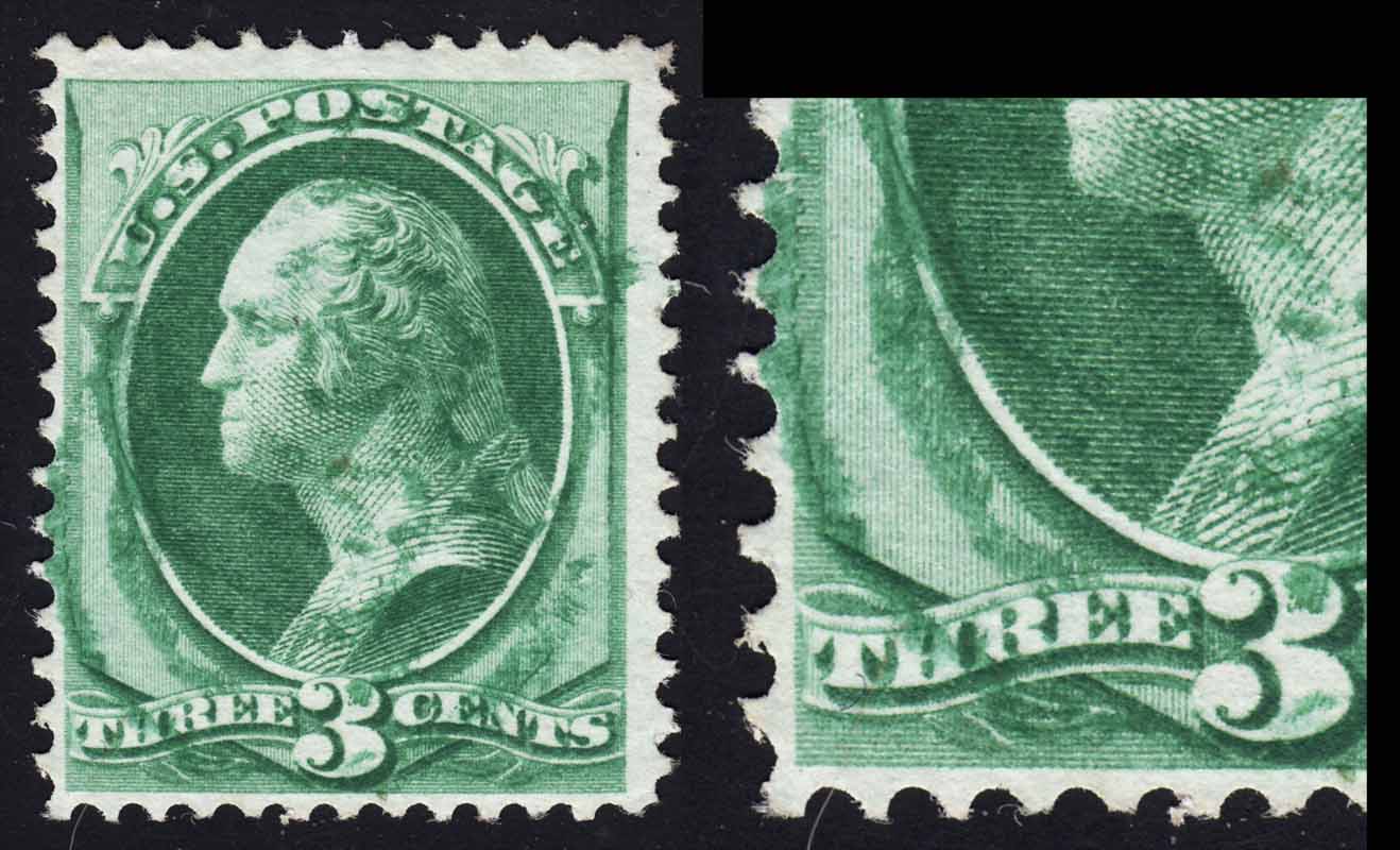
The cancellation appears to be a slight double strike of a concentric ring killer. This I think is a normal green with no hint of a black cancel on the stamp. But my experience with green cancels is quite thin, and I do not consider myself much of a judge on them.

How does this one look so far?
Send note to Staff  Go to Top of Page
Edited by essayk - 04/27/2015 11:11 am
Valued Member
United States
344 Posts
Posted 04/27/2015   11:41 am  Show Profile Bookmark this reply Add kollectorkurt to your friends list  Get a Link to this Reply
Although there is no sign of the mustard-yellow ink permeating the paper, the perf tips have clearly visible wicking, which is an indicator of the cancel being applied off-cover. This is similar to why one inspects perf tips for signs of re-gumming.


Another thing you might try is to check the ink under UV. I have seen modern fakes fluoresce where true period ink will stay dead, albeit magenta and purple inks. I've never personally seen this mustard-yellow.
Send note to Staff  Go to Top of Page
Pillar Of The Community
United States
3167 Posts
Posted 04/27/2015   11:43 am  Show Profile Bookmark this reply Add littleriverphil to your friends list  Get a Link to this Reply

Quote:
How does this one look so far?


It looks green, although there are darker lines on the left side that may be heavier deposits of green ink or possiblly part of another cancel.


Send note to Staff  Go to Top of Page
Edited by littleriverphil - 04/27/2015 11:54 am
Pillar Of The Community
United States
2953 Posts
Posted 04/27/2015   11:53 am  Show Profile Check Rileysan's eBay Listings Bookmark this reply Add Rileysan to your friends list  Get a Link to this Reply
Green cancellations are notoriously hard for me to spot. I have seen many cancellations that I thought were green, but was later corrected. My issue is that I am a Deuteranope (non-functional medium wavelength color cones) and a great many colors simply blend together or change depending on the background.

The yellow-green cancellations posted by Essayk are crystal-clear to me. The others could just as easily be gray to faded black as green.

Posted are two examples from my collection. The first is a certified green cancelled 114. The second is a CDS that looks exactly the same color to me, but apparently is not green.

Brian


Send note to Staff  Go to Top of Page
Brian Riley
APS 223349
Valued Member
United States
344 Posts
Posted 04/27/2015   12:00 pm  Show Profile Bookmark this reply Add kollectorkurt to your friends list  Get a Link to this Reply
Is it possible that the 2-cent vermillion has had a black star removed and the mustard-yellow applied over-top? The dark/light areas of the cancel do not match up to the dark/light area of the vermillion ink. They do perhaps, hint at weakened spots from a chemical cleaning. If one sets aside the dark spot being a paper inclusion, it might be a weak spot where the original black ink permeated so as to be un-removable.


Send note to Staff  Go to Top of Page
Pillar Of The Community
United States
644 Posts
Posted 04/27/2015   12:08 pm  Show Profile Bookmark this reply Add billw2 to your friends list  Get a Link to this Reply
Riley,

The one with the CDS is easy to discount as it's from Cincinnati, which never used green ink but used blue for many years.
Send note to Staff  Go to Top of Page
Valued Member
United States
344 Posts
Posted 04/27/2015   12:10 pm  Show Profile Bookmark this reply Add kollectorkurt to your friends list  Get a Link to this Reply
Rileysan - Your #114 with the CDS is a very nice example of what I call "Cincinnati Blue" - which I too, see as having quite a bit of green (and black) in it. I have a half-dozen of so similar cancels in this color. I wish it were , but it's .
Send note to Staff  Go to Top of Page
Rest in Peace
United States
763 Posts
Posted 04/27/2015   4:56 pm  Show Profile Bookmark this reply Add Bill Weiss to your friends list  Get a Link to this Reply
Regarding the Cincinnati cancel on the 3c 1869. For many years it was believed that all Cincinnati postmarks in this period were "blue" (even though some DID appear to be a little bit "greenish") and expert services always would describe those with a greenish cast to the ink as "greenish blue". But over the last decade or so, it is now widely recognized that SOME Cincinnati "greenish blue" postmarks are really "bluish green"! I have now seen a number of these including one or two certified by the PF and I've done a few. The color is a very dark shade (unlike Brian's, which is basically blue.

So bottom line, Cincinnati postmarks from this era can be found in "blue", "greenish blue" and "bluish green".
Send note to Staff  Go to Top of Page
Page: of 2 Previous TopicReplies: 23 / Views: 3,753Next Topic  
Previous Page
 
To participate in the forum you must log in or register.

Go to Top of Page

Disclaimer: While a tremendous amount of effort goes into ensuring the accuracy of the information contained in this site, Stamp Community assumes no liability for errors. Copyright 2005 - 2026 Stamp Community Family - All rights reserved worldwide. Use of any images or content on this website without prior written permission of Stamp Community or the original lender is strictly prohibited.
Privacy Policy / Terms of Use    Advertise Here
Stamp Community Forum © 2007 - 2026 Stamp Community Forums
It took 0.31 seconds to lick this stamp. Powered By: Snitz Forums 2000 Version 3.4.05