| Author |
 Replies: 15 / Views: 2,794 Replies: 15 / Views: 2,794 |
|
|
Pillar Of The Community
United States
1942 Posts |
|
|
I was browsing in a thread in another SCF forum and I ran across this comment: Quote:
Stamps are like babies..."there are no ugly ones". Altho I have had my opinions concerning some babies, there are no ugly stamps.
Now that got me to thinking, vis a vis classic US stamps. Two questions. 1. We all have our favorites, of course, maybe several. But if you had to name just one stamp design as the poorest, ugliest, least attractive design among US stamps prior to 1940, what would it be? 2. Would it be the worst design for all of US stamps of any time? |
|
Send note to Staff
|
|
|
|
|
Pillar Of The Community
United States
1851 Posts |
|
|
I have three nominees. The first is Scott No. 616, the Huguenot-Walloon Tercentenary issue, basically a picture of the sun rising behind an obelisk. An odd choice. The second is Scott No. 327, the 10c Louisiana Purchase issue, showing a big map. Last, I find it hard to like Stanton's beard on Scott No. 138, perhaps because tastes in facial hair have changed so much (although I know some hipsters who might rival him).
|
Send note to Staff 
|
|
|
Bedrock Of The Community
United States
10629 Posts |
|
|
The ugliest stamps issued before 1940 are the tax exempt potato tax stamps of 1935, Scott RI14-RI18. Nothing comes close. |
|
Send note to Staff
|
|
|
Pillar Of The Community
United States
1942 Posts |
|
|
Okay, I opened this can of worms with imprecise speech so now I have to live with that. Revenues are in, but excluding private die proprietaries (match and medicine). But can we agree to exclude also all CSA, US possessions, UN, locals and Postmasters Provisionals? As well as postal stationery, seals and other non-franking adhesives? That's a lot of BOB categories.
Just federal US postage and revenue stamps as issued.
And within that range I've got to admit the designs of the tax exempt potato stamps are nothing to write home about.
Within the US postage domain, I have never been wild about the design for the Virginia Dare commemorative. The stamp is a 1 inch square, you can barely see the central figure, the baby, and it has always seemed odd to use baby-blue for a baby girl. Then again, at least it isn't pink. |
|
Send note to Staff
|
|
|
Pillar Of The Community
1545 Posts |
|
|
Although I of course, naturally, know nothing of the member who posted that comment, and further, think they should be boiled in oil, I will submit my choice.... There is one stamp design in the classic issues that has always bugged me, and that is U.S. Scott No. 319. The shield-like design never appealed to me. In my album for some reason it is in with the Second Bureau Issues. It doesn't "fit in" design-wise with the others of that set so that also makes it appear to me like it is "out of place". I could violate the rules further by discussing the 1956 Nassau Hall issue (US No.1083) but I won't, partly because I found out it has some historical manufacturing issues concerned with it which now makes it special. I learned this about the Nassau Hall stamp from a book entitled "Fundamentals of Philately" by L. N. Williams, which was recommended to me by the forum member who started this thread, who is a pretty good guy. As a footnote, I must mention That I consider the issue US No. 319 "unattractive", but not ugly.  -IBFS |
|
Send note to Staff
|
All science is either Physics or Stamp Collecting. -- Ernest Rutherford |
|
|
Rest in Peace
United States
82 Posts |
|
|
An attractive but ho-hum rendering of the Coliseum in #1076 certainly is not artistically ugly for showing a building. But for for decades I have wondered
COULDN'T A DESIGN SHOWING A POSTAGE STAMP OR TWO
have been a reasonable substitute?
Of all the first hundred plus years of stamp design
I still cringe at it. |
|
Send note to Staff
|
|
|
Bedrock Of The Community
United States
10629 Posts |
|
|
Why worry about Match & Medicines, there are very few truly ugly ones. Although the faces of a few of the owners who put themselves on some of them is another story....... |
|
Send note to Staff
|
|
|
Bedrock Of The Community
United States
10629 Posts |
|
|
I really can't think of a postage stamp issued before 1940 that I would consider truly ugly. Very distasteful yes, the $4 Columbian showing the perpetrators of the Spanish Inquisition is my least favorite stamp of the time period in question. |
|
Send note to Staff
|
|
|
Pillar Of The Community
United States
7239 Posts |
|
|
In my humble opinion, for pure ugliness the earlier engraved stamps cannot possibly compete with the muddy, multicolor offset issues of the 1970's-'80's. The Lyndon Johnson stamp immediately comes to mind. |
|
Send note to Staff
|
|
|
Pillar Of The Community
United States
669 Posts |
|
|
I agree with essayk on the Virginia Dare stamp, and its also very drab, nothing really stands out.
Stamps with mostly words like 1945s "Toward United Nations" and 1981s "Alcoholism" are among my least favorite post 1940 stamps. |
|
Send note to Staff
|
|
|
Valued Member
United States
225 Posts |
|
|
Pillar Of The Community
Israel
6191 Posts |
|
|
Valued Member
United States
238 Posts |
|
|
Quote:
Within the US postage domain, I have never been wild about the design for the Virginia Dare commemorative. The stamp is a 1 inch square, you can barely see the central figure, the baby, and it has always seemed odd to use baby-blue for a baby girl. Then again, at least it isn't pink. I have to agree. I was looking at my copy of the Virginia Dare stamp last night...even though it is a mint stamp and has no cancellation in the way, it is very hard to see anything with the stamp in that color. If I had been on the committee for that stamp, I would have pitched a major fit about the color. I might not have changed anything, but they would have been well aware of my preferences. |
|
Send note to Staff
|
|
|
Pillar Of The Community
United States
813 Posts |
|
|
 Might be too recent for the OP, but not an attractive issue. |
|
Send note to Staff
|
Member of the Central Oregon Stamp Club.
Redmond, OR 97756 Mailer's Postmark Permit #1
APS 239403 |
|
|
Pillar Of The Community
1151 Posts |
|
|
Good morning essayk, I had not decided whether to weigh in or not on this subject, as I'm sure a lot of collectors will not like my choice for #1 of your original posting. My stamp is RB8b, which just seems all wrong to me. Anyway hope other collectors submit more for all of us to see. 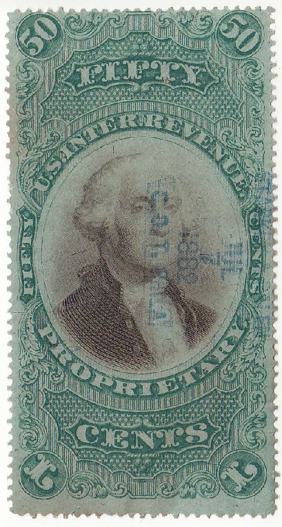 Cheers David (Stampmaster) |
|
Send note to Staff
|
|
|
Rest in Peace
United States
7097 Posts |
|
|
About that Virginia Dare stamp- I believe that President Franklin Delano Roosevelt had a direct hand in the design and production but yes, otherwise the color is a terrible choice in my opinion and the graphic to intricate for that size and color too. |
|
Send note to Staff
|
|
| |
Replies: 15 / Views: 2,794 |
|


