|
This page may contain links that result in small commissions to keep this free site up and running.

Welcome Guest! Registering and/or logging in will remove the anchor (bottom) ads. It's Free!
To participate in the forum you must log in or register.
| Author |
Replies: 13 / Views: 3,179 |
|
|
Pillar Of The Community
790 Posts |
|
|
The attached photos are for two lots being offered by Harmer-Schau in their auction at the APS show. There appears to be a light patch at the left middle of both stamps. I also notice that the picture of this stamp in the Scott catalog appears to have the same aspect. Can someone who is familiar with this stamp shed some light on this - is this the way the stamp was actually printed? Thanks in advance.  
|
|
Send note to Staff
|
|
|
|
|
Pillar Of The Community
United States
1756 Posts |
|
|
Pillar Of The Community
United States
2423 Posts |
|
|
Some very fine examples of this stamp may be found on usphila.com. The design is as such. |
Send note to Staff
|
|
|
Valued Member
United States
466 Posts |
|
|
Oracle, That is a great and very interesting observation. I am adding proof images which all show the same characteristic to some extent and help explain why nearly all (all?) examples show this. 228P1 Is the sunk die proof. So the issue goes all the way back to the starting die.  228P2 is the Roosevelt special proof. Although it is nicely impressed (they were meant for dignitaries presented in a special book) it too shows the left center frame weakness. It is a die proof as well.  228P4 is the card proof which was a plate proof made from a transfer roll. As expected it also shows the characteristic noted.  All of these images I located and can currently be found on ebay if you want a closer look. Evidently the engraver did not deepen those lines well enough on the master die, and it does seem odd that through the entire production proofing process this went uncorrected. |
Send note to Staff
|
| Edited by Crouse27 - 08/15/2015 1:31 pm |
|
|
Valued Member
302 Posts |
|
|
Oracle, I kept this one on my potential upgrade list for some time as I wanted to find a copy without that light patch to the left. After several months of looking I gave up.  Hobsun |
Send note to Staff
|
|
|
Pillar Of The Community
790 Posts |
|
|
Thanks for all the insights, folks. I just thought it was a little strange that, if this phenomenon was the result of the printing process as opposed to a flaw in a few stamps, the powers that be would just let it continue throughout the production run, as Crouse27 notes. |
Send note to Staff
|
|
|
Pillar Of The Community
United States
1942 Posts |
|
|
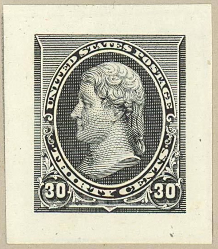
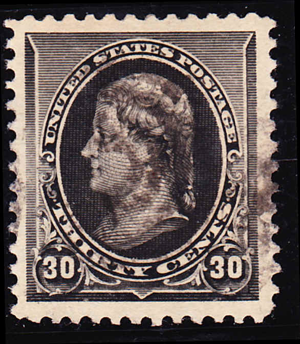
I'm having some doubts about that first die proof. This is being offered by Bill Langs on ebay as a 228P1, which is true as far as that goes, but not necessarily the whole story. http://www.ebay.com/itm/200808936836 A couple of features make me suspect that it may be a hybrid die proof, made by the ABNCo but by a different process than for a true die proof. There are two features about it that raise that suspicion. Let me show you a true die proof, and then I will explain: 
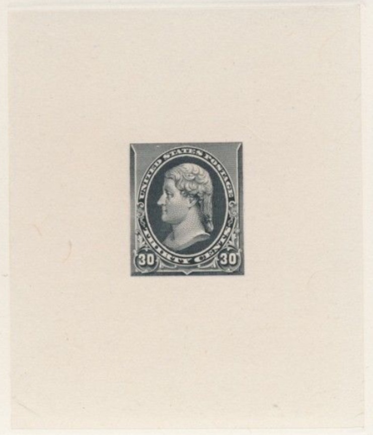
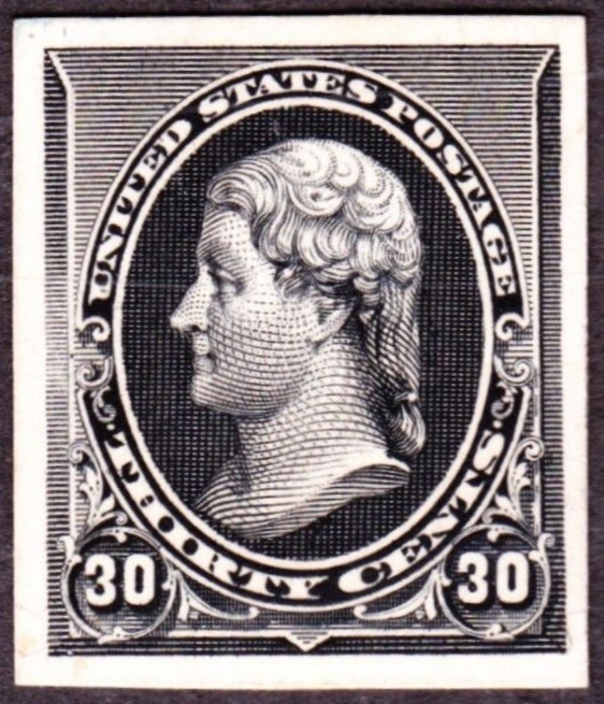
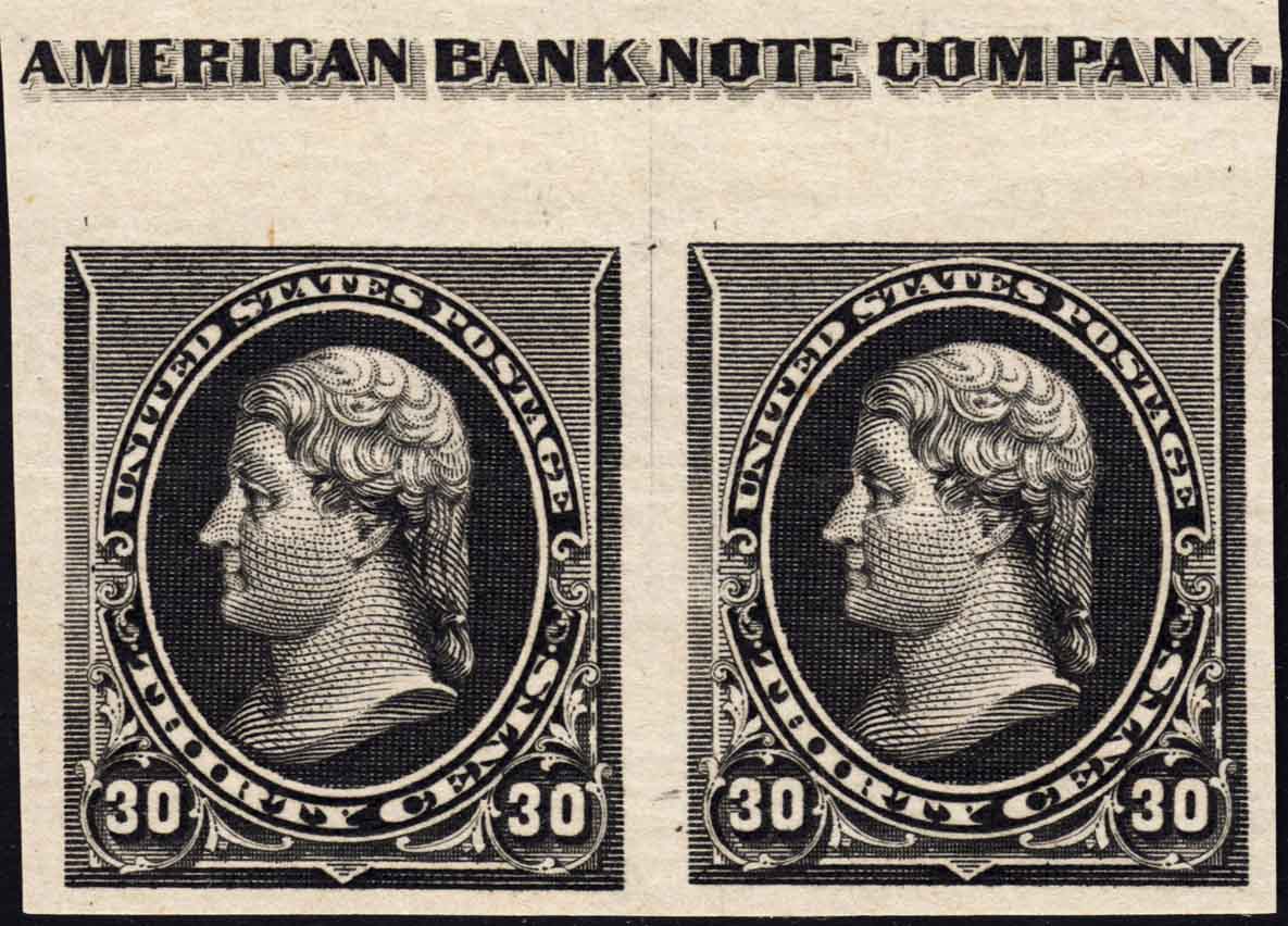
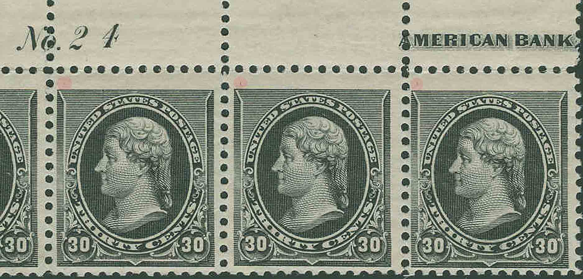
This is from a full size original die proof. This pic shows the sinkage area of a proof on a 6x9" card.  
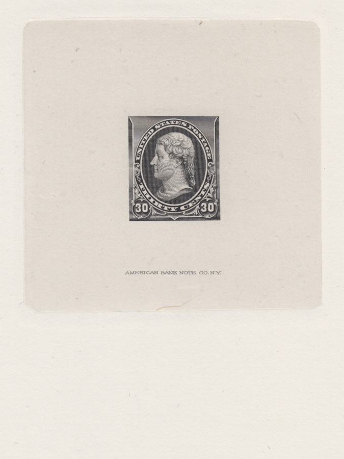
Note that it has an inscription reading, "AMERICAN BANK NOTE CO. N.Y." This inscription, with or without the die number above it, was added to the die late in the design process, but before the die was hardened. Normally we should expect to see it. However, die prints for other denominations in the series are known without inscription (e.g. 6c) so it's absence is not positively definitive. But there is another indicator in this case.  
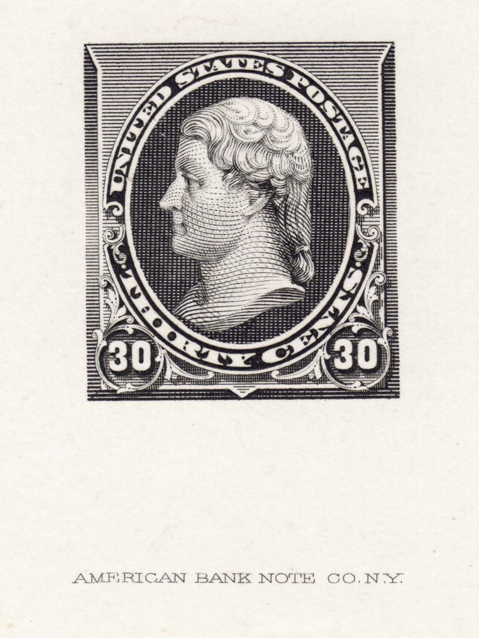
The sinkage area requires attention. What is sinkage? When a die proof is made, a sheet of India paper is positioned over a die prepared for "pulling" a print. This is covered over by a piece of cardboard as a stiff backing. Then the entire stack is slid into position in a hand operated spider press, and pressure is applied to make the print. When it is removed from the press an impression of the die block has been "sunk" into the card stock, and the India paper has been pressed into the card so that it conforms to this impression and adheres to the card. This is called the "sinkage" and its dimensions are the same as those of the die block used. Usually the India paper is trimmed to the dimensions of the sinkage area, though this is never precise. The dimensions of the India paper do not define the "sinkage." Sometimes the trim is well within the sinkage area, and sometimes the India is left untrimmed. So the "sinkage" refers specifically to the size and shape of the impression on the cardstock which was left by the die block itself. 
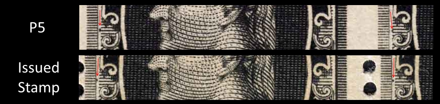
In the die proof image I have given here, you can see that the sinkage area is square with rounded corners. The sinkage area on this block measures 61 mm across and 62 mm down. This square sinkage configuration is typical for all the dies used in this series, although the precise dimensions vary by a millimeter or two. 
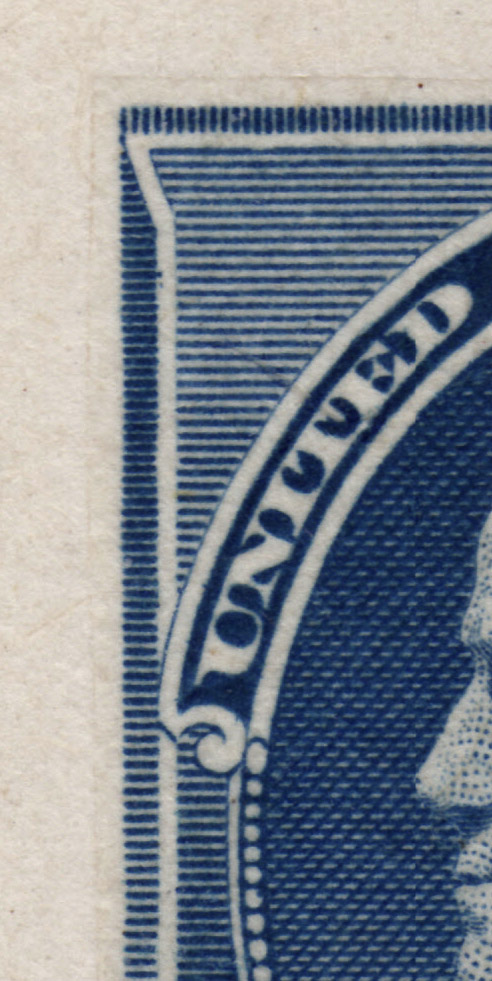
If you look carefully at the sinkage area on the Langs example, you will see that it is rectangular with squared corners. This sinkage was not created by the original die block. Does that mean this item is a fake? Not necessarily. It could be a "hybrid." By way of definition, in the introduction to the proof section in the US Specialized, Scott gives a concise one sentence explanation of how hybrid die proofs are fashioned. "Hybrids are plate proofs... which have been cut to shape, mounted and pressed on large cards to resemble large die proofs." To confirm that the proof in question is a hybrid we would need to see the reverse or a closer look at the area of the stamp design. Here is a hybrid for US #212:  
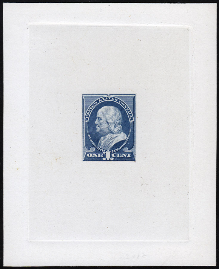
At this distance it looks like a normal die sunk proof. But on closer inspection:  You can see the straight edges where the plate proof on India was trimmed and then mounted to the India paper which was then block sunk to the card backing. The Bank Note companies produced hybrids for a number of reasons which I will not try to detail here. Suffice it to say that most often the work is original to the Bank Note Company. Unfortunately, the catalog does not separately list or price hybrid die proofs, apart from an introductory comment that hybrid proofs command less than their actual die sunk counterparts. And that is not as true today as it once was. Because the image in a hybrid usually emanates from a plate proof on India, a hybrid is not a reliable guide to the condition of the design on the die. I will make a follow-up post discussing the actual condition of the die and also noting the appearance of the design on a couple of proof types not already illustrated. I expect this will tweak the interpretation of what is going on with this design from die to stamp. |
Send note to Staff
|
|
|
Pillar Of The Community
United States
2941 Posts |
|
|
Valued Member
United States
466 Posts |
|
|
Pillar Of The Community
United States
1942 Posts |
|
|
Quote: Evidently the engraver did not deepen those lines well enough on the master die, and it does seem odd that through the entire production proofing process this went uncorrected.
There is more to this than meets the eye, so to speak. On the one hand this is not an error per se. The left margin frame shading intentionally follows a "heavy-light-heavy" gradient pattern from top to bottom. In fact this is a characteristic pattern for all the denominations with this frame style (10, 15, 30, 90), but seems to be more pronounced in the case of the 30c. Here are die images of the 30c and 90c. Both show the gradient, but it is more pronounced on the 30c.  As we move from the die to the stamps, we find that the center of the gradient varies in its intensity, but not in a uniform fashion. Here is a composite look at this section in four different states of production. One left is the die (P1) on India. Next is a plate proof on India paper (P3). Next is a plate proof on stamp paper (P5). Finally on right is an image from a fully finished stamp.  Notice that in moving from India to soft wove stamp paper the lines of engraving become a bit fuzzy and less distinct. In the heavy part of the gradient they tend to merge a bit, but in the light part of the gradient they simply become irregular and even break up. However, this phenomenon is not uniform or consistent, Next is the bottom margin plate proof pair on India paper from which P3 above was taken. It reproduces the gradient shading, but does not show the degraded impression we see on the stamps. But proofs like this are pulled one at a time on a special press, and usually present a superior appearance to that of regular production run from the presses normally used to print the stamps.  Next we come to a larger view of the proof pair used for the P5 image. The paper is the same soft wove paper used for production. However, it is not clear whether the imperforate plate proofs on stamp paper were pulled from regular production, or specially printed on a proofing press. In any case, notice that the stamp on the right has a more noticeable breakup than the stamp on the left. The P5 closeup above was taken from the left stamp.  If these are characteristic design flaws for these positions, then we should find this same kind of difference at this position on another stamp. Fortunately, we are in a position to make such a comparison. Only one plate was used to produce the 30c, and it only has two top imprint positions. This next image is from a plate number and imprint strip of five of the issued stamp The pane assignment of the strip is unknown, but the arrangement of layout lines still present near the imprint is the same on the stamp pair as on the P5 proof pair. These are two prints on stamp paper from the same plate position.  Here the light portion of the gradient appears about the same on both stamps, but if there is an inequality, the left stamp may be the one more "broken." This is the opposite of what we see for this same position on the proof paper. From this we have evidence that the breakdown of the image is ambient, and therefore cannot be attributed to engraving differences, even due to wear, between these two positions. The most probable source of this difference in the strength of the phenomenon is the inking and wiping of the plate. If this is so, then what we are seeing is a printing variety. However, it is a defect that accentuates a slight design difference between the 30c denomination and the treatment of the other denominations in the series. Whether that is an indication of a defective design I leave to your judgment. But once the die was hardened, this could not be changed. |
Send note to Staff
|
|
|
Pillar Of The Community
United States
937 Posts |
|
|
essayk, Excellent write up. Thank you. I agree that it is a phenomenon due to inking. I disagree that the plate proof and imprint strip are from the same position. Compare the dots:  That insignificant issue aside, looking at the comparison image (assuming identical paper and ink formulation) leads me to believe that the plate proof is better inked and the imprint strip's ink dried a bit before the impression was made:  Here's an enlargement of the same areas of each impression from your P1-P3-P5-Issued Stamp image:  Looking left to right we see that the width of each line increases in size and becomes less sharp. This is significant because the gradient along the left edge of the stamp is created by varying the line thickness. The lines in question are those that are the thinnest. If one were to measure the volume of these individual lines on the plate, they would find a indirect relationship between surface area and volume. I cannot say exactly what the proportion between the two would be without knowing the tool tip shape, but a line of half the thickness would have a volume of ink capacity much less than half. I hypothesize that the die was created and tested on higher quality paper which passed inspection. Later testing on softer stamp paper revealed the problem of insufficient ink volume of the thinnest lines, but it was too late to feasibly correct the problem. As for why it is more prevalent on the 30c issue, I hypothesize that the black ink dries faster, or is less dense, or is both compared with the other colors. Did smiley faces exist circa 1890?:  |
Send note to Staff
|
Ryan = HDNAC = DNA = HDC = Hysterical DNA Collector = Historical DNA Collector = me who just loves stamps :) |
|
|
Pillar Of The Community
United States
1942 Posts |
|
|
Quote: Did smiley faces exist circa 1890? Since the decade was called the "Gay Nineties" with no thought of sexual preference, there must have been smiley faces at the top of the social heap if nowhere else. As for the smiley graphic, where better than at the tip of Jefferson's nose? Cute catch. Well, you caught me being sloppy! I'm glad you did, because it forced me to give the matter the attention it deserved in the first place. I am talking about my claim to having a pair from the same plate position in two different states. Since I use that "fact" as a basis for comparison of the two states, it is not an "insignificant" matter in light of my contention that the anomaly we are seeing is mostly a matter of variations in the printing and not the result of deterioration in the plates. Therefore it is imperative that the comparison be matched for position. Ryan, you did a super job on the "flyspecking," and sometimes "flyspecking" makes a world of difference. It was kind of you to try to minimize the position mismatch, but please let me fix that right now A quick trip to the Philatelic Foundation website turned up the material I needed to complete the picture. Here is part of a plate number and imprint strip of four that shows the imprint on the opposite side of the plate number in comparison to the corresponding strip of 5 in my collection. With this strip we can now illustrate the two top imprint positions for the only 200 subject plate used for the 30c. The one with the plate number on the left (the PF example) is from the right pane, and the one with the number on the right (mine) is from the left pane.  However, this strip will also allow us the basis for determining the plate position for the P5 imperf pair. At the top of this strip and the two imprint pairs I have highlighted in pink some vertical plate layout strokes. Note that in this strip there is a mark below the "M" in "AMERICA."  On the P5 imperf pair there is also a mark below the "M" and one below the left edge of the "O" in "NOTE."  However, in the pair from the left pane strip of five, there is a mark beneath the left edge of the "O", but no mark below the "M." So for the imprint pairs, the presence of a mark below the "M" is an indicator of a pair from the right pane of the plate. Thus the two pairs I showed earlier come from opposite sides of the plate and cannot serve the purpose for which I had intended them. With the strip of four we now have an example of a finished stamp from the same plate position as the left stamp in the P5 pair shown above. Unfortunately, the differences in image resolution interfere with the data. Nonetheless, it does appear that the condition of the gradient shading on the stamp under the left end of the imprint in the PF strip has similarity to that of the same position on the P5 pair. This particular position seems to have reproduced the gradient shading better than the positions to the left of it in the strip from the PF. I have to prepare to leave for Grand Rapids, but will return to this subject later. I would be interested to hear any and all thoughts on how much of this gradient problem was due to design and how much was due to differences in inking. Final note for now: Lester Brookman in the third volume of his compendium on 19th century US also called attention to this very problem on the 30c small Bank Note, and concluded that the engraving of the die was at fault, but also observed that the problem was more noticeable on the stamps than on the proofs. What do you make of all that? |
Send note to Staff
|
|
|
Pillar Of The Community
United States
937 Posts |
|
|
essayk, You weren't sloppy. You made an honest mistake that I still contend is insignificant to the explanation of the phenomenon. Your argument of inking being the differential factor still stands with weight regardless of exact plate position. If that did matter, then the other commenters on this thread would have had success in finding stamps that did not display this phenomenon. Stamps displaying this "flawed" attribute are the norm, not the exception.
I didn't explain my argument clearly. I contend that issues relating to softer paper and inking variation were not foreseen when creating the die. Problems were exposed when the issued stamps were produced, but it was too late at that point to necessitate modification of the original die. It appears that the black 30c issue is most significantly affected. I surmise that some characteristic(s) of the black ink highlighted an unforeseen flaw in the original die. The narrowest of lines along the gradient didn't have enough ink volume to sufficiently color the softer paper under typical stamp production conditions.
As for the smiley face, my research puts its first documented usage as circa 1900. However, I cannot imagine that such a simple anthropomorphic depiction of the base features used to display emotion was never used before that date. The simple smiley face uses only the mouth to convey emotion. The eyes are simply reference points upon which to orient the observer concerning the intended emotion displayed by the mouth. I will submit my query concerning the earliest usage of the "smiley" to a forum of historians for further insight and will report back with their insights.
I also want to hear "any and all thoughts on how much of this gradient problem was due to design and how much was due to differences in inking." You don't have to be an expert in these issues to present an idea that makes sense. This is a forum seeking ideas, understanding, and education. It isn't a showcase of "elite" thoughts. If you have a theory, please share it. Any and all ideas are welcome and will be respected. Please spit your thoughts out into words. |
Send note to Staff
|
Ryan = HDNAC = DNA = HDC = Hysterical DNA Collector = Historical DNA Collector = me who just loves stamps :) |
|
|
Pillar Of The Community
United States
1942 Posts |
|
|
Since I did not already have a hybrid 228 die proof, I purchased the proof that was first referenced as a die proof on this thread. Today it arrived and I thought I would report back. Here are side-by-side images of the die proof I had showed, on left, and on right is the proof which I suspected of being a hybrid. It is indeed a hybrid.  The vertical line you can see just left of the image on the right is the edge of a plate proof on India which has been cut close and mounted on India and block sunk onto a large card backing. You can also see a layout dot on the level of the mouth in the shading lines between the end curves of the upper and lower panels of the vignette frame. You will also observe that the outer lines of the frame shading and the gradient are slightly heavier than the same lines on the die proof on the left. All of the engraved lines of the proof on the right appear heavier than the same lines of the known die proof. These features confirm that a plate proof on India has been trimmed and mounted up as a hybrid die proof. |
Send note to Staff
|
| Edited by essayk - 09/05/2015 12:52 am |
|
| |
Replies: 13 / Views: 3,179 |
|
|
To participate in the forum you must log in or register. | |

Disclaimer: While a tremendous amount of effort goes into ensuring the accuracy of the information contained in this site, Stamp Community assumes no liability for errors. Copyright 2005 - 2026 Stamp Community Family - All rights reserved worldwide. Use of any images or content on this website without prior written permission of Stamp Community or the original lender is strictly prohibited.
Privacy Policy / Terms of Use Advertise Here
|
| Stamp Community Forum |
© 2007 - 2026 Stamp Community Forums |
| It took 0.39 seconds to lick this stamp. |
 |
|
|
|