It might help to do a couple of side-by-side comparisons.
On the left is a 187, and on the right is a 209:
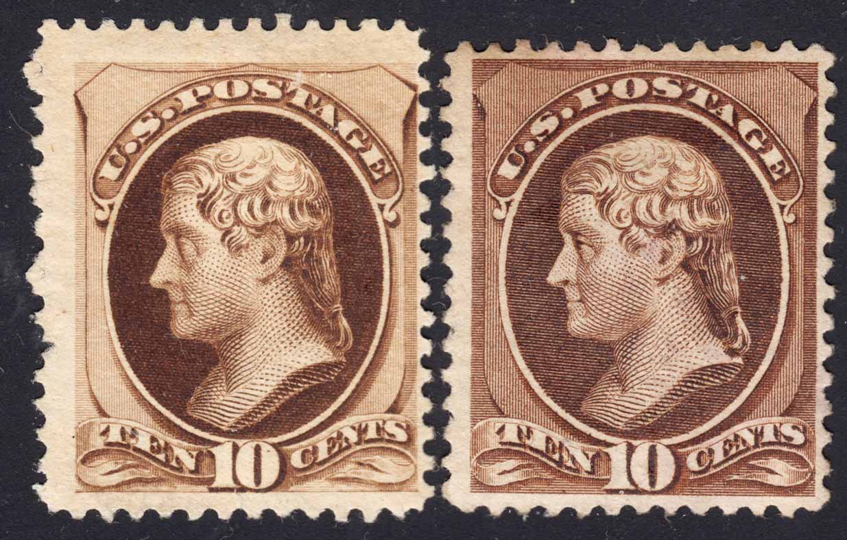
Notice that the 209 has a more 'rough cut" look to its engraving. Certain details, such as the treatment of the eye, is stronger, and the shading of the neck is now strong lines more than dashes.
The U.S. Specialized catalog calls attention to the number of shading lines between the vignette frame and the left frame of the stamp:
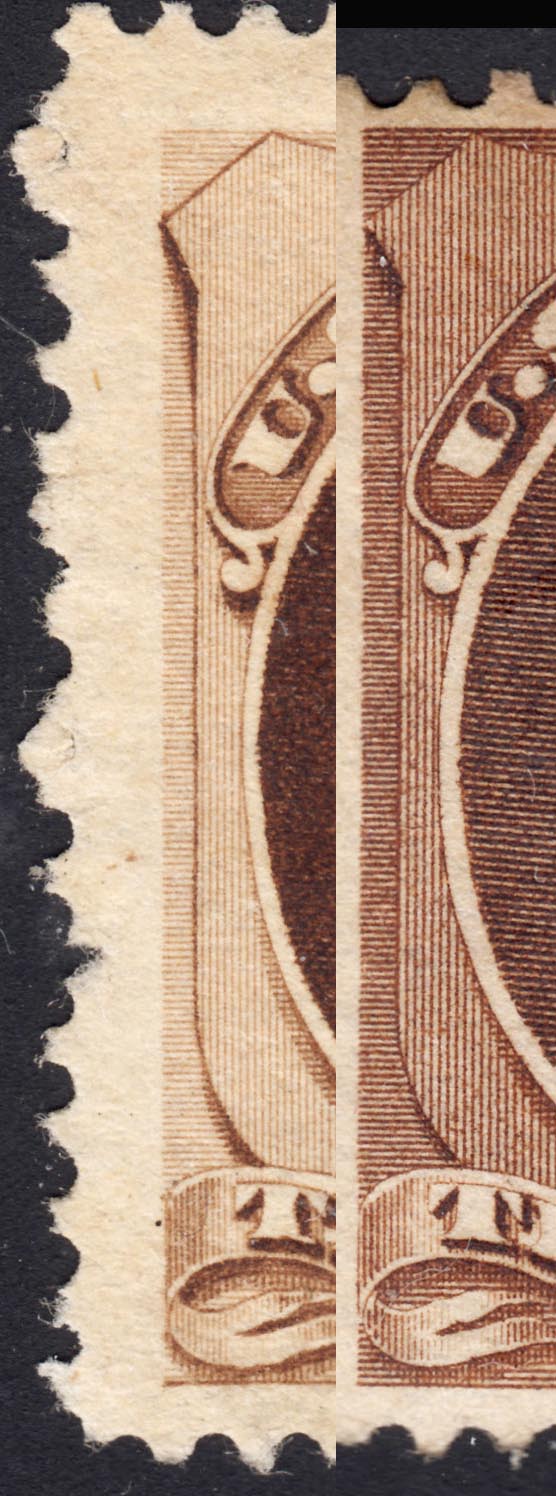
Here you can see that the 187, on the left, has five fine vertical lines in that space, whereas the 209 has four coarse lines.
Overall the cut of the engraving was made heavier than it had been before. This is because the company had transitioned to printing on a thicker, softer paper with a different kind of sizing agent. The new paper responded to printing ink differently and would no longer support fine lines of printing. The surviving stamps don't tell the whole story, because we only see the product that they were willing to give to the public. We don't get to see the large amount of spoilage that made the old designs unprofitable. But that was a driver in the move to redesign this stamp.
If you understand the forces that drove the change, you may be able to see the differences more clearly.


