| Author |
 Replies: 26 / Views: 4,091 Replies: 26 / Views: 4,091 |
|
|
|
Pillar Of The Community
United States
2943 Posts |
|
|
I just checked my 2009 Scotts, it lists a yellow cancel as a $5,000 premium. That tells me, it's doubtful mine is yellow. |
Send note to Staff 
|
|
|
Pillar Of The Community
United States
2226 Posts |
|
|
Stampcrow,
Your colors don't appear to be coming across as true, based on the stamp color (in the first image). I suspect you have what used to be a red, orange, or orange red cancel that either had too much oil in the cancel ink, or is very faded, or both. |
|
Send note to Staff
|
|
|
Pillar Of The Community
United States
2226 Posts |
|
|
Here is a 4800-DPI closeup of the possible purple cancel on the first stamp in my set of three on the previous page.  |
|
Send note to Staff
|
|
|
Pillar Of The Community
United States
2555 Posts |
|
|
I don't remember where I read it and I doubt the Grand Poobah of colored cancels requires the condition to exist in all ultramarine cancels, but the ink is frequently not mixed well and lumpy, for lack of a better term. The ultra cancel that I mentioned earlier exhibited this characteristic in spades. |
|
Send note to Staff
|
|
|
Pillar Of The Community
United States
2943 Posts |
|
|
I believe this is ultra. The color doesn't show well in the scan. No suprise... 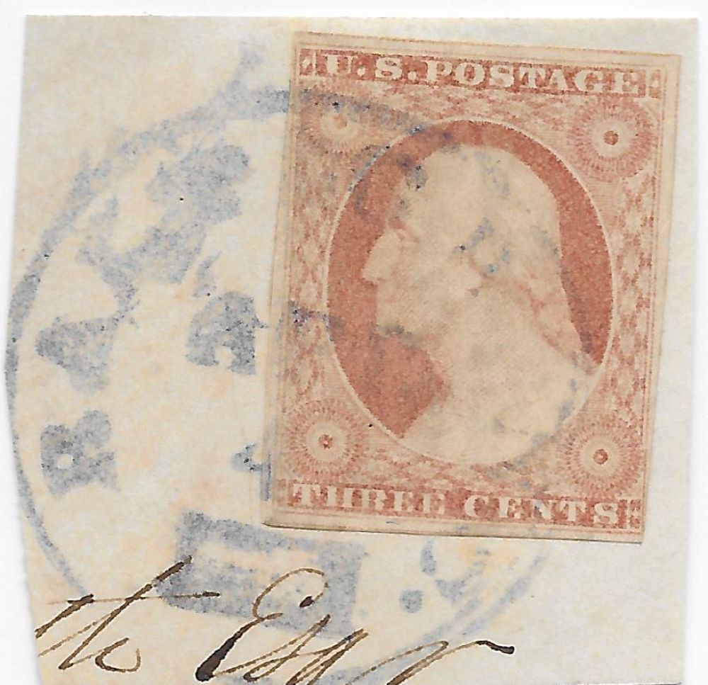 CC, sorry I can't help with your green cancel search. |
|
Send note to Staff
|
| Edited by stampcrow - 12/19/2015 9:28 pm |
|
|
Pillar Of The Community
United States
2226 Posts |
|
|
Sinclair,
You say, "lumpy." That brings "chalky" to my mind. I think of a line being drawn on paper with colored chalk, after which, most of it simply falls off. Some more tiny lumps are seen adhering in the letters of JAN. Many tiny lumps are apparent on Stampcrow's cancel.
So . . . ultramarine vs. purple. This is another controversial issue, as it seems that what some color references call ultramarine, others call purple.
Another controversial question I've been guilty of answering yes to in the past: Should ink quality be factored into classification of ink color? |
|
Send note to Staff
|
| Edited by Classic Coins - 12/19/2015 10:25 pm |
|
|
Moderator

United States
12330 Posts |
|
|
I get uneasy when I read color threads. Even pure pigment will change colors over time in controlled environments. Heck, expensive standardized color charts are not considered color stable over decades of time. But when talking about stamp inks and cancellation inks, often sitting on unstable paper stored in unknown and undocumented environmental conditions, it seems to cry out for a better identifier than a subjective human eye.
In fact this is worse than just a subjective human eye issue. We are now adding to the subjective human eye several layers of computer interpretations; including scanner drivers, computer configurations, and display technologies. And if we limit our discussion to only 'real life' observations, it is understood that humans eyes see color shades differently. It is well known that stamp inks can change, there are many examples of well known stamp issues which are notorious as being color changelings. So when I sit at my desk and put my eyeballs on a stamp or cancellation with what appears to be an unusual shade, I think of Occam's razor. What is the most likely thing that may be happening?
Is anyone willing to bet that a shade we all might agree could be called 'ultramarine' today will still look 'ultramarine' 100-150 years from now?
I cannot help but feel that the best we can do now is to put aside these interesting color examples and wait for the day when definitive chemical analysis is feasible which will positively ID this material.
Don
|
|
Send note to Staff
|
|
|
Pillar Of The Community
United States
2943 Posts |
|
|
Don Downer, tromps into the sand box and kicks over the castles...LOL
Certainly I don't disagree in general, with your statements. But this hobby is loaded with "informed assumptions" based on the study of postal history.
Aren't postmarks an example of that. And in some cases it might be applied to color usage.
I don't know these things to be true. I'm barely even a student and not a very smart one at that. I'm offering these thoughts for what they're worth.
BTW, I use stampcrows shaver...If it's on my desk, It's unlikely to be rare.
|
|
Send note to Staff
|
|
|
Moderator
United States
12330 Posts |
|
|
Quote:
I use stampcrows shaver...If it's on my desk, It's unlikely to be rare  Good one! I don't mean to discourage anyone from studying colors, it is critical that we all get this documented and published now before they change anymore. But I simply feel that we are tilting at windmills when we try to be too definitive. Can we make some conclusions? probably. If a person has a large cache of covers all postmarked during the same time, at the same PO, and all stored in identical conditions over the decades then I assume that we may be to draw some conclusions. We can certainly document what we are seeing, note any info we uncover in communicating with others, and preserve everything as best we can. Things like census can certainly be done. Don |
|
Send note to Staff
|
|
|
Pillar Of The Community
United States
2226 Posts |
|
|
Don, I appreciate your input regarding evaluating cancel colors. It has been well established in this forum by several members, including Historical DNA Collector, that displaying colors accurately comes with a slew of pitfalls, and requires a calibrated scanner at least. I started this thread for collectors to show color cancels from their collections, to discuss associated town postmarks, and to facilitate discussion on misinterpretation of cancel colors (i.e., black cancels with too much oil in the cancel ink being advertised as olive cancels). It was not intended to be used as an authoritative color guide. The below image shows an orange brown #10A on cover. At first glance, the stamp may appear to be canceled with a brown grid. But at full resolution, the original cancel color (probably red, orange, or orange red) is evident. A good example of one of the many unstable cancel inks used in the era.  |
|
Send note to Staff
|
| Edited by Classic Coins - 12/20/2015 12:50 pm |
|
|
Pillar Of The Community
United States
2226 Posts |
|
|
Replies: 26 / Views: 4,091 |
|


