Quote:
... the frames on all values are the same. They appear different because of...
I have to disagree with Phil just a bit here. The frames are not all identical. Here are the left sides of the two denominations you gave as examples:
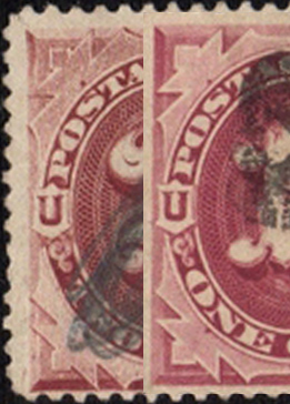
I think in this view it should be fairly easy to see that the frames are not identical, and that the differences have more to do with engraving than any of the factors to which Phil pointed. Note in particular the greater complexity of the shading in the area above and to the left of the word "POSTAGE." So also the line definition in the engine work of the ovals in the vignette frame. As to why? "Artistic license" is my immediate response. The designers sought to add variety to the series in subtle ways like these.
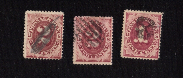
However, everything that Phil said does apply to two stamps of the same denomination. Whatever differences you see between the 2c stamps are not the result of design or engraving. They may be the result of printing, but that needs to be assessed case by case.
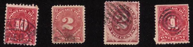
Do you have something to point out for the 2c stamps?