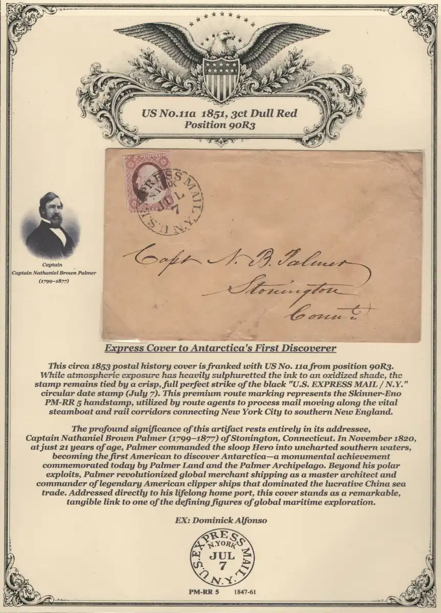
Hi Phade122, I hope that you can take some unsolicited constructive criticism.
I enjoy seeing your nice covers and reading your elaborate album pages, but I must ask, are you using AI to write the descriptions, or do you write them yourself after doing your own original research?
Frankly, the puffery and superlatives in the descriptions are a bit of a turn-off when the features don't match the descriptions.
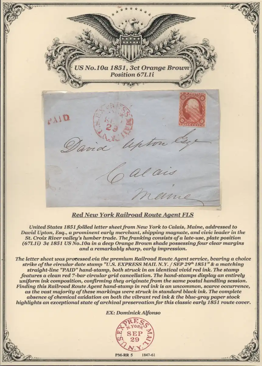
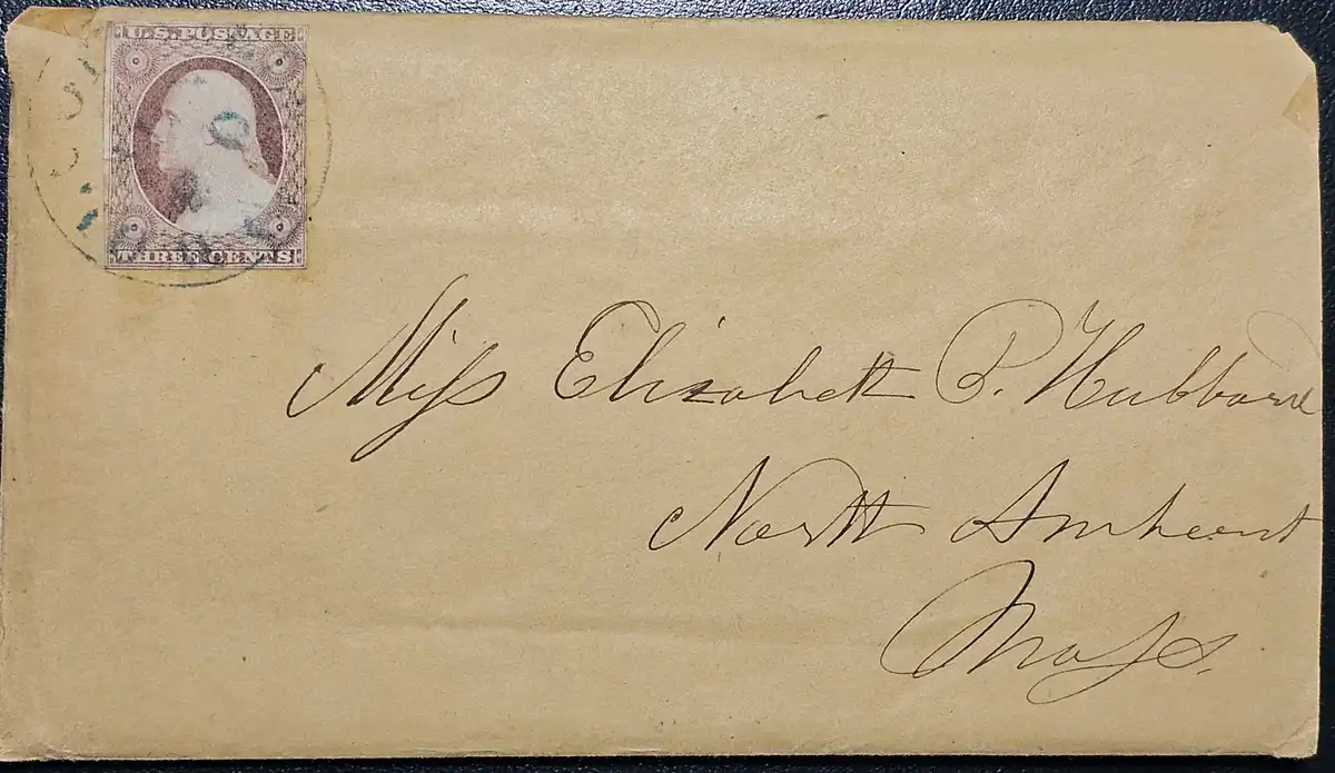
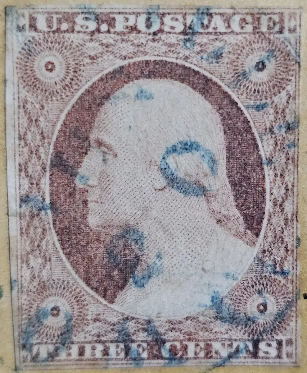
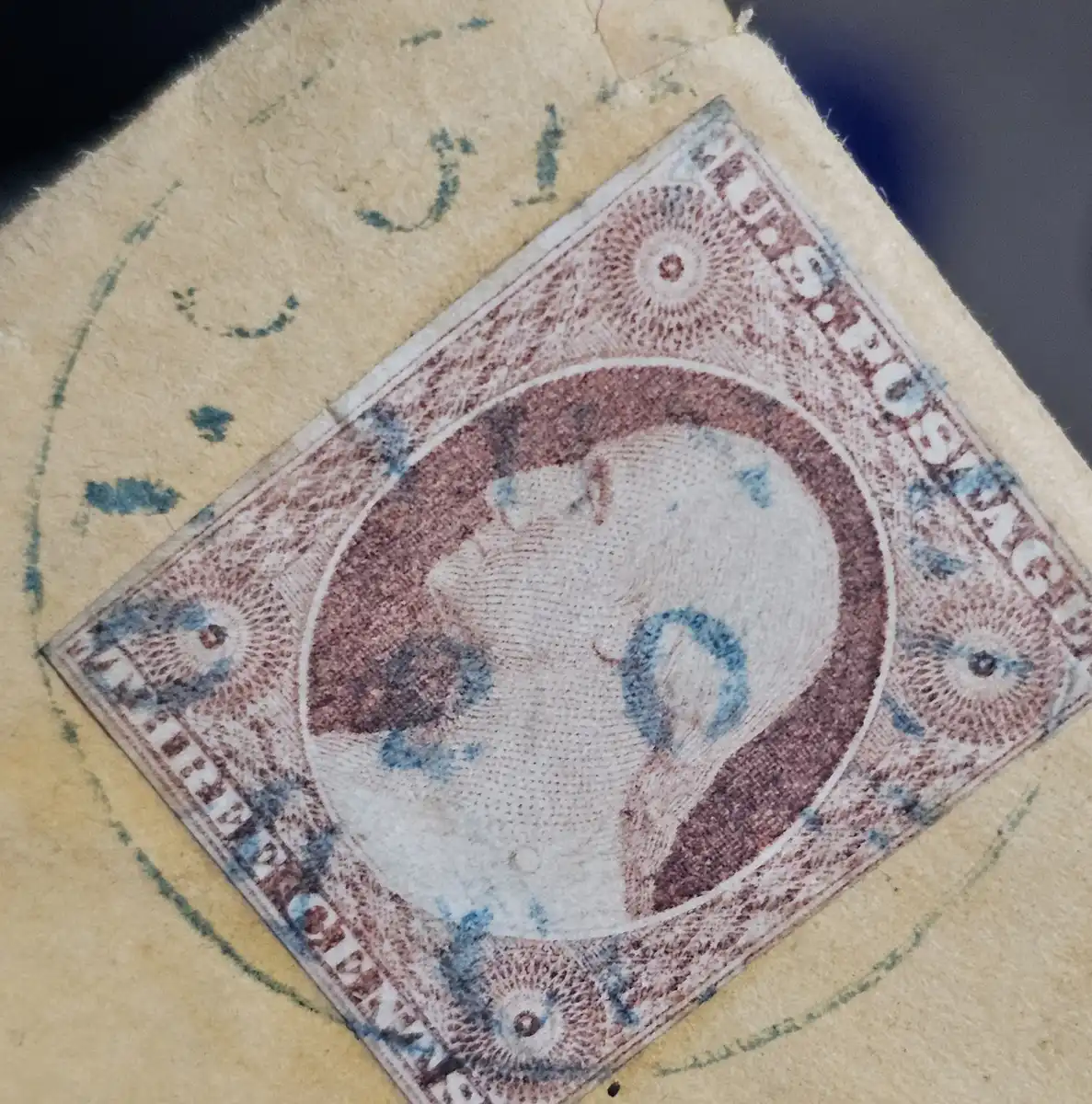
For example, the postmark on the Sep 29 cover is described as "a choice strike of the circular date stamp" when to me it looks typical, average, smudgy, and if I didn't know what it said, I would have hard time reading all of the text. The re-creation at the bottom of the page is what a clear and choice strike could look like.
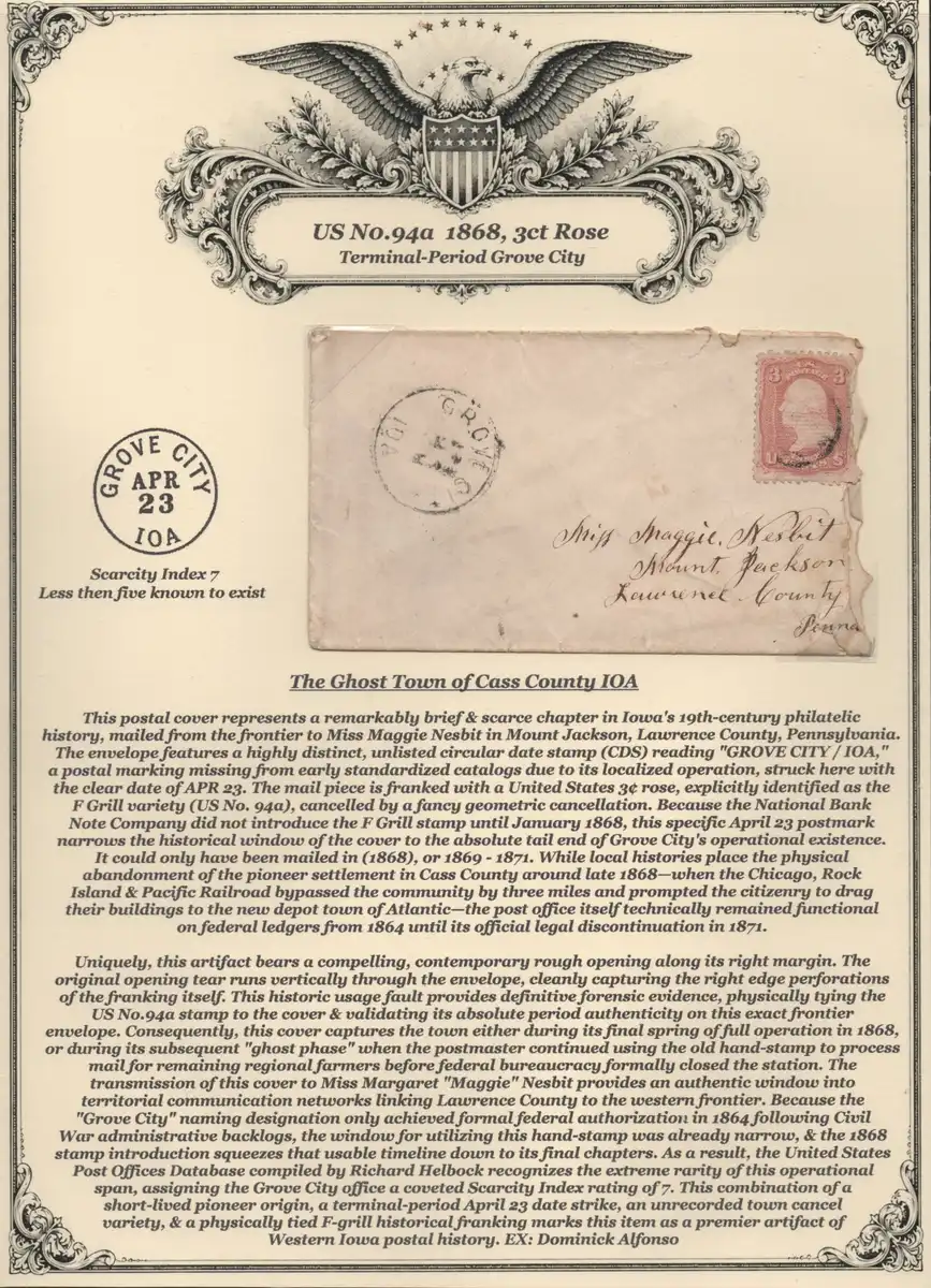
Similarly, on the Apr 23 cover, the postmark is described as a "highly distinct, unlisted circular date stamp ... struck here with the clear date of APR 23". I know that the enlarged scan on the computer monitor is not as crisp as when looking at the actual piece, but can you honestly say that is a clear strike of the Apr 23 postmark? Adding all those extra words makes the page tl;dr and my excitement is diminished when looking at the piece after reading the flowery description.
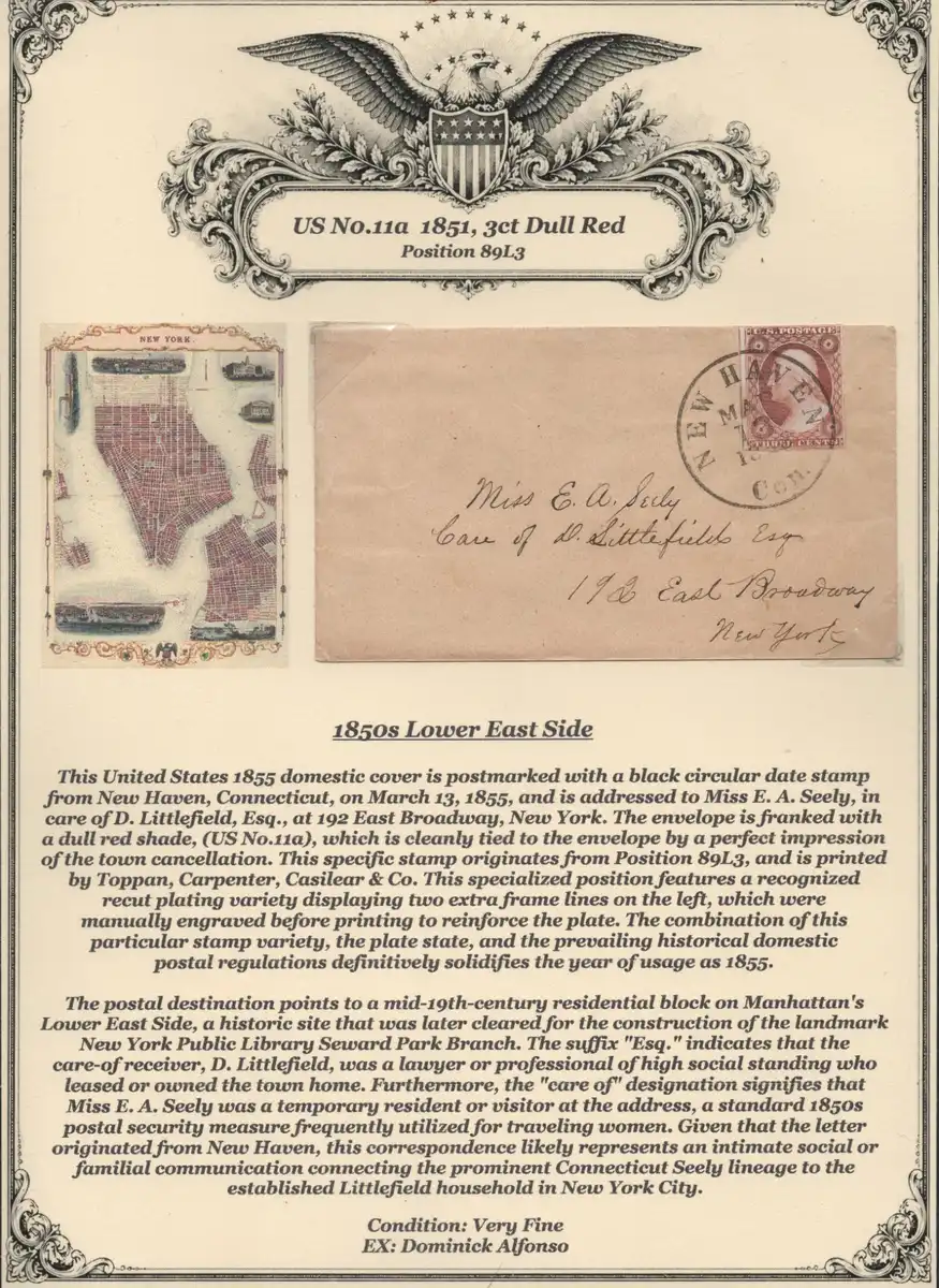
It also makes me think twice about other claims in the descriptions. For example, on the Mar 13 cover, the description says "... the prevailing historical domestic postal regulations definitively solidifies the year of usage as 1855." But the basic domestic postal rate was 3 cents from 1851 to 1883, so what part of the postal regulations ties this definitively to 1855?
This part is funny. I've never seen a roughly torn opening described as a feature instead of a bug. Well done.
Quote:
"Uniquely, this artifact bears a compelling, contemporary rough opening along its right margin. The original opening tear runs vertically through the envelope, cleanly capturing the right edge perforations of the franking itself. This historic usage fault provides definitive forensic evidence, physically tying the US No.94a stamp to the cover & validating its absolute period authenticity on this exact frontier envelope."
I don't want to deter you from putting together these beautiful pages, but if I were judging this as an exhibit or viewing the items at an auction, all I can say is, Less is More.



 Replies: 3,801 / Views: 251,580
 Posted Yesterday 11:24 pm