| Author |
 Replies: 24 / Views: 4,500 Replies: 24 / Views: 4,500 |
|
Pillar Of The Community
United States
548 Posts |
|
|
Hello everybody. Is this indigo or ultra? Thanks David 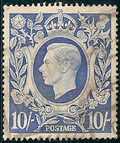 |
|
Send note to Staff
|
| Edited by fincbob2451 - 05/15/2011 12:48 am |
|
|
|
|
Pillar Of The Community
Australia
2156 Posts |
|
|
Pillar Of The Community
United States
548 Posts |
|
|
Pillar Of The Community
Australia
2156 Posts |
|
|
David, ultramarine is normally a dull blue colour; that said, I've seen the term misused quite a lot and things can get ridiculous with such listings as 'blue ultramarine.'
If the stamp you're looking at is valuable in a particular shade, I'd google to find listings on some of the online auction sites. That's a reasonably quick and painless
way to establish whether or not you have the valuable variety,
|
Send note to Staff 
|
|
|
Pillar Of The Community
Australia
578 Posts |
|
|
Hi David Jimjamtwo is correct in saying that ultramarine is a duller blue compared to indigo, which is a dark blue. Your stamp is, however, not indigo, but ultramarine. For this stamp, Scott list the darker colour as indigo, and Stanley Gibbons in their catalogue list it as dark blue Here are the colours from the Stanley Gibbons colour key, which gives an idea as to how dark indigo is. To add confusion to this, I'm sure the Scott colour key would have a slightly different colour compared to the Stanley Gibbons one. Anyway, the scan should show there is considerable difference between ultramarine and indigo/dark blue. |
|
Send note to Staff
|
| Edited by Plateflaw - 05/15/2011 03:06 am |
|
|
Pillar Of The Community
Australia
578 Posts |
|
|
I found copies of the two stamps in my collection:  Indigo/dark blue on the left (Scott #251, SG 478) and ultramarine on the right (Scott #252, SG 478a) |
|
Send note to Staff
|
|
|
Pillar Of The Community
Australia
2156 Posts |
|
|
Oh, that's a massive difference in colour.
Sorry for misleading you, David!
Nonetheless, your stamp does not appear to me to be ultramarine, in terms of the Gibbons colour key.
The person who made the colour key must have been smoking something when he was doing it.
|
|
Send note to Staff
|
| Edited by jimjamtwo - 05/15/2011 03:50 am |
|
|
Pillar Of The Community
Australia
2027 Posts |
|
|
The original Stanley Gibbons Colour Chart gives, I think, a better interpretation Indigo 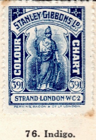 Pale Ultramarine 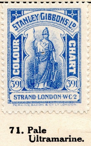 |
|
Send note to Staff
|
|
|
Pillar Of The Community
Australia
578 Posts |
|
|
Bit of a trip travelling to the museum just to colour id a stamp jubilee...  |
|
Send note to Staff
|
|
|
Pillar Of The Community
Australia
2027 Posts |
|
|
The colour chart was one of the best things I ever bought, you cheeky so and so.  Seeing the colour in full context as a stamp is much more useful than a block of colour. |
|
Send note to Staff
|
|
|
Pillar Of The Community
Canada
669 Posts |
|
|
Nice colour chart Jubilee, I have had my eye out for one of those for a while now..... they never turn up.  I also agree with you that seeing the shades in the appropriate context would be a much more useful reference than a solid block of colour, but it is what it is I guess! Here is the format I have taken to using when I want to try and ID a colour/shade:  I also think that a neutral grey is the best background colour to use for accurately scanned colours. See below for a scan that I believe illustrates this point. All of the scans were done using the exact same scanner settings:  Looks like I am 2c. short for my cuppa Joe Have a Good One, Skilo54 |
|
Send note to Staff
|
|
|
Bedrock Of The Community
Australia
38679 Posts |
|
|
Moderator

United States
4788 Posts |
|
|
Skilo54:
Interesting point about the neutral gray background -- it seems obvious now that you say it, but it never occurred to me before.
Certainly in photography, the 18% Gray is standard. But most of us prefer to scan with black background to emphasize the perfs. I get varied results with accurate colors on my scans. Usually I just try to "eyeball" the best match to the actual stamp.
KirkS
|
|
Send note to Staff
|
|
|
Pillar Of The Community
United States
548 Posts |
|
|
Hello everybody, Many thanks to everyone for their input.As always I learned a lot from this.Thanks
David |
|
Send note to Staff
|
|
|
Pillar Of The Community
Canada
617 Posts |
|
|
Hi Skilo54, have a question on that scan of the stamps beside the colour chart. From that example, which of the colour chips did you pick as the colour of the stamp? It's very interesting how the scan of the reddish stamp beside 3 colour background how the stamp seems to change colour.
Dave. |
|
Send note to Staff
|
|
|
Pillar Of The Community
Canada
1084 Posts |
|
|
For those of us who may be confused by the colour charts: do we have a final verdict for both the colour and scott number of Fincbob's stamp? |
|
Send note to Staff
|
|
|
Replies: 24 / Views: 4,500 |
|


