| Author |
 Replies: 10 / Views: 1,623 Replies: 10 / Views: 1,623 |
|
|
Valued Member
United States
106 Posts |
|
|
As I was hinging in some Austria classics today I ran across this one. Narrowed it down to either Scott 27 or 34. The difference according to the Scott catalog was whether it had Fine or Coarse printing. As I didn't have anything to compare it to with either type of printing I thought that someone here may be able to assist me. I hope the scan is large enough. Thanks in advance for any help. Ron 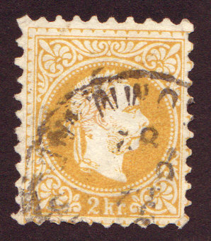 |
|
Send note to Staff
|
|
|
|
|
Pillar Of The Community
United States
7075 Posts |
|
|
Valued Member
United States
106 Posts |
|
|
Thanks for the link Cjd. I did take a look at the info there and *think* it may be the fine print. You'd think I would do a search first before asking. I guess I didn't realize how deep the knowledge base is here! |
Send note to Staff 
|
|
|
Pillar Of The Community
United States
7075 Posts |
|
|
I'd tend to go along with fine, too. But if you post a bigger scan, I reserve the right to change my mind.  |
|
Send note to Staff
|
|
|
Pillar Of The Community
Canada
1084 Posts |
|
|
Before I go bounding through my collection do we have a consensus that this Is the 1876 Austria Scott#34?
My old Scott mentions about five different perforations as well as some compound ones for the "fine" category. I think if I was in my workshop trying to come up with the perfect perforation that I would eventually have determined that one was better than the rest and have stuck with that one through the centuries. This begs the question - do countries issue stamps with different perforations just to suck in the philatelic market? This in itself might make a good thread. |
|
Send note to Staff
|
| Edited by cynical - 11/07/2011 3:42 pm |
|
|
Valued Member
United States
106 Posts |
|
|
I'll try to come up with a larger scan. That previous scan was at 300dpi. I would have thought it would have been a little larger than what it came out to be.... The next time I'm by my scanner I'll try it again. I think my scanning software goes up to 600dpi. Since the difference seems to be the beard/eye region I'll try to focus on that area. |
|
Send note to Staff
|
|
|
Pillar Of The Community
United States
7075 Posts |
|
|
Pending your re-scan, here is a blowup from your first scan... 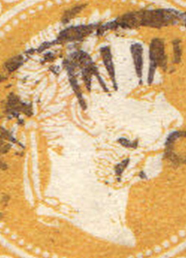 Anyone want to change his or her vote? |
|
Send note to Staff
|
|
|
Rest in Peace
Canada
5701 Posts |
|
|
I would say fine. The 2kr is toughest to distinguish because the color is often much lighter than your copy. Here are three I have: Coarse (I think) 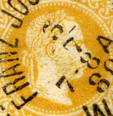 Fine 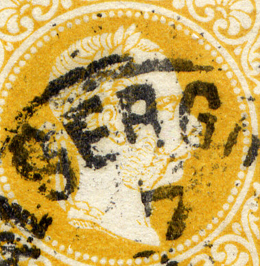 Fine 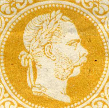 |
|
Send note to Staff
|
|
|
|
Pillar Of The Community
Canada
1084 Posts |
|
|
BeeSee: for someone following along with an old Scott catalogue is your "coarse (I think)" image then 1867 Austria Scott#27? |
|
Send note to Staff
|
|
|
Rest in Peace
Canada
5701 Posts |
|
|
Yes, cynical #27 for the coarse print. The other two would be #34, or whatever perforation they may have, I have not checked them yet. |
|
Send note to Staff
|
|
|
|
Rest in Peace
Canada
5701 Posts |
|
|
I just noticed that the scroll in the "coarse" stamp appears smaller and less sharp than in the "fine" stamps. I did not notice this before scanning the stamps. They were scanned at the exact same resolution all together and then cropped. I will have to check this further when I get home.  |
|
Send note to Staff
|
|
|
| |
Replies: 10 / Views: 1,623 |
|


