| Author |
 Replies: 15 / Views: 3,516 Replies: 15 / Views: 3,516 |
|
|
Pillar Of The Community
Canada
1394 Posts |
|
|
When I posted this topic yesterday, I had forgotten the 2009 reprint. This is a comparison of the three September printings (2005, 2009 and 2012) of the White-tailed Deer and the Atlantic Walrus, SC 1688 and 1689. The 2005 printing was on 60 pound paper, whereas the 2009 reprint was on 80 pound paper. I'm not sure of the 2012 paper, but believed to be 80 pound paper as well.The 12.5 x 13.1 perforations, the Plate Number '1" and the UPC have not changed from the original printing.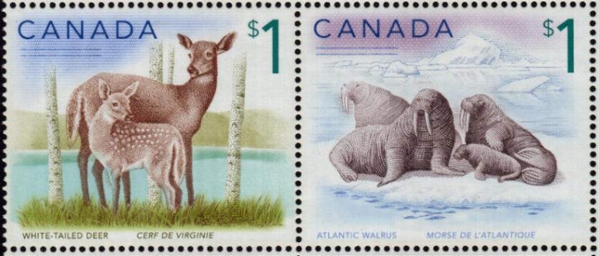  Canada Post Canada Post's "DETAILS" stated that the 2012 reprint "stamps have slight variations in colour and placement." The green hillside behind the deer in the 2005 issue is darker than in the 2009 reprint, which is darker than the 2012 reprint.The images of the doe and fawn become progressively lighter from 2005, to 2009, to 2012.2005 Original Printing - Deer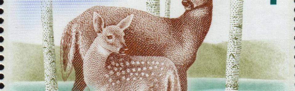 2009 Reprint - Deer 2009 Reprint - Deer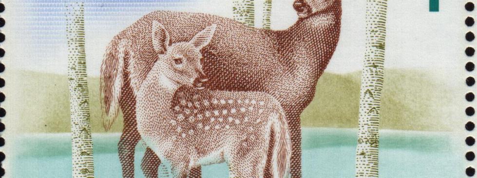 2012 Reprint - Deer 2012 Reprint - Deer I don't see any "placement" changes in the Atlantic Walrus stamp, but: 1. The bluish background becomes progressively lighter from 2005, to 2009, to 2012.
2. The September 2012 Reprint has a blue underline on the bottom edge of the baby's front foot and a blue toe on the baby's back foot.3. The images of the walruses become progressively lighter from 2005, to 2009, to 2012.2005 Original Printing - Walrus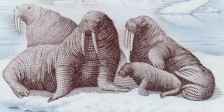 2009 Reprint - Walrus 2009 Reprint - Walrus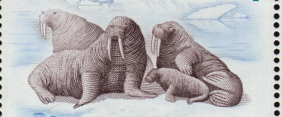 2012 Reprint - Walrus 2012 Reprint - Walrus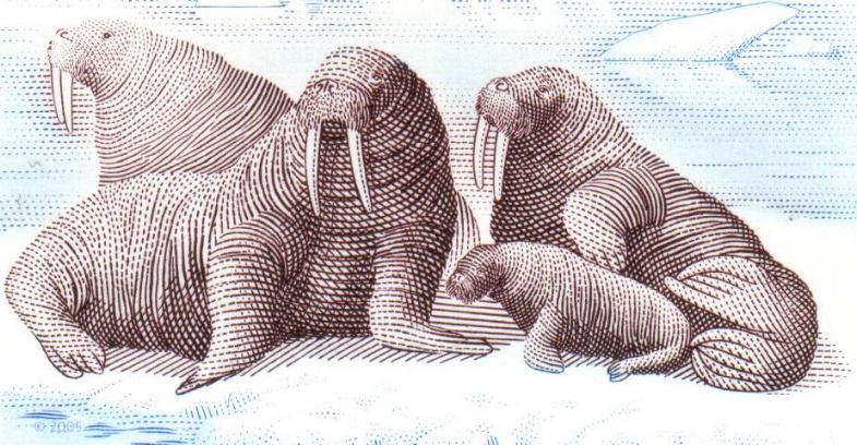 "CANADA is printed in solid blue dots in the 2005 issue, whereas the 2009 printing has circular blue dots with white centres. The 2012 printing is the same as the 2009 reprint.2005 Original Printing "CANADA is printed in solid blue dots in the 2005 issue, whereas the 2009 printing has circular blue dots with white centres. The 2012 printing is the same as the 2009 reprint.2005 Original Printing 2009 and 2012 Reprints 2009 and 2012 Reprints 2005 Original Printing - CANADA and Microprint 2005 Original Printing - CANADA and Microprint 2009 Reprint - CANADA and Microprint 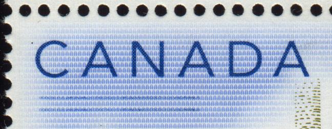 2012 Reprint - CANADA and Microprint 2012 Reprint - CANADA and Microprint There are slight differences and one major difference in the traffic lights between the three printings.2005 Original Printing - Traffic Lights There are slight differences and one major difference in the traffic lights between the three printings.2005 Original Printing - Traffic Lights 2009 Reprint - Traffic Lights 2009 Reprint - Traffic Lights September 2012 Reprint - Traffic Lights September 2012 Reprint - Traffic Lights |
|
Send note to Staff
|
| Edited by BlackJag - 10/17/2012 6:58 pm |
|
|
|
|
Pillar Of The Community
Canada
2277 Posts |
|
|
Great info Blackjag I didn't realize they even did a 09 reprint never mind 2012. I know I have these in the souvenire sheet of 4 and full sheets of 12 if I remember correctly. I just happened across the $2 polar bear with plate scratch on belly but other than that havn't opened up the stock books for awhile. |
Send note to Staff 
|
|
|
Pillar Of The Community
Canada
4648 Posts |
|
|
Agreed, great information and a lot of patience and time in the research as well.
Chimo
Bujutsu |
|
Send note to Staff
|
|
|
Pillar Of The Community
Canada
1394 Posts |
|
|
Thank you. I was surprised that it took so long to do - approximately 3 hours.
Most of the time was "previewing, moving and editing" as its hard to visualize what you're creating without the preview option.
The panes are 16 stamps (4 x 4).
Edited to correct '12' to '16'. |
|
Send note to Staff
|
| Edited by BlackJag - 10/18/2012 12:49 pm |
|
|
Valued Member
Canada
449 Posts |
|
|
Quote:
The panes are 12 stamps (4 x 4). Or 16 stamps, depending on how you count.  But seriously, the 3 pics of the traffic lights you showed, are they all from the UR corner or the LL corner. I've got 2 pages that I bought in 2009, but never was able to tell if it was the 2009 or 2005 printings. The 2009 traffic lights you show was "inverted" compared to the 2005 or 2012 printings, is that because you chose different corners? Which corner did you use? I remember calling CP to buy some of the reprints in 2009, was never sure I got what I really wanted. |
|
Send note to Staff
|
|
|
Valued Member
Canada
449 Posts |
|
|
So I looked a little closer, both panes are 2009 reprints, they have the circular blue dots with white centers instead of the solid blue.
If by any chance someone wants to exchange a 2005 for a 2009, I'm all for it. |
|
Send note to Staff
|
|
|
Pillar Of The Community
Canada
1394 Posts |
|
|
2005 is LL
2009 is UR
2012 is LL
As a retired professional accountant, I obviously can no longer multiply. HOW SAD !
Sorry, no spare 2005s or 2009s. |
|
Send note to Staff
|
| Edited by BlackJag - 10/18/2012 12:58 pm |
|
|
Pillar Of The Community
Canada
652 Posts |
|
|
Thanks for this very detailed review of these stamp issues.
I still haven't bought the reprints as I've been contemplating whether or not I actually want to spend the cash on it. I'm always concerned about a "money grab". |
|
Send note to Staff
|
|
|
Valued Member
Canada
11 Posts |
|
|
Wow BlackJag, you sure have covered a great amount of detail to show differences in the issues. The Traffic Lights do show on my sheets as the obvious colours to determine the issue: that is , the 'green' walrus ... light, dark, darker!
Sorry that I missed this discussion when entering my comments.
..a separate question about this form, "how do I subscribe so that I know of all new entries for Canadian material?"
Wig |
|
Send note to Staff
|
|
|
Pillar Of The Community
Canada
1394 Posts |
|
|
Welcome to the forum Wig.
Even as a visitor here, you have access to anything posted, current or past, and you have to do as I do - log in every day or so as you never know what will be posted or when. I'm surprised nearly every day about what I see and learn and I try to comment or add material that I think may be relevent to the topics or the other visitors.
Edited spelling mistakes only. |
|
Send note to Staff
|
| Edited by BlackJag - 02/26/2013 5:45 pm |
|
|
Valued Member
Canada
123 Posts |
|
|
An interesting topic for me as I had done a similar one on another site here: http://www.stampboards.com/viewtopi...f=13&t=42024In my comparison, I left out the 1998 printing. I feel that the major defining feature is the distance between the bottom labels and the bottom perforations. If you compare the "White-Tailed Deer - Cerf de Virginie" and "Atlantic Walrus - Morse de L'Atlantique" on the 2005 and the 2012 printings, you will notice the labels are considerably closer to the bottom of the stamp on the new printing. I have secured a number of the 2012 printings and the difference seems consistent. I did make a number of enquiries to Canada Post, asking for some specifics, but never received a reply. I am grateful for the work you have done here BlackJag. All the best, Brad |
|
Send note to Staff
|
|
|
Valued Member
Canada
123 Posts |
|
|
I mucked up the dates above. It should be as follows:
1998 = 2005
2005 = 2009
Sorry! |
|
Send note to Staff
|
|
|
Valued Member
Canada
449 Posts |
|
|
You cannot use the minor differences in the distance from different colours of a stamp image to the perforations as a way to determine different printings.
All stamp issues have minor shifts in either the colour or the perforations over the course of long print runs. |
|
Send note to Staff
|
|
|
Valued Member
Canada
123 Posts |
|
|
Hi Studystamps, Ordinarily I would agree with you. But all Canada Post has said about it was that there are differences in "PLACEMENT". I have studied a number of these full sheets now from different sources. Often when I think I notice one shading difference in one sheet, I find that it does not hold true when compared with other sheets of the latest printing. Of 6 sheets I have examined, there are only two factors that I have been able to come up with that consistently differentiates the 2009 from the 2012. One is the darker colour of green, which is most pronounced in the colour dots and almost impossible to see in the stamps themselves. So if you only have a single stamp, I don't think the colour difference in the green will be identifiable. Secondly is that all six sheets had the animal labels very close to the perforations on the bottom. I continue to look for a more reliable way of telling the difference though. All the best, Brad |
|
Send note to Staff
|
|
|
Valued Member
Canada
276 Posts |
|
|
Really appreciate your efforts in uncovering the differences Blackjag. Thanks for sharing. |
|
Send note to Staff
|
|
|
Rest in Peace
Canada
5701 Posts |
|
|
I agree with studystamps, we cannot rely on measurements between perforation and colour. We do not know what Canada Post means by "Placement". Now if there is a difference in height between the top of "Canada" and the bottom of "Atlantic Walrus", then we may have something - if they are both part of the engraved portion - I don't have my stamps in front of me. |
|
Send note to Staff
|
|
| Edited by BeeSee - 02/26/2013 7:16 pm |
|
| |
Replies: 15 / Views: 3,516 |
|


