| Author |
 Replies: 19 / Views: 3,359 Replies: 19 / Views: 3,359 |
|
Pillar Of The Community

United States
3046 Posts |
|
|
|
|
Rest in Peace
Canada
6750 Posts |
|
|
Pillar Of The Community
United States
1510 Posts |
|
|
Don't do the pages with a giant green map of Ireland on top. It drains a color ink cartridge too quickly.
Perhaps a Celtic Harp and something in Gaelic plus the country name. |
Send note to Staff 
|
| Edited by Timm - 12/25/2012 1:28 pm |
|
|
Pillar Of The Community
United States
3046 Posts |
|
|
Fatfingers Andy typos again! Still trying to decide what to do about the top. |
|
Send note to Staff
|
| Edited by apastuszak - 12/25/2012 02:48 am |
|
|
Rest in Peace
Canada
6750 Posts |
|
|
I think it looks pretty nice as it is, clean and classic, like the photo and stamp.
I am not experienced enough to dress it up much myself. |
|
Send note to Staff
|
|
|
Pillar Of The Community
United States
3046 Posts |
|
|
I'm thinking a Gaelic border would be nice around the entire page. It's Christmas and I have nothing to do. The kids have a pile of toys to entertain themselves. Times to go dig up some borders! |
|
Send note to Staff
|
|
|
Pillar Of The Community
United States
1510 Posts |
|
|
Pillar Of The Community
United States
3046 Posts |
|
|
Pillar Of The Community
Canada
1227 Posts |
|
|
Apastuszak, I like what you have done but the border might be a little too thick. The heading on the page is visually very nice.
Mike |
|
Send note to Staff
|
|
|
Pillar Of The Community
United States
1510 Posts |
|
|
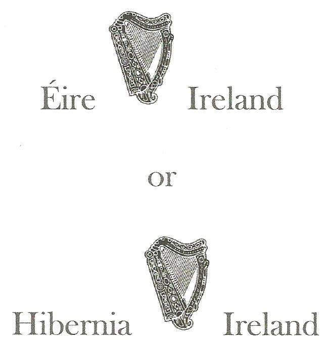
Border is too this for a stamp album. I'd move the title up to break the top line and I'd use a "Cláirseach" or Irish Harp like the one on a bottle of Guinness. More like my sample above. I would also switch the places of the Erie and Ireland; using the native Gaelic first.
Aw, heck! I'd change the whole darn thing; I would, I would!
Have you thought about hiring a Leprechaun to help ya'?
|
|
Send note to Staff
|
|
|
Pillar Of The Community
United States
3046 Posts |
|
|
The symbol in the middle is the Irish Coat of Arms. I thought it would work. I'll keep working on it. |
|
Send note to Staff
|
|
|
Pillar Of The Community
United States
3046 Posts |
|
|
Try number 2:  Border has celtic knots in the corner and is the RGB value of the green in the Irish flag. The harp in the center is the coat of arms of the Republic of Ireland Ireland is written in Gaelic on the left of the harp and in the English on the right. The typeface used for the word Ireland is the same typeface used by anpost on Irish commemorative stamps. |
|
Send note to Staff
|
| Edited by apastuszak - 12/26/2012 5:14 pm |
|
|
Rest in Peace
Canada
6750 Posts |
|
|
Pillar Of The Community
United States
1510 Posts |
|
|
Better, but I still think the country title should break the top line. That would also give more room for stamps in the page.
Make up a page like that and see how it looks.
|
|
Send note to Staff
|
| Edited by Timm - 12/26/2012 8:09 pm |
|
|
Pillar Of The Community
United States
3046 Posts |
|
|
Pillar Of The Community
United States
3046 Posts |
|
|
Ok, here you go.  The harp is centered on the top. Should the harp be centered or should the harp and the two words together be centered. I can't decide which I like better. |
|
Send note to Staff
|
|
|
Replies: 19 / Views: 3,359 |
|