| Author |
 Replies: 10 / Views: 1,812 Replies: 10 / Views: 1,812 |
|
|
Pillar Of The Community
United Kingdom
1187 Posts |
|
|
Decided to get on with making up my album for my Egypt stamps. Been putting this off for a wee while, but have finally decided on hand written blank pages and heavy paper quality. I am using the Stanley Gibbons Clarendon 240 gsm heavyweight leaves. SG punch them out with 22 holes free of charge. Soooo... I have just finished my design work up for the title page, here is the uncoloured design. I would be interested in comments or suggestions on this and for any colouring in ideas (the nice bit). Terry 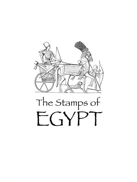 |
|
Send note to Staff
|
| Edited by Terence Collins - 05/07/2013 11:33 am |
|
|
|
|
Pillar Of The Community
United States
630 Posts |
|
|
very nice. If I tried to do something like that it would end up looking like a Picasso. But when he was drunk and upside down. |
Send note to Staff 
|
|
|
Pillar Of The Community
United States
1128 Posts |
|
|
Pillar Of The Community
United Kingdom
1187 Posts |
|
|
Hi yakboomer,
You should have seen my early attempts at doing this stuff. You have given me the idea of using a Picasso image for my Spain album title sheet.
Many thanks
Terry |
|
Send note to Staff
|
|
|
Pillar Of The Community
United Kingdom
1187 Posts |
|
|
Hi ncbuckeye,
Thank you for your kind comment. No, I don't use any specific stamp album creation software, only Photoshop and Mac Fontbook, which I have loaded with lots of really nice extra free typefaces, and some classics. The typeface I used here is appropriately called Papyrus. I use Photoshop to place images and create sets of line rectangles of the sizes needed, which I then just drag and drop onto the page image on screen. Photoshop has a guide tool which can be used to set up numerous green horizontal and vertical guide lines on the page layout. This makes placing the stamp rectangles and stamp images easy and fast and once done the guidelines can be deleted. Text can be laid in using either photoshop or InDesign, or can be handwritten using pencil guidelines which can be erased when done.
I will post some stage by stage images here of my next set of pages so you can see the process. It really is very easy to do. Images, rectangles and text can all be dragged and dropped on to the page layout, resized and moved around with a few easy to use tools. No code to write. No tedious commands to work through. Anyone can do it. Piece of pie.
Terry |
|
Send note to Staff
|
| Edited by Terence Collins - 05/07/2013 5:46 pm |
|
|
Valued Member
86 Posts |
|
|
Very nice. I think it looks great just the way it is without any color, but if I were to pick colors, I would go with bold warm colors, golds, reds, yellows.
I like making my own pages too. |
|
Send note to Staff
|
|
|
Moderator

United States
4788 Posts |
|
|
Quote:
YAK: it would end up looking like a Picasso. But when he was drunk and upside down. Sounds like my first wife  --------- Very nice page, Terence. I think artistic touches like that really make a collection stand out. Kirk |
|
Send note to Staff
|
|
|
Pillar Of The Community
United Kingdom
1187 Posts |
|
|
Thank you KirkS. That is my first one anywhere near finished. Have had a lot of failures prior to it, but I like this one. I will put up some of my pages as soon as I have a few finished. I am greatly encouraged by the support on here. Great bunch.
Terry |
|
Send note to Staff
|
| Edited by Terence Collins - 05/08/2013 09:42 am |
|
|
Pillar Of The Community
United States
521 Posts |
|
|
Terry, how about a fuzzy "wash" of color behind the image? I'm picturing something beige-ish, like aged parchment. |
|
Send note to Staff
|
|
|
Pillar Of The Community
United Kingdom
1187 Posts |
|
|
Yes. I like that. Perhaps with a little colour picking out details in the charioteer and foot soldier, rather than overall colouring.
Good one.
Terry |
|
Send note to Staff
|
|
|
Pillar Of The Community
United States
521 Posts |
|
| |
Replies: 10 / Views: 1,812 |
|


