As long as we're on the subject of the Canada Superman stamp, has anyone ever looked at this side-by-side comparison of what appears to be where the original artwork came from?
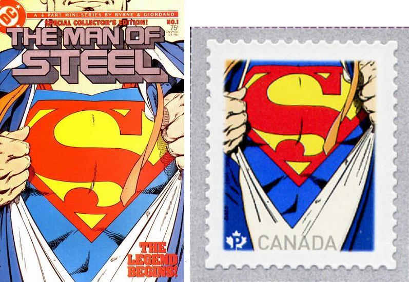
Although the stamp's colors are much bolder and they seem to have gotten the Superman logo, along with the shading around it correct, if you look closely you'll see some variations in the lower parts of the stamp.
Most noticeable is on the lower left of the stamp the shading of the blue shirt is shown wrinkled in a different direction.
Also, on the lower right of the stamp, there is only one shading line on the stamp, when the comic book illustration shows two.
There's also similar "artistic license" (?) used in the white area of the shirt where the shading lines do not extend as far down to the bottom of the stamp (presumably to accommodate the stamp's lettering).
Although this doesn't represent any kind of an error, it is an interesting study for those who like to "flyspeck" the similarities (or lack thereof) used on the stamp as compared to the original artwork.