| Author |
 Replies: 12 / Views: 2,198 Replies: 12 / Views: 2,198 |
|
|
Valued Member
United States
79 Posts |
|
|
|
|
Rest in Peace
United States
7097 Posts |
|
|
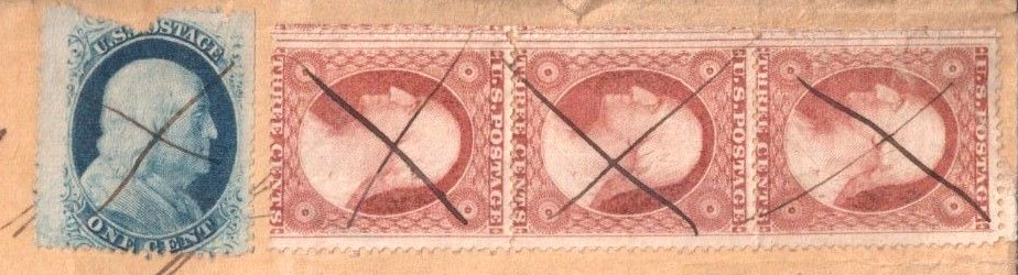
Something looks odd around that one cent stamp. I wonder why there is ink under the stamp and the X looks decidedly different than the others as well. Possibly removed and replaced by another? added later on to pay another fee perhaps? I dunno? |
Send note to Staff 
|
|
|
Moderator

United States
12330 Posts |
|
|
I second ILS opinion based upon the strokes used to create the 'X' cancels; done by a different hand.
don |
|
Send note to Staff
|
|
|
Pillar Of The Community
United States
517 Posts |
|
|
rizzi, Newby here but I will take a shot at it. I do agree with 51and ILS about the 1cent Franklin being added, but as for as the #26 goes I think it is a type III. I don't see any outer frame lines at the top or bottom and the side frame lines are continuous from the top and bottom of the plate. As far as saying if there are any doubling, crack plates, cut lines and so I couldn't tell you but I"m sure there are many here than can. Still learning. |
|
Send note to Staff
|
|
|
Pillar Of The Community

United States
1270 Posts |
|
|
One-cent is a #24, the strip of three is #26. Would have to see entire cover scan for someone to try and determine why the #24 was added to the cover. #24 could be a Va variety but I don't think so. Can't tell the relief or plating from this scan.  |
|
Send note to Staff
|
|
|
Valued Member
United States
79 Posts |
|
|
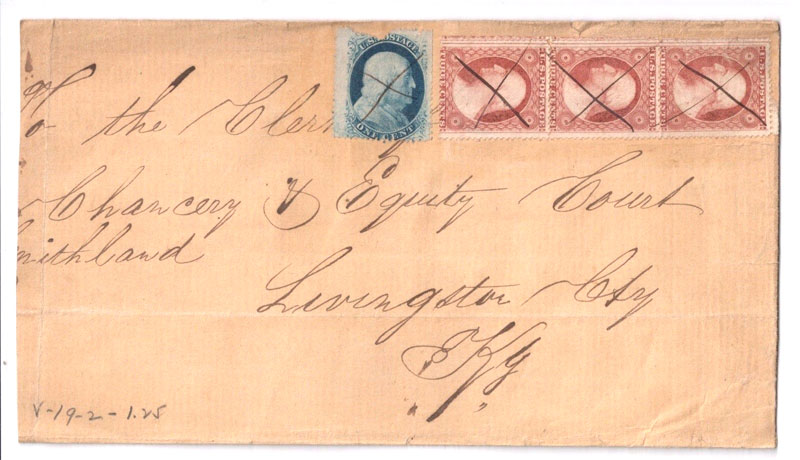
I have added the full cover. I think there was no room so they have to place the stamp over the writing. Adding a damaged stamp does not make sense? |
|
Send note to Staff
|
|
|
Pillar Of The Community
United States
517 Posts |
|
|
Looking at the full cover it does look like a room thing for what ever reason. Only sender and PO really knows but was added later. Looks like the pen cancel is different to me being the x cancel on the Washington looks different than the one on Ben or I could be looking too much into it. The Washington cancel has one bold line going from UL to LR and regular line going from UR to LL. Ben looks like the marks are the same and the cancels or x cancel are wider on the Washington than on Ben. Although to me it looks more attractive with Ben on the cover than just the 3 Washingtons' even though it is damaged. Like I said I'm a Newby and that's what I see wrong or right. |
|
Send note to Staff
|
|
|
Valued Member
United States
79 Posts |
|
|
Newby Stamper your point is valid as fat the cross on blue is totally different.. no one knows the reason behind it. As for strip of 3 #26 on cover is not very common also, |
|
Send note to Staff
|
|
|
Pillar Of The Community
United States
517 Posts |
|
|
Just looking out of the box. I agree not common at all but something about Ben on the cover as well just seems fitting maybe that is why he is on there? Too bad he is not in a little better shape but he is an old man after all isn't he. Still I like the cove! |
|
Send note to Staff
|
|
|
Pillar Of The Community
1211 Posts |
|
|
Hard to tell, but I agree that the 1 cent stamp looks like something added at some point. Another clue is it is covering some the handwriting of the address. Another thing is that none of the stamps are actually tied to the cover so there is always the possibility that all of the stamps were added - there is no way to tell for sure when stamps are not tied. |
|
Send note to Staff
|
|
|
Pillar Of The Community
United States
1270 Posts |
|
|
Is the scan of the cover cropped just to show the stamps or is the cover reduced on the left? Can't tell where the cover was mailed from. I believe there was a 10-cent rate in effect at that time. Perhaps this cover was mailed from somewhere over the milage limit requiring a 10-cent payment and the mailer didn't know that until he/she got to the post office and thats when the 1-cent Franklin was added? Or perhaps the contents was over the weight requiring added postage? Who knows? May never really determine it. |
|
Send note to Staff
|
|
|
Valued Member
United States
44 Posts |
|
|
I'm a little confused as to rates in that era. 1847 says 3c was the letter rate under 3000 miles, which was basically coast-to-coast, and that was 6c. But they also say 10c was the coast-to-coast rate. See http://www.1847usa.com/1851identifier.htmThere is a Livingston County in central New York, Michigan, and Kentucky ... and it looks like "KY" on the letter instead of "NY" but would Kentucky have been abbreviated "KY" in that era? Maybe someone tried to post it as 9c but it was rejected as being 1c short? In any case, Kentucky should not qualify as coast-to-coast mail from any U.S. location. Perhaps a disagreement? 3c was the prevailing Interesting L margin on #24 - too bad it's ripped up at the top. Is there anything inside? |
|
Send note to Staff
|
|
|
Pillar Of The Community
United States
2555 Posts |
|
|
This cover could be a triple rate letter with the 1c stamp added but it could also be a 3000+ mile 10c rate cover. The 1c stamp may have simply fallen off and has been reaffixed. The pen strokes look very similar to me. Hard to tell because we don't know where it originated. |
|
Send note to Staff
|
|
| |
Replies: 12 / Views: 2,198 |
|