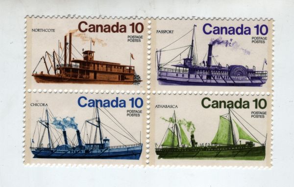
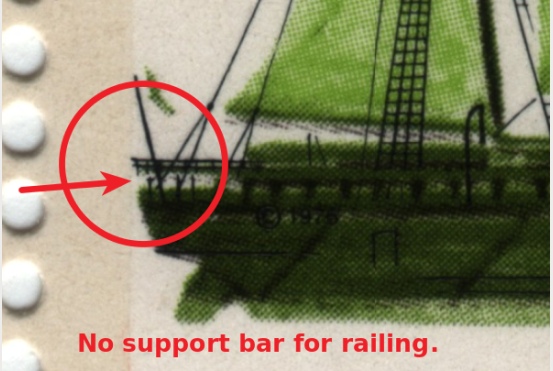
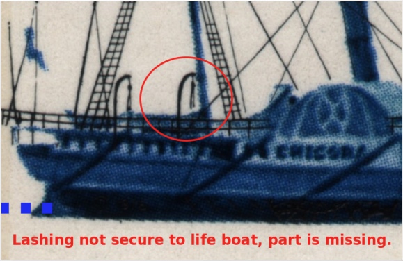
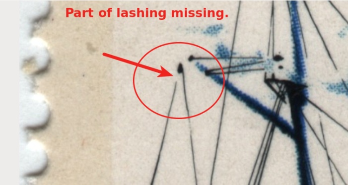
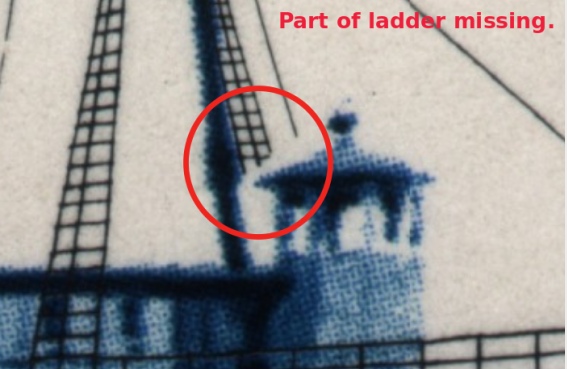
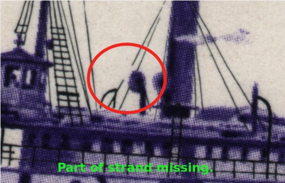
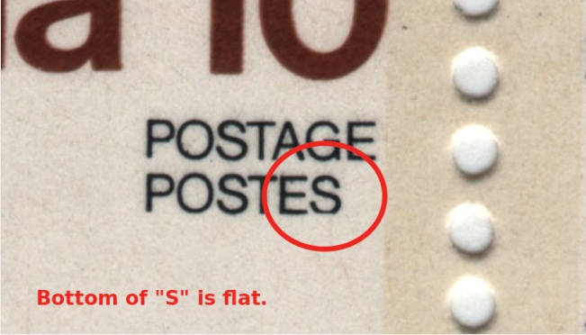
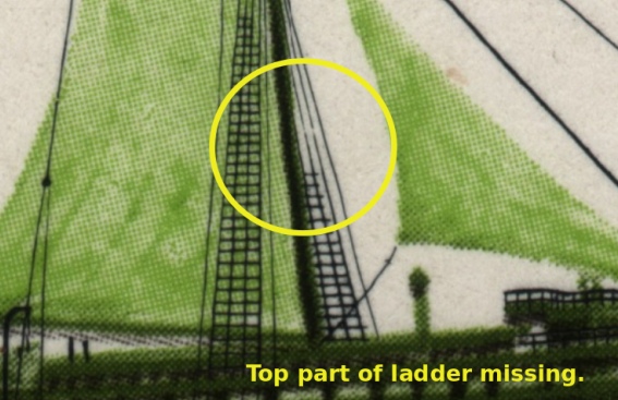
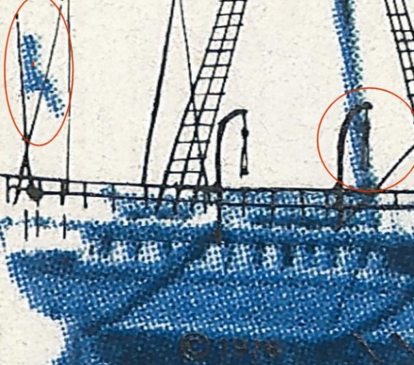
I don't believe most of these details are mistakes, with the exception of the flat-bottomed "S". It is a common artistic technique to add depth or indicate that one line goes "behind" another, or in case of the lifeboat, the gap might be showing the canvas cover.
If specimens could be shown to not have these features, then it might be significant. Have you found any?
I just checked mine and there is a marked difference in the registration of the black print compared to yours. The right-hand lifeboat support is printed more towards the center of the mast on mine and my idea about the canvas cover disappears because it is obliterated by the mast. Also, my "S" isn't flat on the bottom. So one of us has a color-shift on the black, even if only by a fraction of a millimeter!
I use the flag and flagpole as a good guide to how shifted the black ink is. As BreefMackUSA states, the flat S is a variety and occurs on a specific plate position only. The rest are due to the shift and are not errors or varieties in that sense.
Wert- your block has a shift to the left and up a bit . Many of the "unattached lines would re attach if properly registered. Breefmack's example is shifted up . There are a boat load of (pun intended) shifts like this from this time frame.
Disclaimer: While a tremendous amount of effort goes into ensuring the accuracy of the information contained in this site, Stamp Community assumes no liability for errors. Copyright 2005 - 2026 Stamp Community Family - All rights reserved worldwide. Use of any images or content on this website without prior written permission of Stamp Community or the original lender is strictly prohibited. Privacy Policy / Terms of UseAdvertise Here