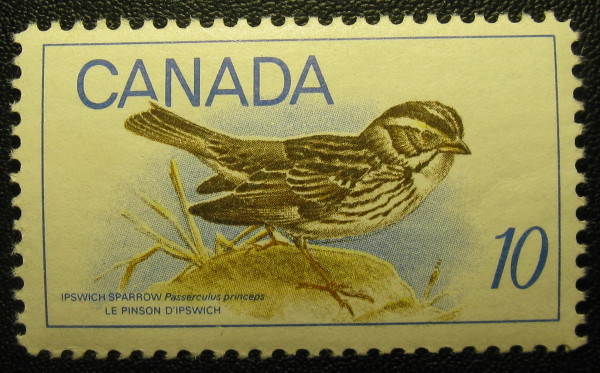
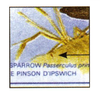
Determined to find something tonight I believe this is a vignette shift. The sparrow is slightly lower creating a gap between the tail feathers and the A-CANADA. The sparrow's front toe is also closer to the lower frameline than normal. Doe's anyone else have one like this?
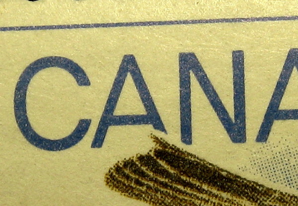
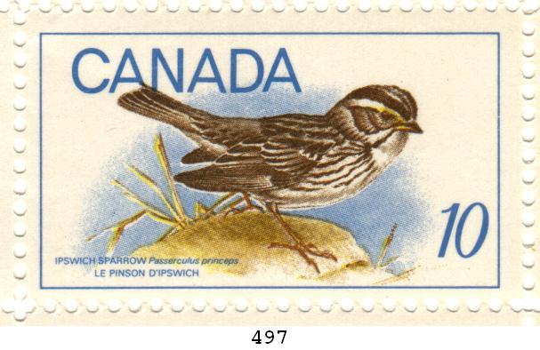
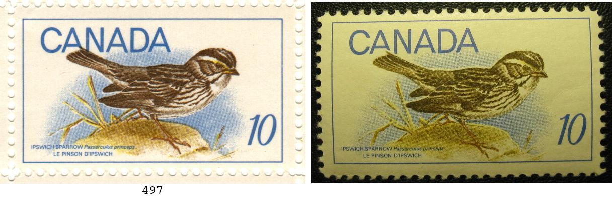
Here's a side-by-side comparison of the two stamps. Is it an optical illusion or does the first example (with the white background) have a slightly bolder font both in the lettering "CANADA" and in the bird species information at the bottom of the stamp?
Disclaimer: While a tremendous amount of effort goes into ensuring the accuracy of the information contained in this site, Stamp Community assumes no liability for errors. Copyright 2005 - 2026 Stamp Community Family - All rights reserved worldwide. Use of any images or content on this website without prior written permission of Stamp Community or the original lender is strictly prohibited. Privacy Policy / Terms of UseAdvertise Here