| Author |
 Replies: 176 / Views: 30,381 Replies: 176 / Views: 30,381 |
|
|
|
Valued Member
109 Posts |
|
|
Re: Paper types
Having a paper reference sample would be a great thing to have. Unfortunately it would not be something that Unitrade could produce and sell as part of the catalogue. A couple of reasons that come to mind are the quantity of stamps that would be needed and the manpower to assemble and produce such a collection.
When I wrote my specialized definitive books several years ago I had thought of doing something similar (perhaps with the reprints?).
The best I can suggest is to obtain examples of each of the stamps listed in the chart on page 25 of the Unitrade. This will give you examples of each of the different papers (and gum types?). [missing from this list is Scott 447, the only Canadian postage stamp with Davac gum).
Robin Harris
Editor, Unitrade Specialized Catalogue of Canadian Stamps |
Send note to Staff 
|
|
|
Rest in Peace
7742 Posts |
|
|
Hi Robin...Ya, its me again thinking out of the box as usual..haha. Anyways, was wondering if Unitrade or yourself ever thought it would be a nice touch to include a " Philatelic Colour Guide" chart for those people who look at say my Scott #17 stamp and really dont know the difference in colours between say "violet, or "red lilac"..New people will have to use a perforation tool to realize a Scott #17 that I ave is actually a Scott #17a because of Perf.12..Robin, lots of people out there are colour blind or close to it, and lets not kid ourselves, woman are better at colours than we are...haha...Anyway..just a thought. SORRY ABOUT USING AN AMERICAN COLOUR CHART  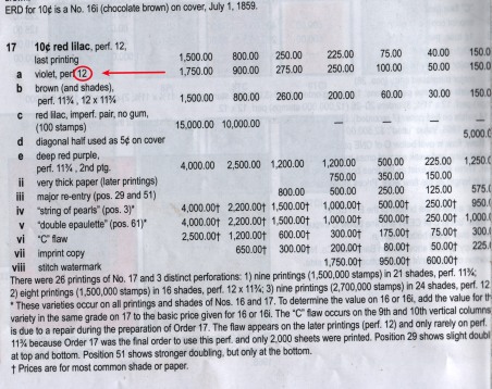 |
|
Send note to Staff
|
| Edited by wert - 04/09/2014 8:14 pm |
|
|
Pillar Of The Community
United States
5894 Posts |
|
|
For US stamps, while shades are mentioned, they are not often included in Scott. There is seminal work by Mr. White in three volumes with shades for classic US stamps (costing in excess of $1000). It seems to me, that for something requiring that amount of research and exactitude would need to be a publication other than the Unitrade Catalog.
I wonder if that is more up the alley of the V.G. Greene organization. |
|
Send note to Staff
|
| Edited by smauggie - 04/09/2014 8:34 pm |
|
|
Pillar Of The Community
Canada
644 Posts |
|
|
Richard Morris has published some really good colour guides for the Admirals and Small Queens. (perhaps others).
They use actual colour chips and are as close a you can get, considering that there are so many nuances in colour shades (can depend on many factors such as natural light - which is best of course, the person viewing, the colour of the paper itself, used vs. mint, etc...) |
|
Send note to Staff
|
|
|
Valued Member
Canada
382 Posts |
|
|
Hello all. I am happy to see the suggestions and constructive criticism that is being offered with respect to the Unitrade catalogue. I fear that the introduction of colour chips or charts is someplace that we don't really want to visit. When I compare the colours on two different editions of the Stanley Gibbons colour guides I note a dramatic difference between identically named colours. 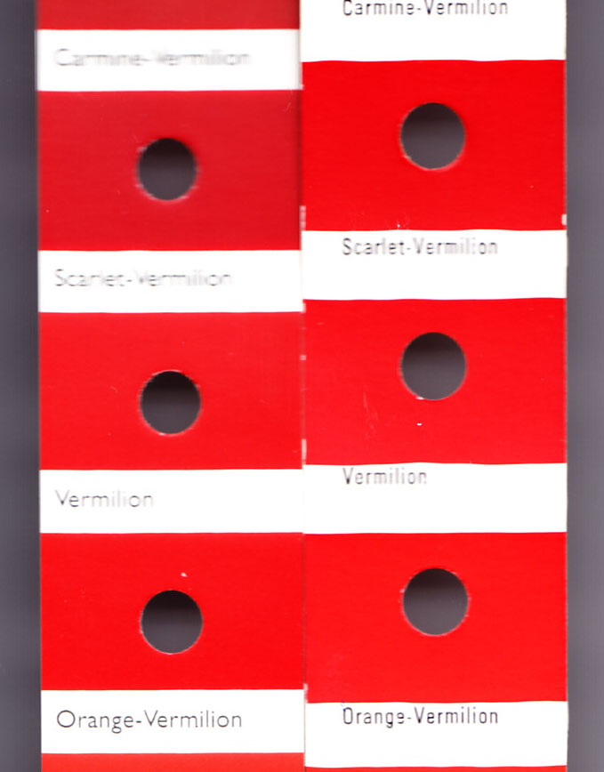 Canadian stamps do not match colours in either Scott or Gibbons colour guides so a new Canadian Colour Guide would be required. I have no doubt that we would experience difficulty printing a general colour guide in 2014 to match colours used through (for example) the 27 years of the Small Queen Issue. At the Greene Foundation, we are attempting to produce a spectrographic analysis and valuation of the colours that are creating arguments in the early issues such as Admirals (#102 pink, sage green, straw, etc); Newfoundland Prussian Blue; Small Queens (copper, indian red, dull red and rose). We still have a lot of work to do. With all due respect to the idea, I think we should drop any idea of attempting colour organization in the catalogue. GJP |
|
Send note to Staff
|
|
|
Pillar Of The Community
United States
728 Posts |
|
|
I agree with GJP. Years ago I got color chips that represent the various an numerous yellows and oranges of the Small Queens and tried to sort my 100's of stamps by color. The charts were made to represent exact ink mixes used. I still found colors that did not match any of the chips. The best one can do without extremely expensive equipment and time is to group them as close as one can. This identification of color is a very difficult process and depends on light, the chemicals used to make the ink (these can be affected by environment and age), and the persons ability to distinguish colors just to name a few variables. I also find that color names vary in the catalogs as well. If you wish to collect shades of stamps enjoy them and group them and don't worry about precision identification. You might not ever get every shade especially in early stamps. Just enjoy what you wish to collect. |
|
Send note to Staff
|
|
|
Rest in Peace
7742 Posts |
|
|
Well guys, thats all nice to hear about not worrying about stamp colours or shades and just enjoy the hobby..IT is part of the hobby..Ya,i wish ALL stamps were one colour, like say black, then collectors would not have to worry about colour...But and I do mean BUT, STAMPS ARE not ALL ONE COLOUR..I will give you one example of one frustration level that I endure as many other stamp collectors...Take for example my Scott 17????? Prince Albert stamp...Is it a Scott 17a or a Scott 17e...Now, most of us are in the hobby for the love of collecting..Some are here to make money, irregardless of the reason, colour plays a big part of it...Looking at Unitrade's value system, a Scott 17a is $225.00..A Scott 17e is $1200.00...That is a big difference...Colours are here with regards to collecting stamps, whether we like it or not...  gportch gportch..continue the good work...  |
|
Send note to Staff
|
| Edited by wert - 04/10/2014 08:02 am |
|
|
Pillar Of The Community
United States
728 Posts |
|
|
Hi wert, The best way to tell 17a and 17e apart is by perforation measurement. 17a should be perforated 12, 17e will be perforated 11.75. Some Lilac and Red Violate shades will fade to a gray appearance when exposed to UV light too long. The Deep Red Purple is a distinct shade and tends to fade less. There are also numerous brown shades. The inks were mixed in batches so color consistency varied slightly with each batch of ink. As far as color vs. catalog value you can use it as a guide to what shades may be harder to find. If you have an early printing perforated 11.75 stamp that is a different shade from Deep Red Purple it would still be an earlier printing. Color changes occur on these early stamps depending on what has been done to them. By the way I have never paid any where near catalog value for any of these in my collection and I have about fifty shades from #16 (I only have one shade on this) through a nice selection of shades on #17. #16 shares the peroration 11.75 with the early printings of #17. I hope you find the elusive Deep Red Purple shade it is very nice shade. |
|
Send note to Staff
|
| Edited by watermark - 04/10/2014 09:44 am |
|
|
Valued Member
109 Posts |
|
|
This could be a good project, but in order to do it properly, the result would be expensive for the collector. The various colour guides prepared by Richard Morris (20 years ago now?) were relatively expensive.
From past experience in philatelic book sales (through Saskatoon Stamp Centre), I have found that most collectors will not spend the necessary money on their stamp library. (this theory of mine is not limited to stamp collecting but I think is representative of any hobby)
I don't think this is a project that Unitrade Associates should take on. *IF* it is done, I think it is something that would be better done by another group, such as the VGG.
Robin Harris
Editor, Unitrade Specialized Catalogue of Canadian Stamps |
|
Send note to Staff
|
|
|
Rest in Peace
7742 Posts |
|
|
Ok Robin..One last stab at it...haha..How about having 2 pockets on the back inside cover with a serpentine gauge and a normal stamp gauge..Your great catalog has ..Colours..Perforation..and pictures..A new guy at stamp collecting would have the whole package within your Unitrade catalog..Tell me if that is going too far and I promise not to bother you again with these ideas (except for one later)...haha |
|
Send note to Staff
|
|
|
Valued Member
Canada
382 Posts |
|
|
Wert, please don't misinterpret what I said. I do not suggest for a moment that colour does not play an important role in our hobby. We should all be paying attention to colours.
What I am suggesting is that colour charts (or chips or guides) are simply guides but if you want names for the colours one must prepare a set of names for that particular issue of stamps. For example, the Machins of Great Britain have standardized colours because the colour charts were done BEFORE the stamps and the printers were required to match the charts. Colour varieties are few and far between.
On the other hand, the colour was never closely controlled. During the First World War, Csnadian printers stopped purchasing pigments from Germany and, as a consequence, there are colour differences through the Admiral Issues.
It would be sheer folly for Unitrade or any other catalogue to produce a set of colour guides that will satisfy a collector of Canadian stamps.
Being a "devil's advocate" for a moment, there are only a few Canadian stamps where colour is critical. These tend to occur in cases where the stamps come from extended production periods and come from multiple printings with multiple plates. For the other stamps, probably all printed in one day, the colour variations are insignificant and who really cares what you call those varieties. Look, for example, at #194, the 13c Britannia which is described as "deep green"......who cares what it is called - they are all the same. Does anyone ever compare this stamp to #89, the 1c Edward? No - because it doesn't matter.
As I mentioned in a posting yesterday, we are working at the Greene Foundation to create a spectrographic analysis of the contentious colours in Canadian philately. We will retain the reference stamp ant the analytic profile in our reference collection. To produce a chart of these colours would be a waste of time because users of the chart would be comparing shades under different lighting using only the "eyeball" method. Any meaningful comparison needs to be done under identical circumstances using similar equipment.
Time to stop before I fall off my soapbox. Thanks for bearing with me.
GJP |
|
Send note to Staff
|
|
|
Pillar Of The Community
United States
5894 Posts |
|
|
I know for certain US stamps *cough* posage dues *cough* they mixed the powdered pigment into the base by hand in the tray from which the ink was drawn to print stamps. Each batch was off by a little bit. |
|
Send note to Staff
|
|
|
Rest in Peace
7742 Posts |
|
|
gportch..I have the highest regard for you and the Greene Foundation along with Robin at Unitrade..I know I was asking for the world, but it was a wish list..I understand exactly what you are saying and appreciate your time and Robins to reply back to a (nobody) stamp collector..Thanks for addressing my concerns..subject on colours to me is now dropped..Thanks
Robert. |
|
Send note to Staff
|
|
|
Valued Member
Canada
382 Posts |
|
|
Wert, thanks for your kind words. I hope you will go back into your last posting and delete the word "nobody" when referring to yourself. You are making a significant contribution to the hobby with your worthwhile suggestions and observations. Don't under rate the contribution.
GJP |
|
Send note to Staff
|
|
|
Rest in Peace
7742 Posts |
|
|
And thank you gportch for saying those very nice things..This idea goes to Robin, but you can reply also gporth..Given that computers are now running everything we do, Robin, I use an array of FREE software programs that can enhance a collectors ability to study, analyze and enjoy this great hobby..I have on peoples request sent links to some of these programs that even Windows uses can benefit from(haha)..Robin, it would be an easy fix to add them to a page in your catalog for buyers would be able to download..Think it is worth the effort..And you know I will have other ideas..(I can see you grinding your teeth right now..haha)..??
Robert |
|
Send note to Staff
|
|
|
Replies: 176 / Views: 30,381 |
|



 Posted 04/07/2014 8:18 pm


