| Author |
 Replies: 32 / Views: 7,631 Replies: 32 / Views: 7,631 |
|
Rest in Peace
7742 Posts |
|
|
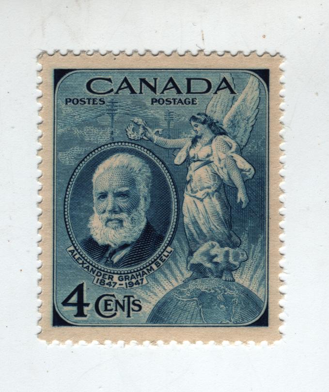
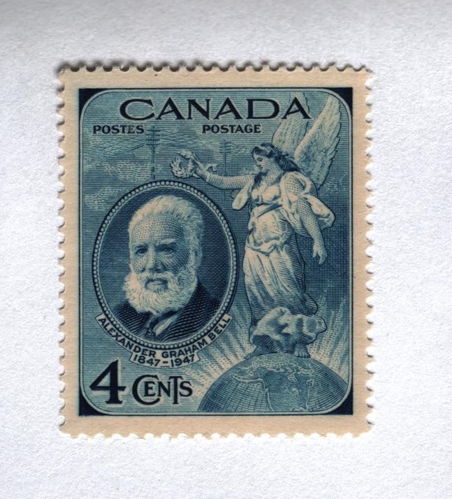
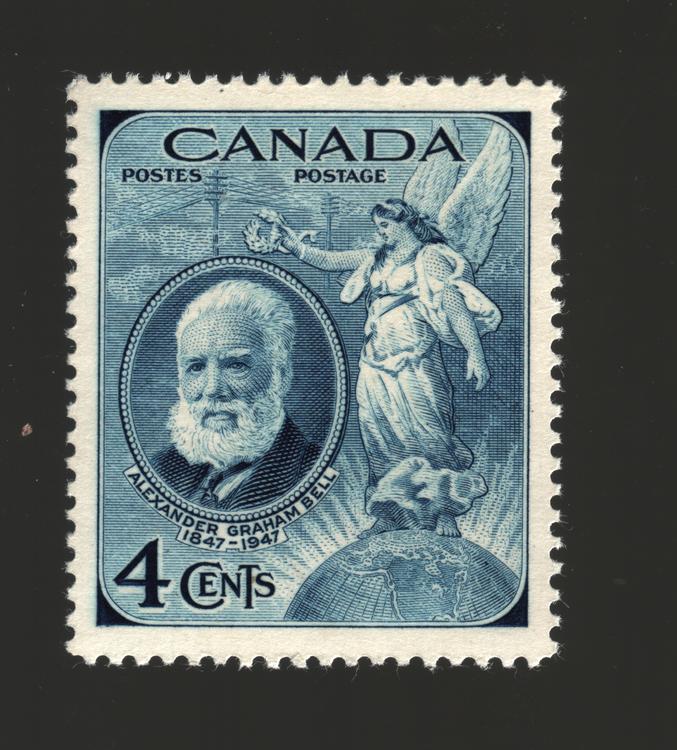
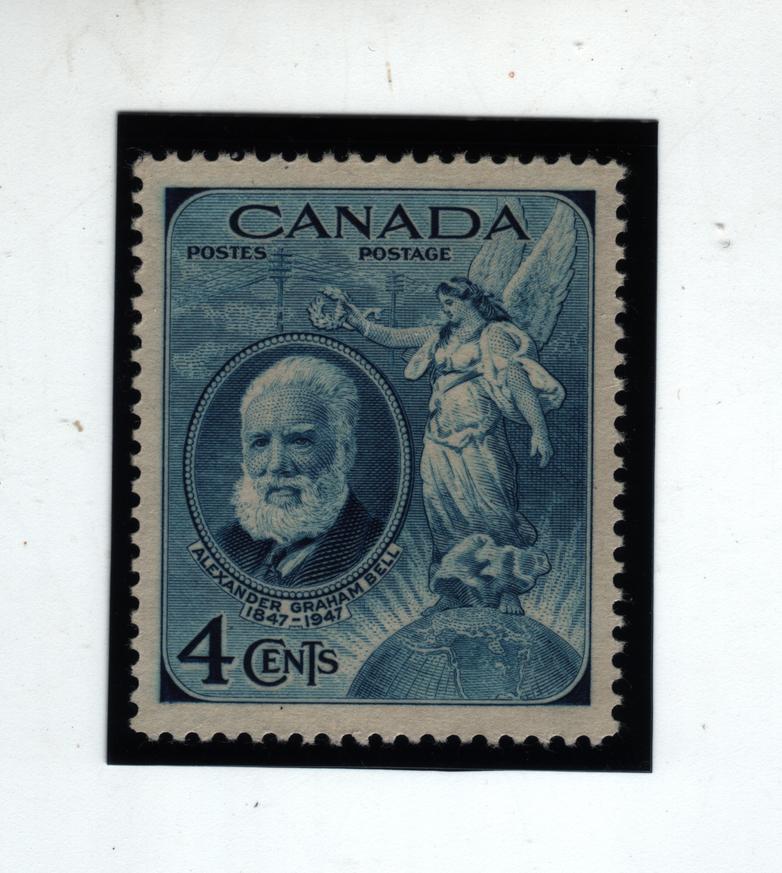
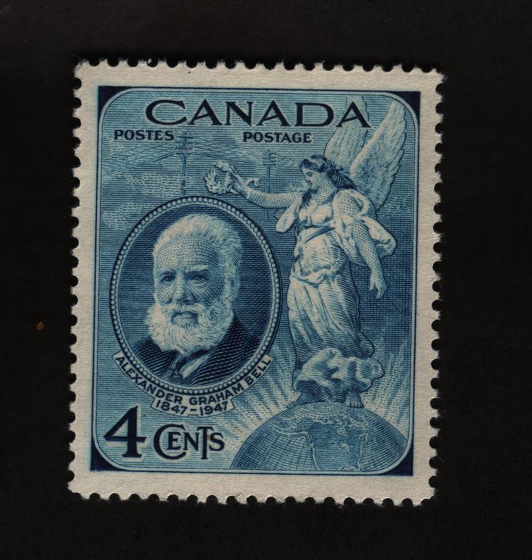
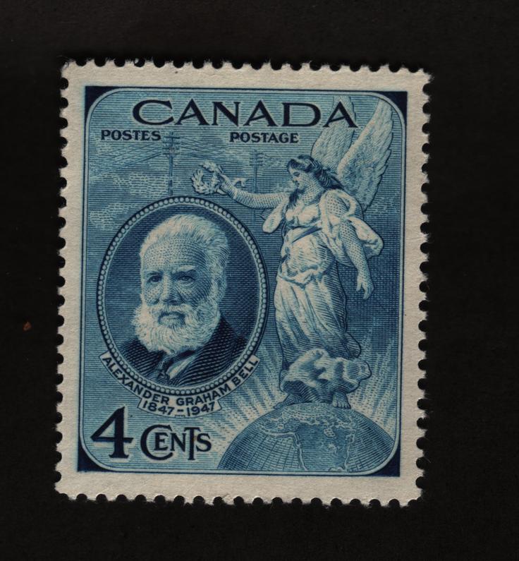
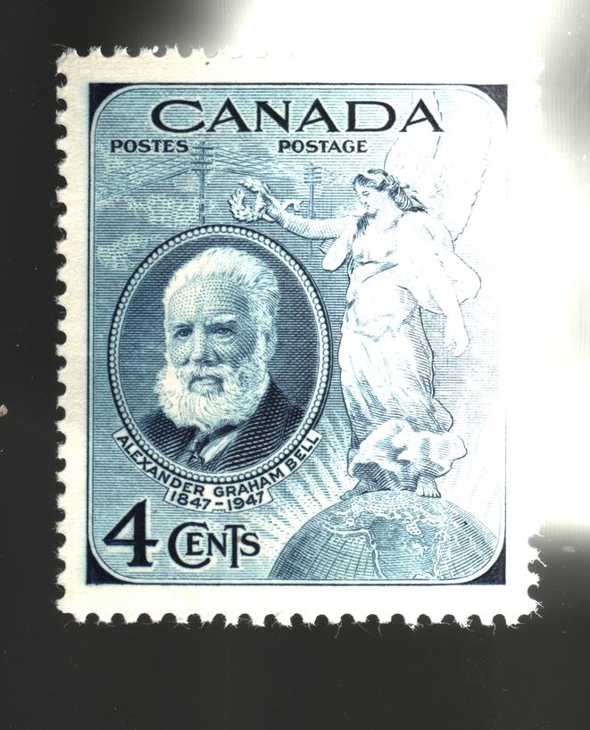
Hi guys...I am always trying to find the best scan of a stamp as possible...I know if you scan at 2400 dpi it is clearer that 600 dpi...We all know that...Take a look at this stamp I scanned. 1 - The one on the left is scanned as a normal scan. 2 - The one in the middle is scanned with a white paper over top. 3 - The one on the right is scanned inside a Hawid mount to give it a nice looking background. As you can see, the one with the white paper over top gives you the best/brightest image...Even though the black background looks the nicest, it is the darkest...I think I will start scanning everything with a piece of 8.5 X 11 paper from now on...Any comments or other suggestions for a better stamp scan..??..Thanks.  |
|
Send note to Staff
|
|
|
|
|
Pillar Of The Community
United States
1614 Posts |
|
|
Valued Member
109 Posts |
|
|
Wert:
Try scanning the stamp with only a black background.
That is, don't use the Hawid mount. The clear plastic of the mount will be the cause of some of the darkness you are seeing.
Tip: try to always have the stamp touching the surface of the scanner directly without any form of plastic between the stamp and the scanner glass.
Tip: use additional software (the best, but also most expensive, is Adobe Photoshop) to "tweak" the image. This software can lighten the lights and darken the darks (and crop and unsharpen) to give you even better images.
Every scan I use for the Unitrade catalogue can take several minutes to scan and tweak. |
Send note to Staff 
|
|
|
Rest in Peace
7742 Posts |
|
|
Ok Robin...That makes sense that the plastic would interfer with the scan...And yes I use software to lighten dark stamps all the time...Yes Adobe Photoshop is expensive and does the trick..May I suggest to the forum people that SHOTWELL and GIMP do as good a job and are completely FREE.
Mike33...I will give that a try...Thanks. |
|
Send note to Staff
|
|
|
Pillar Of The Community
United States
1614 Posts |
|
|
Another tip - if your scanner software has the option of photo or document, try the opposite you have used and look at the difference. I use document and it comes out much better IMO
|
|
Send note to Staff
|
|
|
Pillar Of The Community
United States
8956 Posts |
|
|
Wert, Robin suggested using a black background. I do that myself, and have had the best results with black poster paper. Black plastic will reflect some of the scanner light, poster paper is dull and wont give any trouble!
Peter
|
|
Send note to Staff
|
|
|
Rest in Peace
7742 Posts |
|
|
Pillar Of The Community
United States
822 Posts |
|
|
I have always been a fan of a 600 dpi scan with a black card stock back ground. I took a piece of black card and taped it to the lid of my scanner so it would always be black. That scanner is only used for stamps, I have another for scanning pages, so no conflict.
I like the fifth one best. What dpi was it scanned at? |
|
Send note to Staff
|
Member of the Central Oregon Stamp Club.
Redmond, OR 97756 Mailer's Postmark Permit #1
APS 239403 |
|
|
Moderator

United States
12330 Posts |
|
|
Wert,
Using software to 'tweak' a stamp image might result in a better looking image but is not ethical if you are using the image to sell the stamp. It should also be avoided if you are trying to make any sense of color shades.
In my opinion if you are trying to use images to for selling or to ask for help in these forums, you really ought to list any 'software enhancements' that you have done to the image so others understand what is going on in the image.
That said, I see nothing wrong with using various background colors if desired. Do not use a 'flood fill' feature to change the background color, this ends up changing perforation details.
don
|
|
Send note to Staff
|
|
|
Valued Member
452 Posts |
|
|
i like your black plastic mount it looks matted. I sometimes use a red or blue binder as a background the red has a textured look and if I use black on that red it really stands out. Other backgrounds, felt of different colors (i like green),or cloth of different textures or colors. |
|
Send note to Staff
|
|
|
Pillar Of The Community
United States
1614 Posts |
|
|
Rest in Peace
7742 Posts |
|
|
51studebaker my friend...What made me think that you would not get into the mix...haha..Yes, you are correct..I DO NOT sell stamps (or my coins) and I only use software to enhance my ability to view details..A stamp in its natural state is colour effective in identifying colour shades as you said...Yes, you are correct. |
|
Send note to Staff
|
|
|
Moderator
United States
12330 Posts |
|
|
Wert,
Understood, as you know I think it is hard enough to account for the deltas between scanners, graphics cards, monitors and their associated drivers. But to then add in the fact that some folks also run images through various (and often multiple) scanning imaging enhancements makes it very difficult to understand what the stamp actually looks like 'in real life'.
In my opinion it would be best if the 'rule' was that full disclosure be done in many situations so readers would understand what they are actually looking at.
In terms of a book, article, or catalog publisher (reference materials); I hope they include a disclaimer that they are publishing images that have been manipulated so everyone is on the same page.
don
|
|
Send note to Staff
|
|
|
Rest in Peace
7742 Posts |
|
|
51studebaker...I like your way of thinking..With regards to monitors, saying everyone's is different, is true....I had thought of an idea that would put EVERYONE on the same page with colours/shades and such, where when I tell you a colour of a stamp, you will know exactly what colour I am referring and you never have to look at your monitor...Sounds far fetched..??...It is not...Interested..??? |
|
Send note to Staff
|
|
|
Moderator
United States
12330 Posts |
|
|
Wert,
My experience with color standardization began years ago when working my way through college in a textile dye house. Dyers would have to take a color sample from wet cloth in the dying machines and compare it to a standard; if not a match they would have to determine the exact dye formula to adjust the cloth into specification. Lighting and the differences in the human eye were the greatest obstacles to overcome. Experienced dyers would often dial in a match on the first try but it was not uncommon for inexperienced dyers to tale many, many tries before getting the shade to match.
In the latter part of my career we often had to specify an exact color shade of an electronic product we were designing and manufacturing. Pantone standardization was an obvious choice and we invested annually in color samples for inspection accuracy. Many 'color dependant ' applications such as PhotoShop and Coreldraw often included Pantone calibration tools that were meant to sync up a person's monitor and printer; I found most of them to be less than ideal.
Anyone interested in the study of color standardization can quickly fill their afternoon with a ton of good reading online. Many standards have been attempted with varying degrees of success. But I am all ears if you have a new approach to meeting this challenging issue! Any solution would obviously require that we all have the same standardize color sample in hand to ensure that our home equipment is in calibration.
don
|
|
Send note to Staff
|
|
|
Rest in Peace
7742 Posts |
|
|
Well Don...As you said...Colour standardization...Monitor differences and the human eye are ALL road blocks to "colour standardization"...So I have posted this before with little response, but YOU seem to be more aware than most on this forum of the so called colour problem...
If I could say to you and others, the stamp I am looking at is say 'Aztec orange" (i know a weird choice of colours), and you could see EXACTLY what colour I am looking at, then you or anyone could give a reasonable analysis as to the colour/shade my stamp was..That is what I am trying to achieve..
Ok, here goes...My paint store or even "colour your world" has a computer program that reads a colour of a chip, paint smear, or any other form of analysis...If I got a colour off their machine and grabbed one of those colour paper samples they allow you to bring home and you had the same samples in front of you..Then, you would see exactly the colour I am looking at.
Does that make any sense...its the only way that I can see how we can both look at the same colour, and UNITRADE with their great colour consistency in their catalog would help in identifying stamp colours/shade...
|
|
Send note to Staff
|
|
|
Replies: 32 / Views: 7,631 |
|




 Posted 05/14/2014 7:53 pm