| Author |
 Replies: 10 / Views: 4,809 Replies: 10 / Views: 4,809 |
|
|
Valued Member
132 Posts |
|
|
|
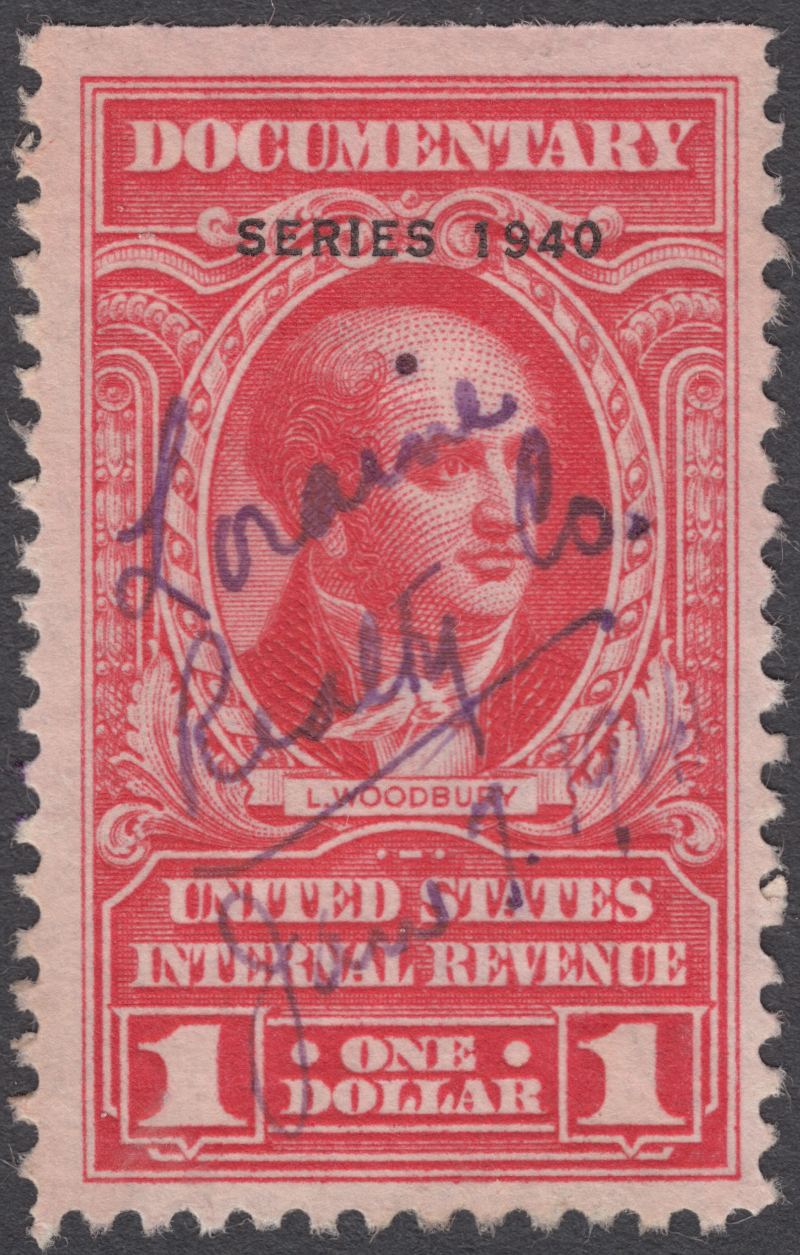
I have numerous Revenue stamps that are (all Used) R288, 289, 290, 300, 301 and 302. Is there a visual test that can help identify the sensitive ink variety? Would special lighting help?
I tried looking in the Linns book by R. Friedberg, and West's revenue book to no avail.
Thank you for any assistance and or guidance.
Respectfully,
Richard Klink
|
|
Send note to Staff
|
|
|
|
|
Pillar Of The Community
United States
1721 Posts |
|
|
Unless you have seen them it is a little difficult to describe.
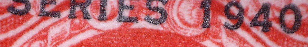
On a mint stamp the "Series of 19XX" has a crystaline look.
When soaked if becomes sightly smeared and the ink runs slightly.
Go to a show with one of the better known revenue dealers and ask to see one. |
Send note to Staff 
|
|
|
Pillar Of The Community
United States
6447 Posts |
|
|
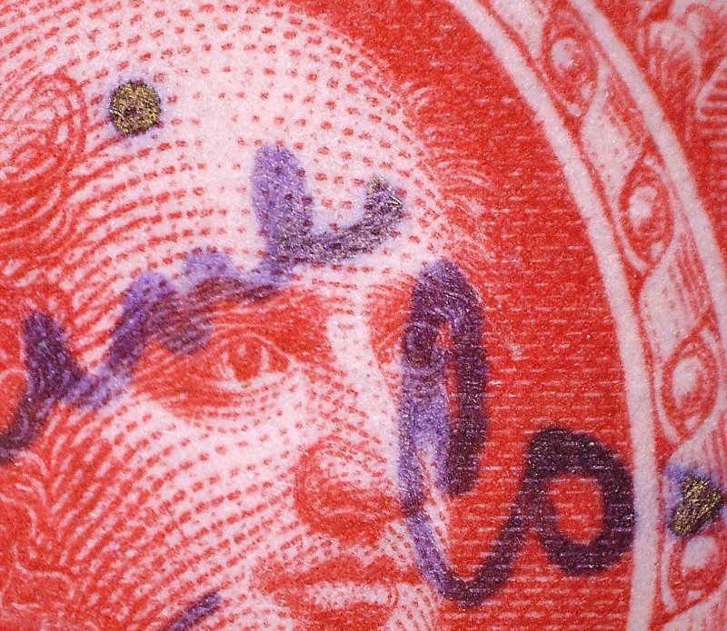
If you have multiple potential examples, put them side by side under good lighting and compare them. The sensitive ink examples will have "sparkles" (for lack of a better word) in the overprint. Also, the sensitive ink is a dark bluish-purple rather than black.
Once you see them, it's pretty easy to tell the sensitive ink examples from the non.
I've got some examples floating around here somewhere that I pulled from a mixture. I'll see if I can locate them and do some high-res scans... I'm not sure if the differences will show up in scans. |
|
Send note to Staff
|
|
| Edited by revenuecollector - 06/21/2014 9:44 pm |
|
|
Bedrock Of The Community
United States
10670 Posts |
|
|
The sensitive ink is in the word series and the date. As I recall they tend to be a kind of bluish-purplish black with tiny flecks of gold. Obviously easier to see on mint stamps. |
|
Send note to Staff
|
|
|
Pillar Of The Community
United States
6447 Posts |
|
|
Quick and dirty scan: The stamp on the left is the normal variety, the stamp on the right is sensitive ink. You'll want to click on the image and view it at full size.  |
|
Send note to Staff
|
|
| Edited by revenuecollector - 06/21/2014 9:49 pm |
|
|
Pillar Of The Community
United States
1721 Posts |
|
|
Quote:
The sensitive ink examples will have "sparkles" (for lack of a better word) in the overprint. Also, the sensitive ink is a dark bluish-purple rather than black. "Sparkles" is the word I was looking for. I forgot to put the dark bluish-purple ink on the list. Once you have seen one it is easy to tell. |
|
Send note to Staff
|
|
|
Valued Member
132 Posts |
|
|
Thank you all for the guidance and pictured examples. I sorted thru all mine and did fine 3 that I would classify as sensitive ink. When compared to the otheres the ink is different. I plan on visiting the APS show in hartford conn. this fall and will take the advice in speaking to some to the revenue dealers there. looking at their examples and seeing if they can confirm what I thought to be sensitive ink examples as such. Once again thank you. This sight has been a blessing to find with the help and scope of knowledge that is shared. |
|
Send note to Staff
|
|
|
Moderator

United States
5101 Posts |
|
|
Pillar Of The Community
United States
6447 Posts |
|
|
Look at the images I posted above, specifically the image on the right. It's the "SERIES OF 1940" that will be in dark bluish-purple ink with sparkles rather than black ink, not the company cancel. |
|
Send note to Staff
|
|
| Edited by revenuecollector - 08/19/2017 8:18 pm |
|
|
Moderator
United States
5101 Posts |
|
|
Quote:
It's the "SERIES OF 1940" that will be in dark bluish-purple ink with sparkles rather than black ink, OK, that wasn't clear from the explanation in Scott's. There is nothing that says the SERIES is in a different color, though your example clearly is one. What is interesting, though, is that the Pen Cancel has seemed to pull out some of the color, creating that golden area. Just seems odd to me. Thanks for the follow-up. |
|
Send note to Staff
|
|
|
Pillar Of The Community
1151 Posts |
|
|
My examples have sparkles either gold color or silver color, not sure which color for sure, but distinctive and clearly show up.
I would suggest, they easier to see on mint stamps as opposed to a used stamp!
Revenuecollector examples clearly show this, well done!
David Thompson (Stampmaster)
MSGT/USAF/Retired |
|
Send note to Staff
|
|
| |
Replies: 10 / Views: 4,809 |
|