| Author |
 Replies: 14 / Views: 2,044 Replies: 14 / Views: 2,044 |
|
|
Moderator

United States
5094 Posts |
|
|
A significant color shift on the right, but makes it appear to be a completely different stamp, don't you think? My other copies aren't even close in the amount of red in the sky, or even on Kelsey himself. It almost looks like the red was sent through twice, once inverted.  |
|
Send note to Staff
|
|
|
|
|
Rest in Peace
Canada
6750 Posts |
|
|
Perhaps the red, printed over the blue, gave the first stamp it's purplish colour, while on the second stamp, the red or blue is shifted, making the red's red and the yellow's, a lightening colour of course, appear more prominent, or reddish.
Very nice. Quite a display of colourful sky on an album page it would be. |
Send note to Staff 
|
|
|
Rest in Peace
7742 Posts |
|
|
Partime...I think I read something in one of my old catalouges that called it the "aurora borealis"....Nor a constant though. |
|
Send note to Staff
|
|
|
Moderator
United States
5094 Posts |
|
|
Puzzler and Wert, thanks for the replies. The Aurora Borealis concept seems to cover it well. I was just wondering about the possible over-application of the magenta/red ink. In the first example, it appears that this color is used sparingly, and is not really obvious anywhere covering Kelsey. In the second stamp, it appears that they used this color as a base or maybe a final coating over the entire stamp as a darkener, or something similar. In any case, an unusual sample that will have a place on the appropriate page. |
|
Send note to Staff
|
|
|
Rest in Peace
7742 Posts |
|
|
Quote:
I was just wondering about the possible over-application of the magenta/red ink. In the first example, it appears that this color is used sparingly Color...???...Oh you mean colour Partime....hahaha Hey, that may be explanation to why they look different...I will try to find my old catalogue for you to see if it says any more about it.. |
|
Send note to Staff
|
|
|
Moderator
United States
5094 Posts |
|
|
Excellent. The more you find aboot it  , the better. (About ... aboot ... what's the difference?) |
|
Send note to Staff
|
|
|
Rest in Peace
7742 Posts |
|
|
 You got a good sense of humour Partime( or is it humor)...haha I will look for you... |
|
Send note to Staff
|
| Edited by wert - 07/17/2014 4:30 pm |
|
|
Pillar Of The Community
Canada
1324 Posts |
|
|
Where do yankees get the idea that Canadians say "aboot"? Is this some crazy thing from a comic strip? |
|
Send note to Staff
|
|
|
Moderator
United States
5094 Posts |
|
|
Well, y'all might think that, I reckon. I'll have to do some research on that myself. Update: I did a little more searching, and found an excellent website on just this topic http://www.quickanddirtytips.com/ed...nounce-aboutIt is also interesting to note that most internet articles refer to the pronunciation of "about" being closer to "aboat", not "aboot". Now, back to the colour discrepancy ... |
|
Send note to Staff
|
| Edited by Partime - 07/17/2014 7:06 pm |
|
|
Pillar Of The Community
Canada
1324 Posts |
|
|
The aboot thing is how (some) yanks hear. Not how people who speak English properly speak. |
|
Send note to Staff
|
|
|
Valued Member
Canada
65 Posts |
|
|
If you look closely at the top of the second stamp, you will see the blue completely shift up. This will explant the different between the two stamp. |
|
Send note to Staff
|
|
|
Rest in Peace
7742 Posts |
|
|
Jacklac...The blue shift upwards does not explain the intense colour where my arrows are pointing...? 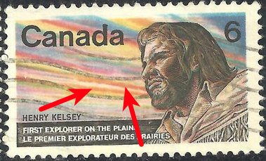 I have a single and a block of these..I will check mine Partime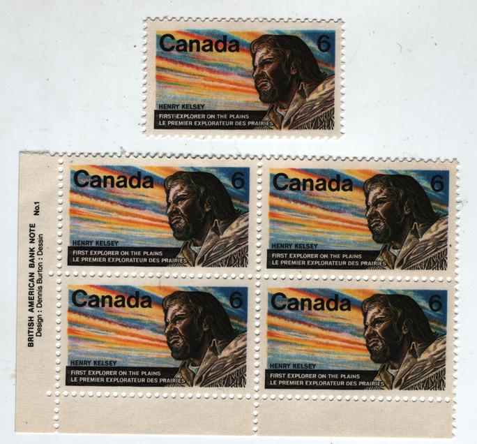 Puzzler Puzzler...Maybe it really has to do with the colour shift..My single above is more intense than my block..The single is shifted and the block is not. ALSO NOTICE WHERE THE "NO1" IS...IN BETWEEN THE LINES..NO OTHER BLOCK I HAVE IS LIKE THAT..GOOD THING TO CHECK OUT. 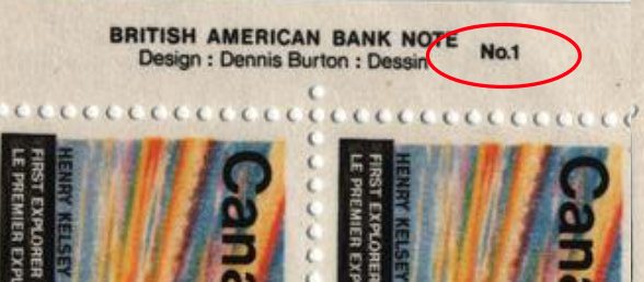 |
|
Send note to Staff
|
| Edited by wert - 07/18/2014 2:29 pm |
|
|
Moderator
United States
5094 Posts |
|
|
I admit the blue is shifted up significantly. However, that doesn't explain why I see more red in this area on the stamp in question. Quite odd. 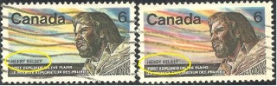 |
|
Send note to Staff
|
|
|
Pillar Of The Community
Canada
1394 Posts |
|
|
I alos have both versions of this issue.
The "aurora borealis" version has been known for several years but is not mentioned in the 2014 Unitrade. |
|
Send note to Staff
|
|
|
Rest in Peace
Canada
6750 Posts |
|
|
Here are the two original stamps shown separated out as singles. I see the second stamp, the darker one, is covered by plastic. Does this affect the reddish colouring of Kelsey at all? You can now downlaod these two files below and flick back and forth (kind of) with the cursor keys to not the differences more. 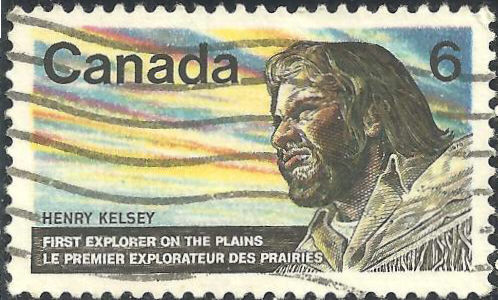  It seems that they could have printed the first stamp first rather than the second stamp first. or the other way. Either Looking at Kelsey, either he is mostly more red or mostly more yellow. May be that an extra yellow layer was added out of sync also? |
|
Send note to Staff
|
|
| |
Replies: 14 / Views: 2,044 |
|


