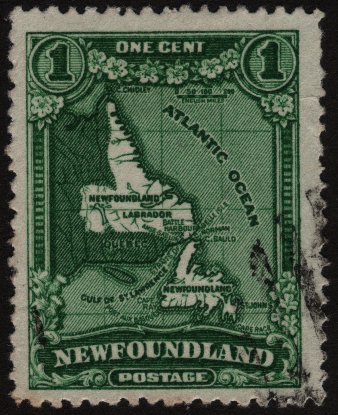
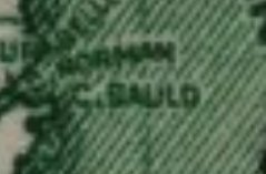
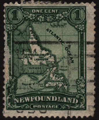
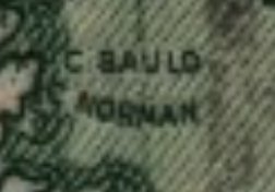
Hi guys...Take a look at this map of Newfoundland...There are two versions of it..One has "C. Bauld" above "C. Norman"...and the other has the reverse...Interesting.......Which one is right..?
Your second image is correct. Cape Bauld is up at the tip of the island, Cape Norman is farther south. The earlier version (#145) of the map was correct. In fact Cape Norman is farther down the coast (about half way) than indicated, according to the real map I'm looking at right now.
The first issue (#145) was issued in 1928. The reengraved version, with the changed map (#163) appeared in 1929. It was issued again in 1931 on unwatermarked paper.
jamesw nailed this one : three versions 1928, 1929 and 1931, with the latter having the correct Bauld-Norman positioning.
Each of the Publicity Issues (2cent to 30cents) all have differences which were brought about because in 1929, a new printing firm won the competition for the contract; the refusal of the previous printer to hand over the 1928 dies and plates, caused the new firm to copy the designs.
This is one of the crazy and fun areas of Newfoundland because they all blur together
tommy your bugger...You got me interested in province stamps and I acquired about 250 NFLD stamps, but I thought Large Queens were hard to classify, NFLD stamps sometimes has 3 versions of stamps like 146, 164, 173 just to name one..Drives me crazy....haha
One of the reasons Newfoundland drives me crazy (the stamps I mean) is how many variations they had for different issues. Change the perts! Watermark NO watermark! Redraw and redraw again! It's no wonder I've still got a small pile to sort through. Can't bring myself to tackle them.
Disclaimer: While a tremendous amount of effort goes into ensuring the accuracy of the information contained in this site, Stamp Community assumes no liability for errors. Copyright 2005 - 2026 Stamp Community Family - All rights reserved worldwide. Use of any images or content on this website without prior written permission of Stamp Community or the original lender is strictly prohibited. Privacy Policy / Terms of UseAdvertise Here