Stamp Community Family of Web Sites
Thousands of stamps, consistently graded, competitively priced and hundreds of in-depth blog posts to read


Stamp Community Forum
 
Username:
Password:
Save Password
Forgot your Password?

This page may contain links that result in small commissions to keep this free site up and running.

Welcome Guest! Registering and/or logging in will remove the anchor (bottom) ads. It's Free!

Would You Change A Stamp Design..?

Next Page    
 
To participate in the forum you must log in or register.
Author Previous TopicReplies: 16 / Views: 4,848Next Topic
Page: of 2
Rest in Peace
7742 Posts
Posted 12/14/2014   3:01 pm  Show Profile Bookmark this topic Add wert to your friends list Get a Link to this Message
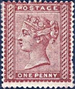
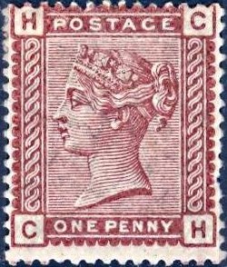
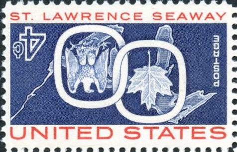
Hi guys...Take a look at my Scott #72 stamp...Look at the ugly "G" at the bottom on the left side..Sort of out of place..Take a look at the same stamp where I changed the "G" on the right stamp to a more eye pleasing "G"..Do you agree..??

Is there any other stamps you can think of that a change would have made it better..??
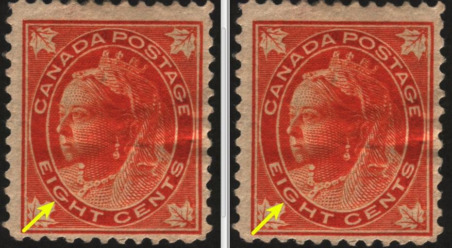

Send note to Staff

Bedrock Of The Community
United States
12128 Posts
Posted 12/14/2014   4:27 pm  Show Profile Bookmark this reply Add wt1 to your friends list  Get a Link to this Reply
It does seem curious, especially since in both examples the "G" in "POSTAGE" shows the extended line in the "G", too. One would think the printing would be consistent.

If you really want to flyspeck those stamps, take a look at:

The "E" in "POSTAGE" which has a very short bottom line; versus
The "E" in "EIGHT" which has a medium bottom line; as compared to
The "E" in "CENTS" which has a very long bottom line.

Sometimes I think these anomalies may be intentional (perhaps to thwart counterfeiting) by making subtle changes to the design. It seems to me no professional printer would miss seeing those easily spotted design elements were it not intentional.
Send note to Staff  Go to Top of Page
Edited by wt1 - 12/14/2014 4:34 pm
Pillar Of The Community
United Kingdom
895 Posts
Posted 12/14/2014   5:09 pm  Show Profile Bookmark this reply Add Ringo to your friends list  Get a Link to this Reply
Beautiful...


Ugly...


Send note to Staff  Go to Top of Page
Rest in Peace
7742 Posts
Posted 12/14/2014   6:28 pm  Show Profile Bookmark this reply Add wert to your friends list  Get a Link to this Reply
Ringo...Did you change it..If so I am impressed..

And shouldn't you stamp have a "G" where the circle is and not a "C"..??
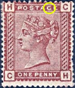


wt1...If I ever need a apprentice to hire for forensic investigation (fyspecking)...I will call you...

Not only that...look what is the focal point of the stamp..The queens ear..Older stamps had the Queens face as the focal point.
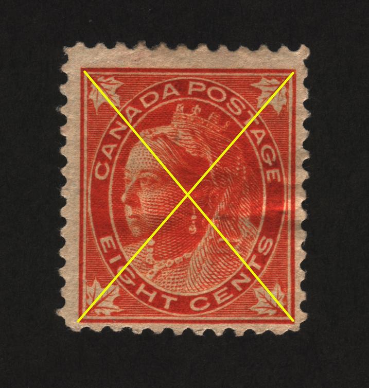


Send note to Staff  Go to Top of Page
Edited by wert - 12/14/2014 8:08 pm
Pillar Of The Community
923 Posts
Posted 12/15/2014   10:11 am  Show Profile Bookmark this reply Add sak to your friends list  Get a Link to this Reply
Perhaps we should start with this: #85 (100 years later)

Send note to Staff  Go to Top of Page
Pillar Of The Community
United Kingdom
895 Posts
Posted 12/15/2014   10:32 am  Show Profile Bookmark this reply Add Ringo to your friends list  Get a Link to this Reply
Scotland almost went grey as well, a couple of months back!
Send note to Staff  Go to Top of Page
Pillar Of The Community
United Kingdom
895 Posts
Posted 12/15/2014   10:48 am  Show Profile Bookmark this reply Add Ringo to your friends list  Get a Link to this Reply
I'd certainly change this...


To this...


Send note to Staff  Go to Top of Page
Rest in Peace
7742 Posts
Posted 12/15/2014   10:50 am  Show Profile Bookmark this reply Add wert to your friends list  Get a Link to this Reply
Good one sak...that is funny...

Ringo...this thread is becoming a "wheres waldo"....haha
Send note to Staff  Go to Top of Page
Edited by wert - 12/15/2014 11:06 am
Pillar Of The Community
United Kingdom
895 Posts
Posted 12/15/2014   11:20 am  Show Profile Bookmark this reply Add Ringo to your friends list  Get a Link to this Reply


Send note to Staff  Go to Top of Page
Pillar Of The Community
1849 Posts
Posted 12/15/2014   12:13 pm  Show Profile Bookmark this reply Add kevin504 to your friends list  Get a Link to this Reply
Ringo.....????
Send note to Staff  Go to Top of Page
Rest in Peace
Canada
5701 Posts
Posted 12/15/2014   12:30 pm  Show Profile Bookmark this reply Add BeeSee to your friends list  Get a Link to this Reply
Nice topic Wert. Very funny Ringo!

Send note to Staff  Go to Top of Page
BeeSee in BC
"The Postmark is Mightier than the Stamp"
http://brcstamps.com ---- BNAPS, RPSC, APS
Pillar Of The Community
Canada
1324 Posts
Posted 12/15/2014   12:57 pm  Show Profile Bookmark this reply Add CanadaStamp to your friends list  Get a Link to this Reply
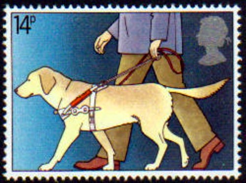
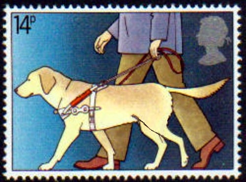
I'm looking at the seeing eye dog - and well - I'm not seeing the change.
Send note to Staff  Go to Top of Page
Rest in Peace
7742 Posts
Posted 12/15/2014   1:07 pm  Show Profile Bookmark this reply Add wert to your friends list  Get a Link to this Reply
CanadaStamp
HINT...Look at his back legs...

You would make a terrible "flyspecker"...haha
Send note to Staff  Go to Top of Page
Edited by wert - 12/15/2014 1:09 pm
Valued Member
Canada
228 Posts
Posted 12/15/2014   5:15 pm  Show Profile Bookmark this reply Add Scottamer to your friends list  Get a Link to this Reply
Any kind of better colour assignment and better "trapping" of the layered colours could have saved this banana stamp and its transparent weathervane.
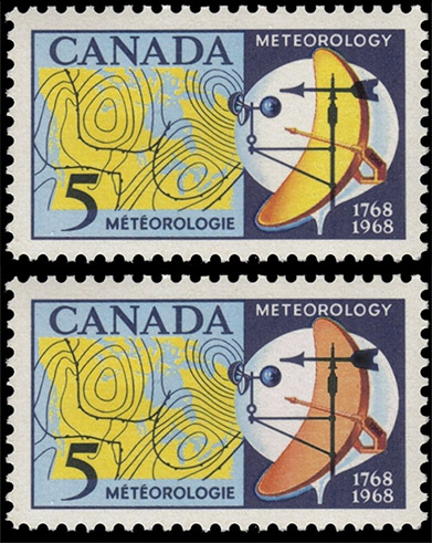
Send note to Staff  Go to Top of Page
Pillar Of The Community
923 Posts
Posted 12/15/2014   10:37 pm  Show Profile Bookmark this reply Add sak to your friends list  Get a Link to this Reply
Here's the Quebec Quatercentenary Issue: #97b

Send note to Staff  Go to Top of Page
Rest in Peace
7742 Posts
Posted 12/15/2014   10:45 pm  Show Profile Bookmark this reply Add wert to your friends list  Get a Link to this Reply
Sak...you kill me...really good one....
Send note to Staff  Go to Top of Page
Page: of 2 Previous TopicReplies: 16 / Views: 4,848Next Topic  
Next Page
 
To participate in the forum you must log in or register.

Go to Top of Page

Disclaimer: While a tremendous amount of effort goes into ensuring the accuracy of the information contained in this site, Stamp Community assumes no liability for errors. Copyright 2005 - 2026 Stamp Community Family - All rights reserved worldwide. Use of any images or content on this website without prior written permission of Stamp Community or the original lender is strictly prohibited.
Privacy Policy / Terms of Use    Advertise Here
Stamp Community Forum © 2007 - 2026 Stamp Community Forums
It took 0.21 seconds to lick this stamp. Powered By: Snitz Forums 2000 Version 3.4.05