Stamp Community Family of Web Sites
Thousands of stamps, consistently graded, competitively priced and hundreds of in-depth blog posts to read


Stamp Community Forum
 
Username:
Password:
Save Password
Forgot your Password?

This page may contain links that result in small commissions to keep this free site up and running.

Welcome Guest! Registering and/or logging in will remove the anchor (bottom) ads. It's Free!

Help Identify Early Transvaal - Forgeries Or Authentic?

 
To participate in the forum you must log in or register.
Author Previous TopicReplies: 14 / Views: 4,096Next Topic  
Pillar Of The Community
Norway
1661 Posts
Posted 05/17/2015   9:29 pm  Show Profile Bookmark this topic Add Blaamand to your friends list Get a Link to this Message
I am re-visiting my Transvaal collection. I have trouble on the 'First republic' issues - and last time I simply gave up identifying these . Now that I have realized the enormous amount of knowledge you have out there, I was hoping anyone will share their experience. (I found other threads in here on later Transvaal issues, but none on these)

I believe most of my copies are forgeries. But I have no other reference than the Scott Classic Specialized, and not too much information is given. Can anyone help me to give a 'verdict'?


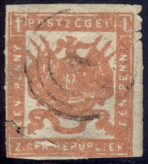
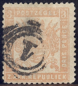
I believe these are all counterfeits? (all have the 'D' of 'EENDRAGT' not touching the ribbon above)


Then, here are some others - and I'm hoping some of them might be real?
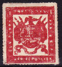
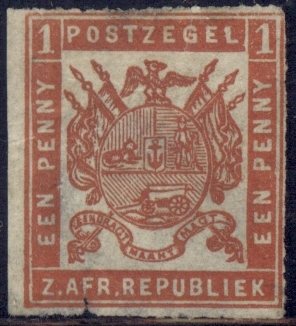


1)
1p orange red, rouletted 6. Very heavy/overinked impression. Can it be Sc #47a - or a reprint / fake? Very messed up, but I don't bother too much as long as I might get a spacefiller.
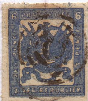


2)
1p red, roul 16, very thin paper. 'D' touching ribbon. Sc.#4? Reprint?
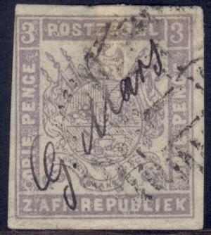


3)
3p dull or gray lilac, imperf, thin paper. Sc. #25 - or #34?
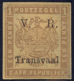


4)
Sc # 120? Or the 'dull orange red forgery' as described in scott?
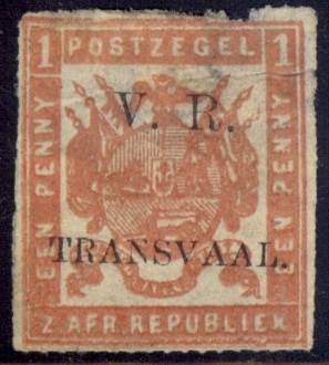


5)
Sc. 122 - or reprint / fake?
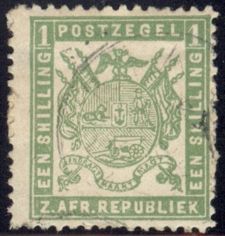


6)
'D' not touching ribbon - forgery?


7)
'D' almost - but not quite touching ribbon - forgery?


Any help would be most appreciated - anyone?

Send note to Staff

Pillar Of The Community
Norway
1661 Posts
Posted 05/17/2015   9:58 pm  Show Profile Bookmark this reply Add Blaamand to your friends list  Get a Link to this Reply
I overlooked the possibility that 1) could be Scott #11a. Maybe the poor, overinked impression matches better with being a 'Local printing'?
Send note to Staff  Go to Top of Page
Valued Member
Australia
415 Posts
Posted 05/17/2015   10:45 pm  Show Profile Bookmark this reply Add pagoda to your friends list  Get a Link to this Reply
I wouldn't hold much hope for this one


The forger had a spelling problem with POSTZEGEL,


Pagoda
Send note to Staff  Go to Top of Page
Pillar Of The Community
Norway
1661 Posts
Posted 05/17/2015   11:22 pm  Show Profile Bookmark this reply Add Blaamand to your friends list  Get a Link to this Reply
Pagoda - thanks for the feedback! My 'gut' feeling also tells me 1) is a crude forgery...but I still had a small hope the strange 'P' and the missing bar in 'E' could be have been caused by (very!) poor impression/poor local print. But I realize it is most likely simply a poor forgery...

What about the others - anyone?
Send note to Staff  Go to Top of Page
Pillar Of The Community
United Kingdom
1255 Posts
Posted 05/18/2015   01:54 am  Show Profile Bookmark this reply Add Tim H to your friends list  Get a Link to this Reply
Blaamand, most of the first batch are reprints from the Celliers 1875 printing; the 3d lilac and 1s fill me with a bit of suspicion as well but I'd have to compare them next to other examples. They have nice clear impressions and are on relatively thin paper. The postmarks look genuine, but I don't have Matthews with me so I won't be able to confirm just yet. In your other photos, 1, 3 and 4 look genuine. The others are a poor example of the forger's art. Forgery and reprinting is rife in early Transvaal. Hope this helps and I'll try and get back later with the postmark info and more thoughts on the first batch.
Send note to Staff  Go to Top of Page
Pillar Of The Community
United Kingdom
1255 Posts
Posted 05/18/2015   04:02 am  Show Profile Bookmark this reply Add Tim H to your friends list  Get a Link to this Reply
Blaamand, the lass managed to get a quick look at Matthews before she scooted off to work and this is what I get:
Krugerspost is postmark 27
Strydkraal is postmark number 21
Zeerust is postmark number 8
Pretoria is postmark number 1

The 1d black and 3d lilac may be Otto printings from 1871 although these were reprinted extensively for collectors in Europe. The postmark number 19 is for Bushman's Spruit and 17 is for Pietersburg, but the circles look too thin for a contemporary strike. Compare with postmark "21" for example.

Your 3d lilac (#3) may be a fiscal use. The cancellation look interesting as it has the "barred oval" form of British Colonial Post Offices. The number in the centre is 1, indicating Pretoria.

I am 2000 km away from reference books and my collection, so this is the best I can do! Transvaal is one of those countries where you need to have lots of stamps to compare and have a good idea of the paper type, better still sit with an expert (which I have managed to do) and sort the wheat from the very abundant chaff.

Hope this helps. Tim
Send note to Staff  Go to Top of Page
Pillar Of The Community
Norway
1661 Posts
Posted 05/18/2015   07:13 am  Show Profile Bookmark this reply Add Blaamand to your friends list  Get a Link to this Reply
Tim - thanks a lot! Yepp, this Transvaal stuff is really difficult, with plentiful of forgeries of various quality - and if authentic, several different printings/paper types etc..
Quote:
the 3d lilac and 1s fill me with a bit of suspicion as well but I'd have to compare them next to other examples

I believe you mean the 3d and 1s from my batch of supposed counterfeits?
Here are some better images if you have a chance to look more closely


8) 3d lilac


9) 1s


Very useful information on the postmarks! If I understand you correctly the first batch are most probably forgeries of the 1875 printing (originally by the the stampcommision Pretoria on pelure parer acc. to Scott) - some having authentic/CTO strike, whilst the '17' and '19' strike is replicated later? (Probably also the very fine '27' strike?)


Quote:
In your other photos, 1, 3 and 4 look genuine

Still some hope then! What printing would you think 1 and 3 is from?

Thank you so much for helping!
Send note to Staff  Go to Top of Page
Pillar Of The Community
Norway
1661 Posts
Posted 05/18/2015   11:47 am  Show Profile Bookmark this reply Add Blaamand to your friends list  Get a Link to this Reply
I am hoping anyone can assist with more tell-tale signs of forgeries. My Scott catalogue states that if the 'D' of 'EENDRAGT' is not touching the ribbon above, then it is a forgery (desgin A1) Can anyone confirm if this is an absolute sign, for all the different (and authentic) printings? Or does some authentic printings actually have the 'D' not touching the ribbon?

(Tim: I received your mail in my inbox, thank you very much! Your Transvaal collection is really amazing Your scan would probably be a very good reference, but unfortunately the resolution does not allow me to study any details beyond the general impression. So I am not able to see the 'D' on the scan of your expertized stamps)

Tim believes that my stamp no 1) is authentic (overinked amateur impressions of M.J. Viljoen) - the same stamp that I and Pagoda believed to be a poor forgery. For now I go with Tim as he has studied these stamps in detail with experts.

For now my conclusion is that this Transvaal stuff is quite complicated, first of all to establish what is authentic or not. Secondly to identify the printing/paper on whatever found to be authentic.

Does anybody have any other information about - or good links - concerning how to identify Transvaal forgeries? Or how to separate the different authentic printings from each other?
Send note to Staff  Go to Top of Page
Pillar Of The Community
United Kingdom
1255 Posts
Posted 05/18/2015   2:35 pm  Show Profile Bookmark this reply Add Tim H to your friends list  Get a Link to this Reply
Jon, I have never found the "EENDRAGT" clue to be completely infallible although it can be good for the clearer printings. The short flagstaff at bottom right stops short of the central shield; this can be more useful.

A lovely example of Viljoen's horrors is shown below. His efforts are best described as amateurish and he never got a contract to print any more stamps after these:


How do you look for plate differences in this?
Send note to Staff  Go to Top of Page
Pillar Of The Community
Norway
1661 Posts
Posted 05/18/2015   5:44 pm  Show Profile Bookmark this reply Add Blaamand to your friends list  Get a Link to this Reply
Tim - Wow, that's an awesome example of poor impression and overinking and whatever else at the same time. Kinds of make one understand it might be difficult to look for details, at least on Viljoen's printings. I presume my stamp no.1) is a somewhat better example of the same printer then.

Thanks for the tip concerning the flagpole at the lower right. I actually came across a description of the same on another forum, where the difficulties of these stamps was discussed in more detail. (Moderator - is allowed to post links to threads in other stampforums in here?)

Is anybody else into Transvaal
Send note to Staff  Go to Top of Page
Valued Member
United States
262 Posts
Posted 05/18/2015   6:03 pm  Show Profile Bookmark this reply Add DCStamps to your friends list  Get a Link to this Reply
Thanks Jon for starting this.

I have always avoided going through my Transvaal stamps as there are so many forgeries and reprints out there. Can anyone suggest a good reference?

Tim, you mentioned "Williams"? What reference are you referring to?

Michael
Send note to Staff  Go to Top of Page
Pillar Of The Community
Norway
1661 Posts
Posted 05/18/2015   6:34 pm  Show Profile Bookmark this reply Add Blaamand to your friends list  Get a Link to this Reply
Hi Michael,
Funny, I actually visited your website earlier today, hoping you had already mapped the landscape for Transvaal!

Not so, but I am sure you will make a hell of a job at it once you get going. Your 'transistion chart' for SA was very nice. btw - I like your new avatar!

Let's hope someone can enlighten the mystery of Transvaal.

Jon
Send note to Staff  Go to Top of Page
Valued Member
Australia
415 Posts
Posted 05/18/2015   7:10 pm  Show Profile Bookmark this reply Add pagoda to your friends list  Get a Link to this Reply
Tim,

are you saying that the C for the 1st. E in POSTZEGEL is normal, even for overinking I find this hard to believe,


Pagoda
Send note to Staff  Go to Top of Page
Valued Member
Australia
415 Posts
Posted 05/18/2015   7:31 pm  Show Profile Bookmark this reply Add pagoda to your friends list  Get a Link to this Reply
Blaamand, it is not a missing bar in E, it is a C for E, there are many other anomalies,

Pagoda
Send note to Staff  Go to Top of Page
Edited by pagoda - 05/18/2015 7:33 pm
Pillar Of The Community
Norway
1661 Posts
Posted 05/18/2015   10:33 pm  Show Profile Bookmark this reply Add Blaamand to your friends list  Get a Link to this Reply
Pagoda,
I agree with you the 'E' looks very funny However I have seen several other expertized copies of the Viljoen printings - for some of them the printing is so poor that some of the letters get all messed up. See the example below, the first 'E' in 'ZEGEL' looks more like a 'C' here as well:


I have seen several other expertized Viljoen copies with an even more poor and overinked printing than mine, with more funny letters than mine also. So I am still thinking my copy could also be Viljoen - but I am absolutely not convinced.

However by looking at the expertized sample above, it seems to be all about anomalies - the overinking obliterates almost all details. Pretty much like on mine, don't you think?
Send note to Staff  Go to Top of Page
  Previous TopicReplies: 14 / Views: 4,096Next Topic  
 
To participate in the forum you must log in or register.

Go to Top of Page

Disclaimer: While a tremendous amount of effort goes into ensuring the accuracy of the information contained in this site, Stamp Community assumes no liability for errors. Copyright 2005 - 2026 Stamp Community Family - All rights reserved worldwide. Use of any images or content on this website without prior written permission of Stamp Community or the original lender is strictly prohibited.
Privacy Policy / Terms of Use    Advertise Here
Stamp Community Forum © 2007 - 2026 Stamp Community Forums
It took 0.2 seconds to lick this stamp. Powered By: Snitz Forums 2000 Version 3.4.05