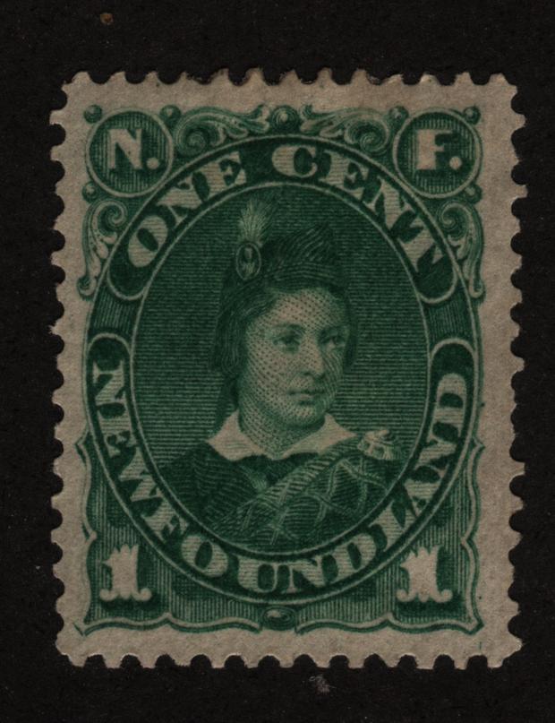
Here are the versions of my mint stamps; a few comments (subjective and my viewpoints, apologies in advance):
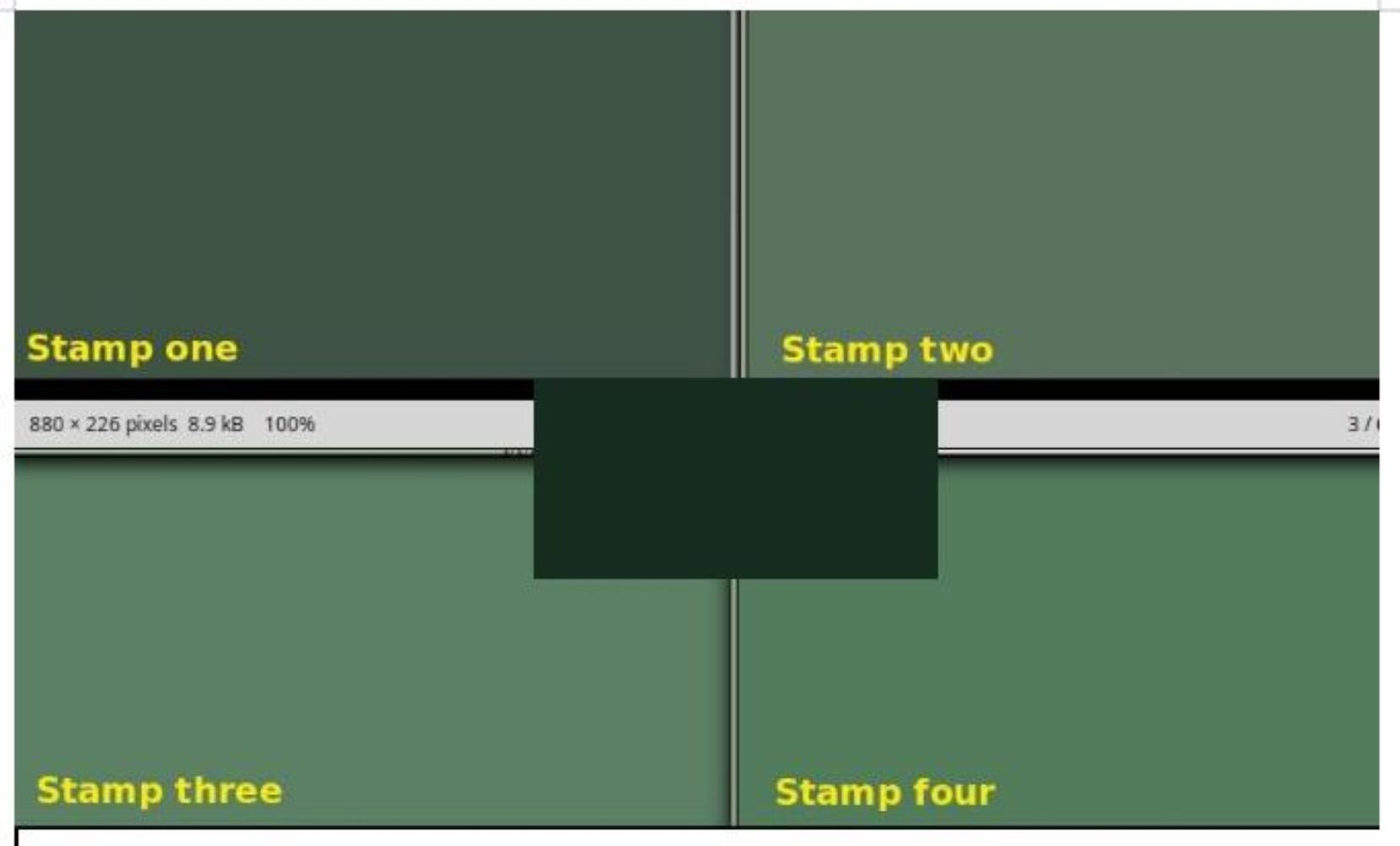
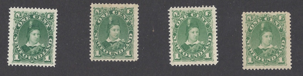
1. These 4 color versions are very hard to distinguish and probably the best way is to have side by side comparison under bright light and good magnifying lenses or the like. Looking at one by itself and divining which would take a color expert.
2. I'm reasonably confident that these are accurate : 3 of them came from Eastern Auctions or Gary Lyon over the last 20 years and one predated the others.
3. The first stamp on the left is #44 and is deep or dark green and was issued in 1898
4. The second stamp from the left is #44a and is gray green and was issued in 1888
5. The next stamp over (to the right of #44a) is #45 and is just green; from November 1, 1887 (first issue of the bunch)
6. The far right stamp is #45a and is yellow green from 1896.
7. The values are all similar, so it almost doesnt matter except for really fussy people (like me).
8. If you look closely at the image (or for me in real life), I think it is subtle but clear that there are differences. The deep green looks darker. the next one has some gray in it. the next one is, well, not like the first two and just "green". and the far right pops in comparison with yellow in it.
Why the shades? Boggs' seminal book is sort of vague on this specific stamp, but does reference and relate many of the color changes during this time period to be tied to the British American Bank Note Company in Montreal, who used plates from the old American Bank Note Company, compounded by repeated reprint orders from the Newfoundland government during this decade.





 Posted 06/01/2015 3:36 pm