Stamp Community Family of Web Sites
Thousands of stamps, consistently graded, competitively priced and hundreds of in-depth blog posts to read


Stamp Community Forum
 
Username:
Password:
Save Password
Forgot your Password?

This page may contain links that result in small commissions to keep this free site up and running.

Welcome Guest! Registering and/or logging in will remove the anchor (bottom) ads. It's Free!

Scott #198- Difference In Design.

 
To participate in the forum you must log in or register.
Author Previous TopicReplies: 12 / Views: 2,226Next Topic  
Rest in Peace
7742 Posts
Posted 08/30/2015   5:17 pm  Show Profile Bookmark this topic Add wert to your friends list Get a Link to this Message
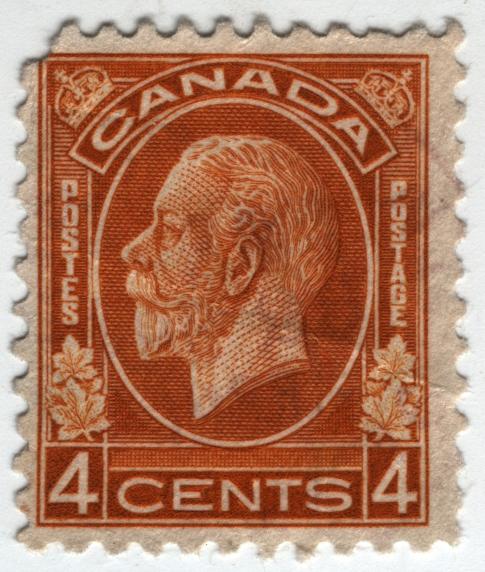
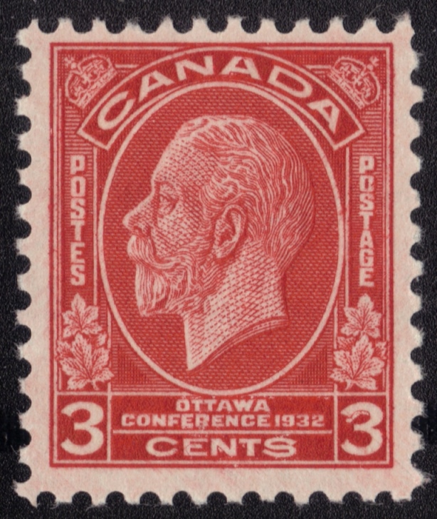
Hi guys...Not earth shattering news but take a look at this old scott #198 King George V stamp...


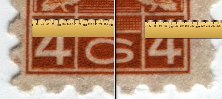
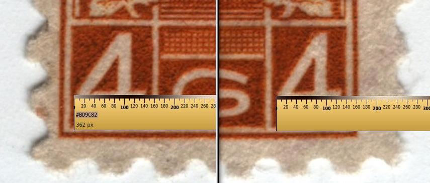
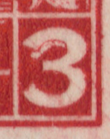
THE LEFT NUMERAL BOX ON TH LEFT IS 160 PIXELS AND THE
RIGHT NUMERAL BOX IS 149 PIXELS WIDE.


THE HORZ. PART OF THE NUMERAL ON THE LEFT IS 143 PIXELS
AND THE RIGHT NUMERAL IS 130 PIXELS LONG

VERY BAD DESIGN SYMMETRY..HAHA

Ya,ya, I know it is in bad shape..was just trying to show the difference..that's all.
Send note to Staff
Edited by wert - 08/31/2015 08:06 am

Pillar Of The Community
United States
8956 Posts
Posted 08/30/2015   5:38 pm  Show Profile Bookmark this reply Add Petert4522 to your friends list  Get a Link to this Reply
I think the designer did not realize someone by the name of Wert was going to scrutinize his work!
By the way Robert, you might want to edit the title of this thread? It is Scott 198, not #1!


Peter
Send note to Staff  Go to Top of Page
Edited by Petert4522 - 08/30/2015 5:40 pm
Pillar Of The Community
United States
845 Posts
Posted 08/30/2015   7:10 pm  Show Profile Bookmark this reply Add HungaryForStamps to your friends list  Get a Link to this Reply
Design is an aesthetic enterprise. Symmetry and appeal to the ruler may not be the goal.
Send note to Staff  Go to Top of Page
Pillar Of The Community
United States
725 Posts
Posted 08/30/2015   7:19 pm  Show Profile Bookmark this reply Add watermark to your friends list  Get a Link to this Reply
Wert if your going to worry about that you may also note the letters in POSTES are larger than those of POSTAGE.
Send note to Staff  Go to Top of Page
Edited by watermark - 08/30/2015 7:20 pm
Moderator
Learn More...
United States
5103 Posts
Posted 08/30/2015   7:33 pm  Show Profile Bookmark this reply Add Partime to your friends list  Get a Link to this Reply
I'd be more worried about some other things:

1. That ugly torn upper corner.
2. The color is supposed to be Ochre

(Just having fun ...)
Send note to Staff  Go to Top of Page
Valued Member
Canada
84 Posts
Posted 08/31/2015   5:05 pm  Show Profile Bookmark this reply Add hutin to your friends list  Get a Link to this Reply
OH MY GOD!
Send note to Staff  Go to Top of Page
Valued Member
Canada
84 Posts
Posted 08/31/2015   5:07 pm  Show Profile Bookmark this reply Add hutin to your friends list  Get a Link to this Reply
i agree with partime; please burn this stamp
Send note to Staff  Go to Top of Page
Rest in Peace
7742 Posts
Posted 08/31/2015   8:26 pm  Show Profile Bookmark this reply Add wert to your friends list  Get a Link to this Reply
Come on guys...Just trying to explain the difference..Don't need negative comments about this crappy stamp..ok

Robert
Send note to Staff  Go to Top of Page
Pillar Of The Community
United States
8956 Posts
Posted 08/31/2015   8:58 pm  Show Profile Bookmark this reply Add Petert4522 to your friends list  Get a Link to this Reply
Robert, just having fun! But really, have you ever considered trying to find out the what and the why? I mean, this difference is so obvious that even a blind man can see it. When this stamp was released did no one notice?
Seems to me that someone should have written an article about this at one time or another?

Peter
Send note to Staff  Go to Top of Page
Pillar Of The Community
Canada
5821 Posts
Posted 08/31/2015   9:14 pm  Show Profile Bookmark this reply Add lithograving to your friends list  Get a Link to this Reply

Quote:
OH MY GOD!


Quote:
i agree with partime; please burn this stamp


@hutin

If you're trying to be funny I could understand.

If you're serious then you're really rude.


Send note to Staff  Go to Top of Page
Rest in Peace
7742 Posts
Posted 09/01/2015   1:32 pm  Show Profile Bookmark this reply Add wert to your friends list  Get a Link to this Reply

Quote:
I think the designer did not realize someone by the name of Wert was going to scrutinize his work!
....
Thanks Peter.


Quote:
Wert if your going to worry about that you may also note the letters in POSTES are larger than those of POSTAGE.
...Ya watermark, just to occupy the same area I presume.


Quote:
i agree with partime; please burn this stamp

I hope you were joking as Peter said...

Robert
Send note to Staff  Go to Top of Page
Pillar Of The Community
Canada
728 Posts
Posted 09/01/2015   7:37 pm  Show Profile Bookmark this reply Add jimjung to your friends list  Get a Link to this Reply
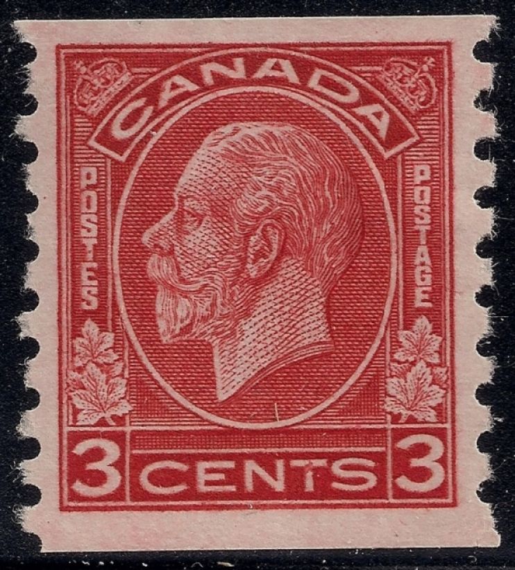
Here's a couple of weirdo wacko stamps from this issue to keep the excitement alive.


Send note to Staff  Go to Top of Page
Valued Member
Canada
84 Posts
Posted 09/02/2015   6:09 pm  Show Profile Bookmark this reply Add hutin to your friends list  Get a Link to this Reply
of course I was joking
Send note to Staff  Go to Top of Page
  Previous TopicReplies: 12 / Views: 2,226Next Topic  
 
To participate in the forum you must log in or register.

Go to Top of Page

Disclaimer: While a tremendous amount of effort goes into ensuring the accuracy of the information contained in this site, Stamp Community assumes no liability for errors. Copyright 2005 - 2026 Stamp Community Family - All rights reserved worldwide. Use of any images or content on this website without prior written permission of Stamp Community or the original lender is strictly prohibited.
Privacy Policy / Terms of Use    Advertise Here
Stamp Community Forum © 2007 - 2026 Stamp Community Forums
It took 0.21 seconds to lick this stamp. Powered By: Snitz Forums 2000 Version 3.4.05