| Author |
 Replies: 74 / Views: 18,638 Replies: 74 / Views: 18,638 |
|
Pillar Of The Community
United States
1033 Posts |
|
|
I know color isn't great to analyze on the board as monitors are all different, but I'll give this a try. Recently I noticed that scott#63 has quite different valuations in different shades: 63 (blue, pale blue or bright blue)- least valuable 63a (ultramarine)- The most valuable 63b (dark blue) When I analyze these stamps at auction house web sites, I can rarely tell the difference. I think the far left is pale blue (definitley lightest of them all), the far right is dark blue??? I don't think any are ultramarine Regardless, this exercise may be futile unless some of you get a good color image contrasting the differences on your monitor. Without a certified copy in my hand of a dark blue and ultramarine I may never be able to tell difference 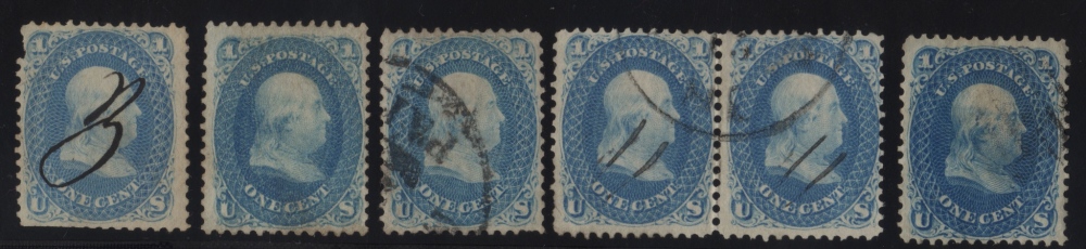 |
|
Send note to Staff
|
|
|
|
|
Pillar Of The Community
United States
1942 Posts |
|
|
I don't know if this will be of much help, but here is a reduced version of a page from the award winning exhibit of 1861 material assembled by the eminent philatelic judge (National and International) Richard Drews. Rich is perhaps the greatest living authority on these stamps, and in this page you have all of the Scott listed color varieties side by side under a single light source.  Let me know if you want to see any section up close. Edit: Here is a closer look at the set of color shades in the top row (you may need to click on the image for the full size):  |
Send note to Staff 
|
| Edited by essayk - 02/09/2016 11:14 pm |
|
|
Pillar Of The Community
United States
1347 Posts |
|
|
He is also the preeminent 3c 1861 expert, too...
Thanks for posting this, Essay.... |
|
Send note to Staff
|
|
|
Valued Member
United States
175 Posts |
|
|
Valued Member
United States
80 Posts |
|
|
Essay,
That is a beautiful page and an excellent reference. Thanks for the posting--bookmarked.
Art |
|
Send note to Staff
|
|
|
Pillar Of The Community
United States
1033 Posts |
|
|
Essay, agree with above. Awesome post... Very helpful!!
I think I figured out colors based on these references.
Thanks
rg |
|
Send note to Staff
|
|
|
Pillar Of The Community
United States
1942 Posts |
|
|
My pleasure. I will pass the word on to Rich if I see him tomorrow. Now that you have a tool, let's put it to the test (and once again reveal the limitations of online comparisons). Here is a group from my collection scanned together with the same light source (one lighting condition for all): 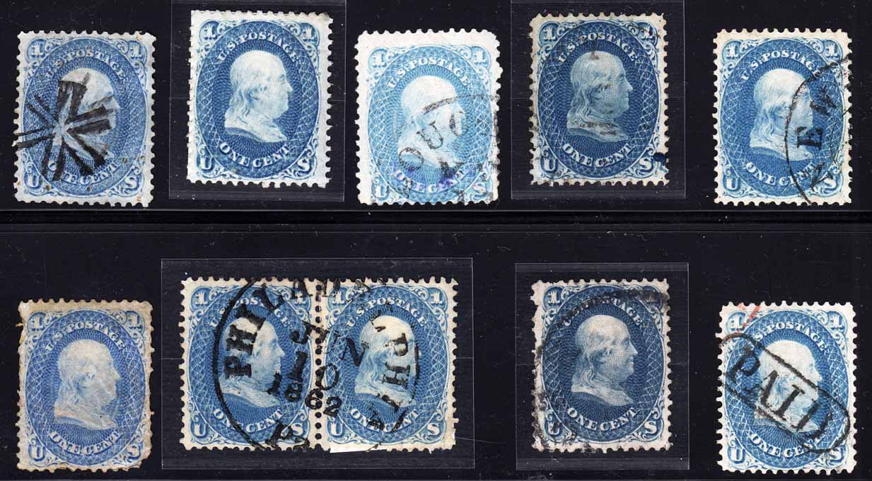 So which of the color types do we have here? Some may be duplicated. The Scott list: blue pale blue bright blue ultramarine dark ultramarine dark blue Which, if any, of the Scott colors is missing? One in my group is certified dark blue (63b) One is on thin paper (not separately listed) To start you off, the two on the right (top/bottom) are both basic "blue" |
|
Send note to Staff
|
|
|
Pillar Of The Community
United States
1033 Posts |
|
|
Two stamps second from right up/down look dark blue. Pale blue for 3rd on top
|
|
Send note to Staff
|
|
|
Pillar Of The Community
United States
1033 Posts |
|
|
Pillar Of The Community
United States
1942 Posts |
|
|
Quote:
Two stamps second from right up/down look dark blue. Pale blue for 3rd on top
You are doing well with these. Right on the button. The top row dark blue (63b) has a cert. The one on the bottom row has not yet been submitted. Quote:
Pale blue and ultramarine are a nightmare for my eyes to discriminate Okay. Chances are ultramarine has not been explained to you. Let's look at that in two steps. I have taken the liberty of bringing together those examples from the Drews page side-by-side, and setting them opposite what should be corresponding examples from the group in my collection. I will try to discuss the correspondences with you, noting the differences, but first I need to know how much you are seeing.  1. do you see two parallel sets of "intensity" (value) differences between the stamps in each set of three images? If so, in each set, rank them by "lightness" or "darkness" 2. In the upper set, are you seeing three distinct color shades (chroma and hue)? In the lower set, same question - are you seeing three distinct color shades? 3. Do you see a difference between his "ultramarine" and mine? |
|
Send note to Staff
|
|
|
Pillar Of The Community
United States
1033 Posts |
|
|
Now that you lined them up I definitely see the 3 different color shades in top group!
Ultramarine definitely looks different than blue and pale blue. Pale blue looks lightest intensity and blue darkest.
|
|
Send note to Staff
|
|
|
Pillar Of The Community
United States
1347 Posts |
|
|
Pillar Of The Community
United States
845 Posts |
|
|
My problem with these color determinations is discriminating the blue from ultra. For example, just going by the online images, I want to say the blue in your set is ultramarine whereas the ultramarine is blue. I see a chalky "shade" of blue in the rightmost and the smallest hint (undertone) of green in the leftmost.
It probably really helps to see them in person. |
|
Send note to Staff
|
|
|
Pillar Of The Community
Norway
1661 Posts |
|
|
Essayk - most interesting! Bookmarked. I was actually thinking the somewhat troubled stamp in your group, the one on lower left corner, would be the ultramarine... I am thinking ultra as a intense-bright-blue but at the same time also ice-blue and 'happy-blue', however contradicting that might sound. And - add a very faint shine of violet/lilac. Shades are impossible to describe....such a shame a standard color-guide has not been made yet. I have the feeling Scott, Stanley Gibbons , Michel and others describe shades quite differently.  Rgstamp - thanks for starting this thread |
|
Send note to Staff
|
|
|
Pillar Of The Community
United States
1033 Posts |
|
|
Ray.mac-- I have always thought ultramarine should have a greenish tinge as well--- its really hard for me to see it. Sometimes I think I imagine a greenish hue, but its really not there, especially as the shade of blue lightens. I just don't see much green in any of the ultramarine in these scans.
|
|
Send note to Staff
|
|
|
Pillar Of The Community
Norway
1661 Posts |
|
|
btw - ultramarine comes from Latin 'ultra' (other side) and 'mare' (sea/ocean) and can be translated into something from the other side of the sea. The sea in this case (for the Italians) were obviously the Mediterranean and 'the other side' must have been imported goods supplied from abroad, mostly Persia, India and beyond. |
|
Send note to Staff
|
|
|
Replies: 74 / Views: 18,638 |
|


