| Author |
 Replies: 74 / Views: 18,639 Replies: 74 / Views: 18,639 |
|
|
|
Pillar Of The Community
United States
1942 Posts |
|
|
Quote:
I was actually thinking the somewhat troubled stamp in your group, the one on lower left corner, would be the ultramarine...
It is, but a slightly paler version of ultramarine than the one I chose to highlight. I do not think that the sample I selected is deep enough to be dark ultramarine, but it is certain that the banged up stamp is a better example of the shade. (I originally did a pic that featured it this way, and weenied out of using it.) [Edit: That stamp is also on thin paper, which is odd, but part of the reason it looks as it does. I'd soak it to flatten it out, but I don't want to risk altering the shade.] What's going on with these sets of three? Because of my work with shades of the 1c Banknote issues, for which the principle color is described as ultramarine rather than blue, I have become sensitive to what ultramarine should look like in the mixes of pigments used for the issue of 1861 as well. Ultramarine is a slightly "warmer" tone than the Prussian and Cobalt blue tones we usually think of and call "blue." It has more red in it, not green as some of you were suggesting. If you don't believe that, check out this website for a company that makes artists paints: http://www.gamblincolors.com/artist....oils/blues/ Four of the first five color types they illustrate and discuss were available from the mid-nineteenth century on. In the second row I am showing you the stamps in my group which correspond one-to-one with the shades on the Drews page, but now on a black background and viewed by a different scanner. I don't know how useful vertical comparisons are going to be with that, but the horizontal comparisons show that the intensity differences we saw in the Drews page have carried over to the set of three on black. However, on mine the hue and value differences are more apparent than what their counterparts on the Drews page are showing for the ultramarine and pale blue shades. I will see Rich tomorrow, I think, and if I do I intend to ask him about that (with my samples at hand). But I have no hesitation in offering these images as examples of the various Scott listed shades. |
Send note to Staff 
|
| Edited by essayk - 02/11/2016 01:02 am |
|
|
Pillar Of The Community
Norway
1661 Posts |
|
|
Quote:
It has more red in it  I use a slight shine of violet/lilac as an indicator for ultra, which is the result when a little red is mixed with blue. I also think the banged up is a better example of the shade, and on my screen the other of your ultra stamps appears to me dark ultra.... Then again, scanning a stamp and judging shades on a screen is different from real life. Thanks for sharing. |
|
Send note to Staff
|
|
|
Pillar Of The Community
United States
1942 Posts |
|
|
Well the good news is that last night Rich Drews and I had a chance to discuss the batch of 1861 1c stamps I've shown here. The bad news is that we only had an old lamp with a tungsten bulb in it to use as our light source. 3200 degrees Kelvin is not very friendly to reds. The long and the short of it: Rich is quite sure that the banged up stamp is the true ultramarine shade as cataloged for this stamp. The slightly deeper example (with the radial cancel) he is not sure about, but given the poor lighting cannot rule it out as the dark ultramarine. So ... as we were leaving at the end of the night, I asked him if we could follow up and, so prodded, he offered to bring some of his material along for a "session." (Something he and I have done several times down through the years.) At the next Collectors Club of Chicago meeting (March 10) we are going to bring along material from our collections, find a spot with good sunlight in the third floor study room, and compare, compare, compare. Those sessions can get interesting, and we both get a kick out of it. When we have beaten it to death I will get back to you and let you know what comes out of it. For now, however, you have this revised version of my earlier composite, about which I spoke but did not show: 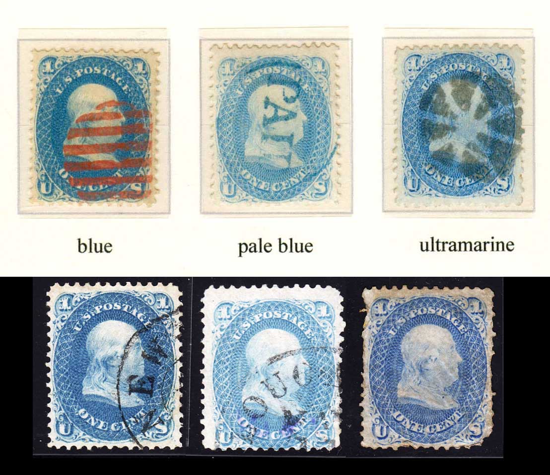 My ultramarine example here isn't very pretty, but it is right on for shade. |
|
Send note to Staff
|
| Edited by essayk - 02/12/2016 3:27 pm |
|
|
Pillar Of The Community
1849 Posts |
|
|
Pillar Of The Community
1849 Posts |
|
|
Pillar Of The Community
United States
1942 Posts |
|
|
Quote:
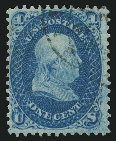
#63 deep blue variety
Not familiar with that shade, Kevin, and with a solo pic I can't tell on my screen how it would compare with anything listed in Scott. Given the nomenclature, I understand it to be a normal blue (hue) that differs in intensity (value) from the norm, but still with the same black level (chroma). This makes it different than the 63b dark blue, which has a higher black level for a given intensity. To what does this one compare in the earlier groups by Drews or me? |
|
Send note to Staff
|
|
|
Pillar Of The Community
1849 Posts |
|
|
Pillar Of The Community
United States
1033 Posts |
|
|
That looks dark blue to me. I think PF made mistake and meant "dark" blue. They even put 63b on cert |
|
Send note to Staff
|
|
|
Pillar Of The Community
1849 Posts |
|
|
Pillar Of The Community
United States
1033 Posts |
|
|
Pillar Of The Community
United States
1033 Posts |
|
|
Pillar Of The Community
United States
1033 Posts |
|
|
I think certs like this are what drive a collector out of hobby. Nomenclature is everything. Sadly some one sent that to PF and stil has no idea what scott# they got. Is it 63b or some variety NOT listed in Scott making it super rare! I hate to see this. |
|
Send note to Staff
|
|
|
Pillar Of The Community
United States
1033 Posts |
|
|
Kevin,
U going to resubmit it or ask Scott to add deep blue to possible color variations? Perhaps rich drews can take a look for you?
I still think it is definitely dark blue as subtle color differences again can drive people never to submit/collect and eventually get fed up with the hobby! |
|
Send note to Staff
|
|
|
Pillar Of The Community
United States
1942 Posts |
|
|
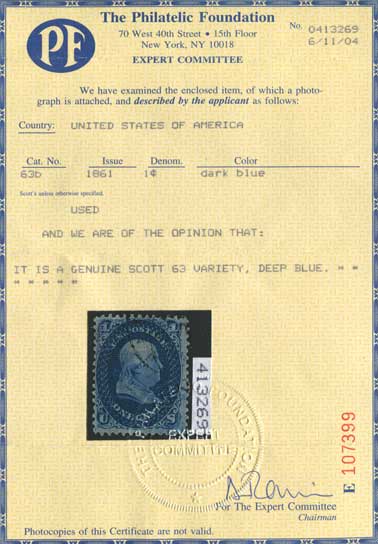
Kevin,
The PF was not consistent with its own standards with that cert, and should be challenged to reconsider. Back at that time (2004) a yellow cert normally signaled an affirmation that the item is what the person who submitted it had queried; in this case 63b - dark blue. If they chose to certify it as something else they used a blue background cert.
But in the determination paragraph on this one they said merely that it is a #63 variety, namely deep blue. They did not say it is a #63b which Scott lists as dark blue. In the Munsell nomenclature "dark blue" (chroma difference) is not that same thing as "deep blue" (value difference). They are not equivalent, especially in a formal determination. In their response the PF did not affirm either the original number nor the queried color, so they should not have made that kind of change on a yellow cert. It was sloppy, and the submitter is left to ask them again for further clarification.
I just ran into that same kind of problem with an item I had Siegel place on extension with the PF asking, "Is this a precancel usage?" Siegel altered the question into "Is this X "tied by Glen Allen Star precancel...?" to which the PF responded, "it is a genuine usage the cover with a corner..."(condition details). So I had to ante up on the affirmative. But really, they did not answer the question. At issue? - Does/Can a precancel ever "tie" a stamp to cover?
With the new rate structure they seem to have done away with the yellow/blue distinction, so you can't read their minds as well. If I were you I would call them to inquire about what they meant to say with that cert. Or leave it for the buyer who is hoping for a 63b with a clean cert. |
|
Send note to Staff
|
|
|
Pillar Of The Community
United States
911 Posts |
|
|
Quote:
Back at that time (2004) a yellow cert normally signaled an affirmation that the item is what the person who submitted it had queried; in this case 63b - dark blue. If they chose to certify it as something else they used a blue background cert. I have never seen a blue background PF cert. At some point the PF switched from the yellow certs to blue on white certs but to the best of my knowledge all of the certs (good and bad) were yellow during that period. |
|
Send note to Staff
|
| Edited by SPQR - 02/13/2016 12:57 pm |
|
|
Replies: 74 / Views: 18,639 |
|