| Author |
 Replies: 11 / Views: 1,430 Replies: 11 / Views: 1,430 |
|
|
Valued Member
447 Posts |
|
|
|
|
Pillar Of The Community
United States
2544 Posts |
|
|
Valued Member
447 Posts |
|
|
Pillar Of The Community
6327 Posts |
|
|
The top row contains 2p stamps with 3 different catalog numbers. I don't have a catalog handy, but the center stamp has the large oblong security perforations at the sides. Then comparing the upper left and the upper right stamps - look at the length of the base of the numeral 2 - quite a difference. Three issues in 3 slightly different shades. The vertical rows of dots on the top center stamp are from postal processing. It is not a printing error. Here is a portion of an envelope showing similar dots, which tie the stamps to the cover. 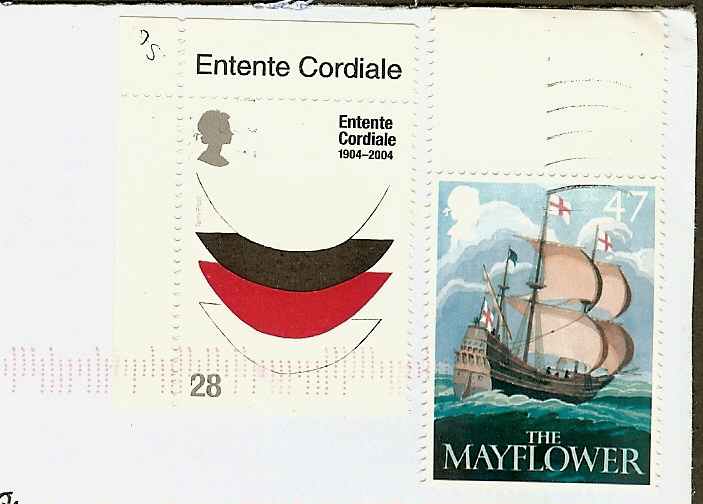 |
Send note to Staff 
|
| Edited by John Becker - 05/02/2016 10:37 am |
|
|
Pillar Of The Community
Canada
4648 Posts |
|
|
Hi. The perforations on four of the stamps you have scanned are called 'syncopated' perfs. There is another name for them too but it escapes me presently.
Chimo
Bujutsu |
|
Send note to Staff
|
|
|
Pillar Of The Community
United Kingdom
3211 Posts |
|
|
Pillar Of The Community
United States
8956 Posts |
|
|
Robi, there is a huge amount of these stamps, which are called "machins" after the designer. You can fin all about the different types etc. on the website http://adminware.ca/machins and go to "machins". Peter |
|
Send note to Staff
|
| Edited by Petert4522 - 05/02/2016 2:50 pm |
|
|
Pillar Of The Community
United States
8956 Posts |
|
|
Bujutsu, I think the Machin perfs are called "elliptical perfs". Syncopated perfs are where a pin or sometimes more are taken out of the perforator. That does leave a straight edge, not an elliptical edge.
Peter |
|
Send note to Staff
|
|
|
Valued Member
447 Posts |
|
|
Pillar Of The Community
Canada
4648 Posts |
|
|
Pillar Of The Community
United Kingdom
895 Posts |
|
|
That 2p stamp came into being in 1971 and is still in use today, with all manner of changes being made over the years - security features, digitised imaging, perf changes, self-adhesive format, you name it. The main GB catalogue - Gibbons - doesn't even bother with shades, but there will be many, and countless smaller varieties with different head types, numeral positions and so forth.
One noticeable difference, once it's been pointed out, is that they changed the design of the numbers. See how the one on the left has a much longer base line on the "2". They had to change the typeface across the range when impossibly large denominations like 20 and a half pence started being needed in that little space. |
|
Send note to Staff
|
|
|
Valued Member
447 Posts |
|
| |
Replies: 11 / Views: 1,430 |
|


