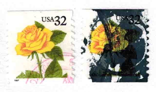
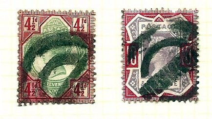
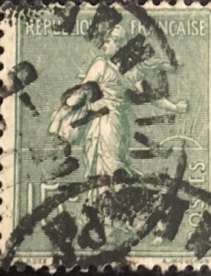
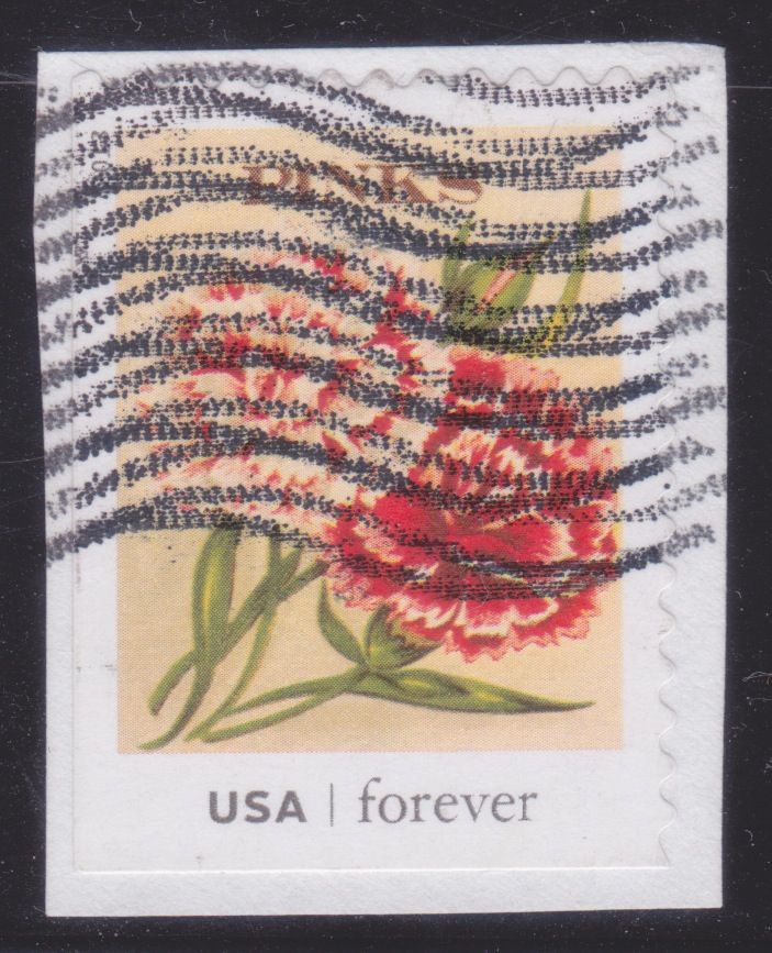
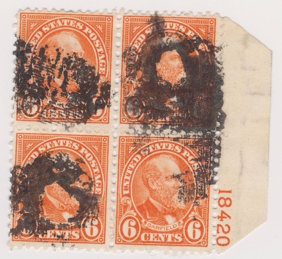
The old cork cancels on 19th century stamps could pretty much obliterate a classic stamp. Some of those cancels, however, had character and gave the item an added value based on the scarcity or desirability of the marking.
Today's amorphous, dot matrix slogan or pictorial markings have a colder, mechanical look...but they are equally as effective in obliterating the stamp image.
Let's see your heaviest or ugliest cancels. Ugliness also is in the eye of the beholder.