Stamp Community Family of Web Sites
Thousands of stamps, consistently graded, competitively priced and hundreds of in-depth blog posts to read


Stamp Community Forum
 
Username:
Password:
Save Password
Forgot your Password?

This page may contain links that result in small commissions to keep this free site up and running.

Welcome Guest! Registering and/or logging in will remove the anchor (bottom) ads. It's Free!

This Can't Be A 37B Or 37d.

Previous Page
 
To participate in the forum you must log in or register.
Author Previous TopicReplies: 30 / Views: 5,108Next Topic
Page: of 2
Valued Member
United States
254 Posts
Posted 09/23/2016   1:23 pm  Show Profile Bookmark this reply Add Aurora to your friends list  Get a Link to this Reply
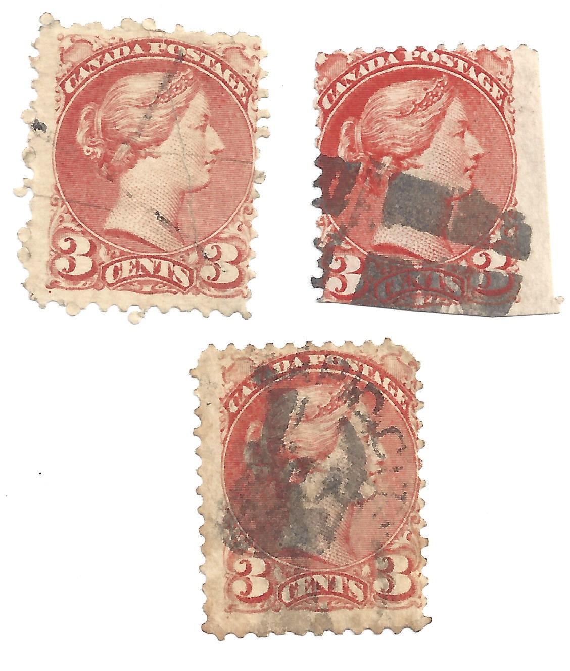
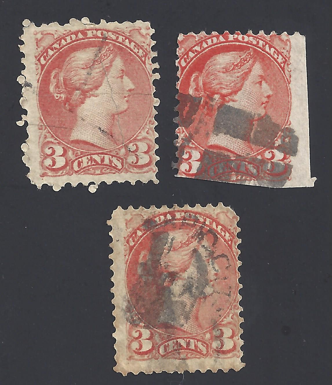
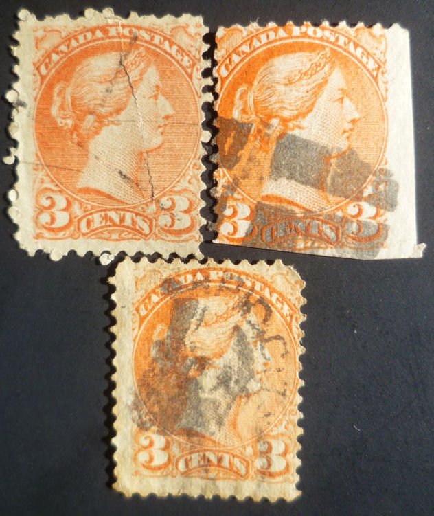
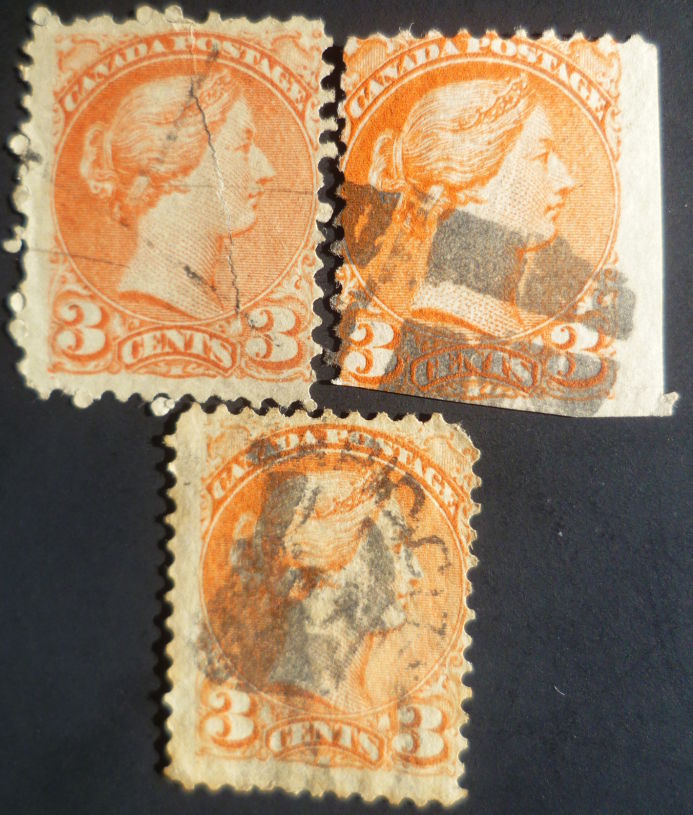
Can I join your discussion? I agree that Scanner changes the exact color. The few stamps that I have are obviously some kind of "orange", but scanner makes them look different. Only pictures reflect the color as is (but not perfectly).
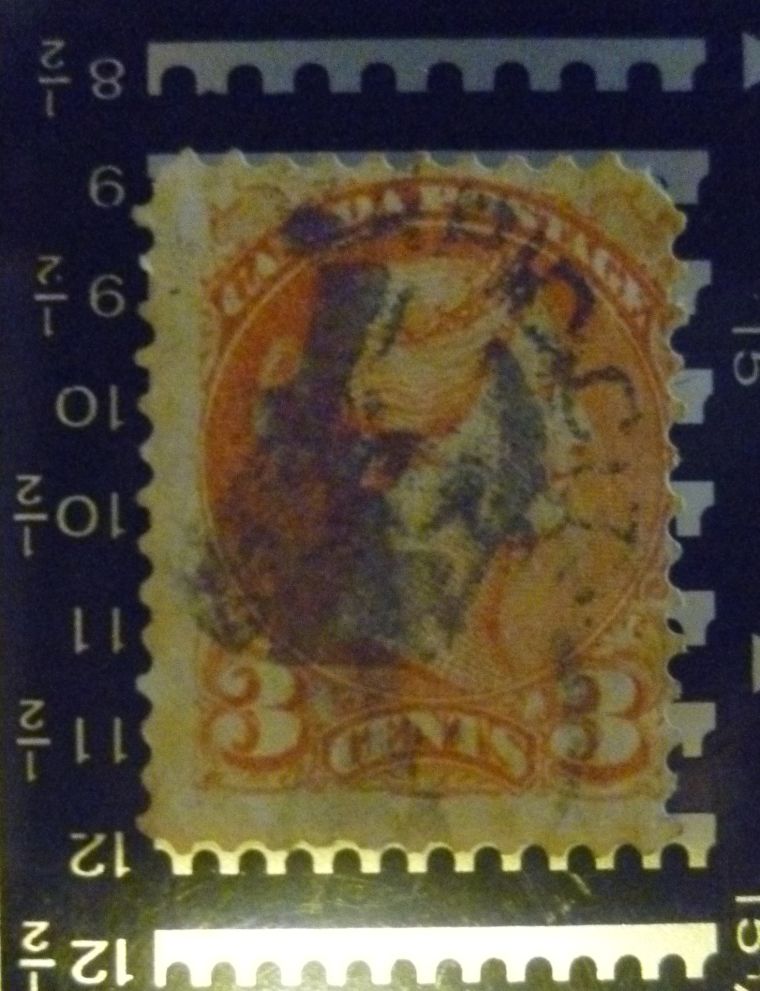
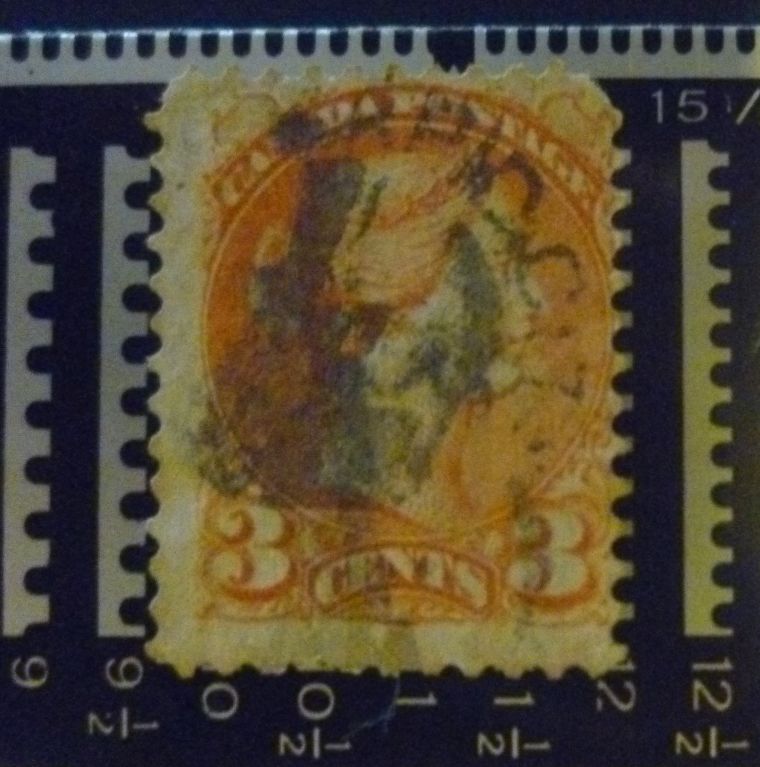
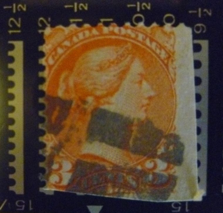
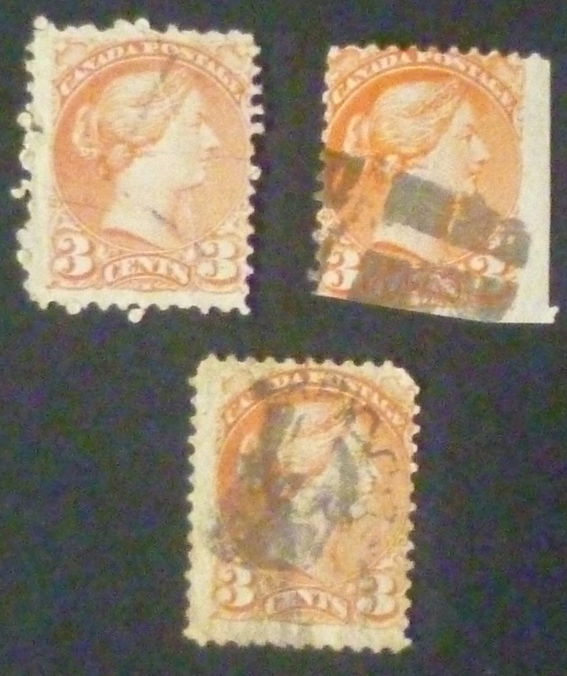
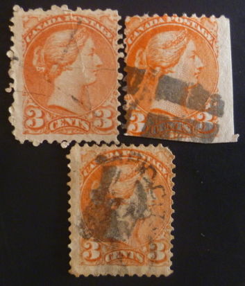
Please kindly review what I ahve. I will really appreciate, if you tell me the exact Scott numbers. Thank you!


Send note to Staff  Go to Top of Page
Edited by Aurora - 09/23/2016 1:35 pm
Rest in Peace
Canada
5701 Posts
Posted 09/24/2016   10:52 am  Show Profile Bookmark this reply Add BeeSee to your friends list  Get a Link to this Reply
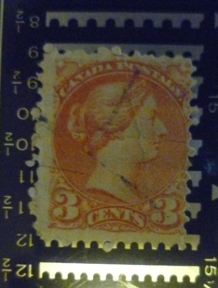
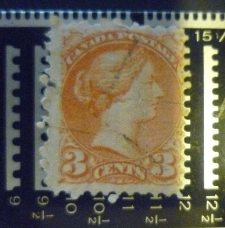
Aurora, your images are too blurry for 100% I.D. but the perf 12, orange shade and guide dots (on two) suggest Scott 37.
Send note to Staff  Go to Top of Page
BeeSee in BC
"The Postmark is Mightier than the Stamp"
http://brcstamps.com ---- BNAPS, RPSC, APS
Rest in Peace
7742 Posts
Posted 09/24/2016   11:35 am  Show Profile Bookmark this reply Add wert to your friends list  Get a Link to this Reply
Aurora....BeeSee is right..need better scans of a few of your stamps to make any intelligent analysis buddy...

Robert
Send note to Staff  Go to Top of Page
Valued Member
United States
254 Posts
Posted 09/25/2016   11:33 am  Show Profile Bookmark this reply Add Aurora to your friends list  Get a Link to this Reply
Thank you very much!
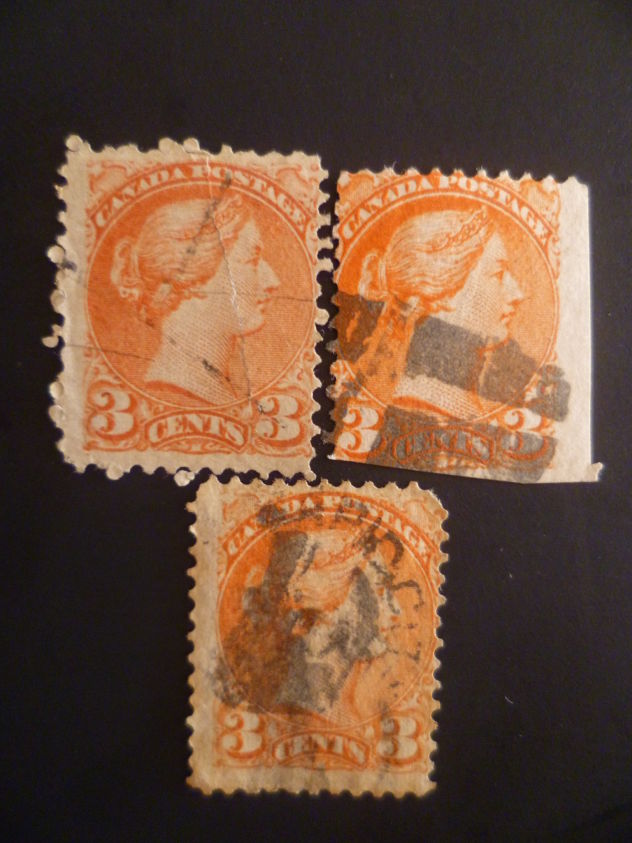
Just made a few better pics.


Send note to Staff  Go to Top of Page
Rest in Peace
Canada
5701 Posts
Posted 09/26/2016   12:15 am  Show Profile Bookmark this reply Add BeeSee to your friends list  Get a Link to this Reply
I am sticking with 37
Send note to Staff  Go to Top of Page
BeeSee in BC
"The Postmark is Mightier than the Stamp"
http://brcstamps.com ---- BNAPS, RPSC, APS
Valued Member
39 Posts
Posted 09/27/2016   11:13 am  Show Profile Bookmark this reply Add Cjusz_911 to your friends list  Get a Link to this Reply
I have scanned a couple of my early 37s as you guys suggested someone should. I don't know if this is of any help as you already noted the huge impact scanners and computer screens have on perceived colors...

As for your initial question wert, I also think it is a regular 37. It is not, strictly speaking, impossible that this stamps has been used 18 years after it's issue, but I think that unless proven otherwise, it is highly improbable.

One way I find useful to distinguish copper/indian red 3 cents from others is by paper type. I'm not, repeat NOT!, a paper expert, far from it! I always had, and still have, a hard time distinguishing between them, but the paper on the early 37 is "easy" to single out on most occasion as it is the same paper that was used on many Large Queens. You can often see the mesh on these papers, and it also have a shine to it that you will not find 1872 onwards.

So when I try and ID my early 37s, I usually flip over a couple of 3 cents Large Queens and see if there is any family resemblance.

It is not always conclusive and you always have to check for other printing characteristics, but that's something I have found usefull from time to time.

I also use the Morris color guide for the Small Queens, it is invaluable!

So here are the scans :

Please note that the name I use to describe the colors are from Hillson and Nixon's book.

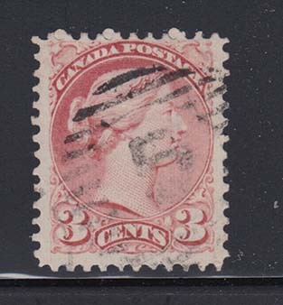
The first stamp is dated MR 70, the others are, in my opinion, variations of the same Copper/Indian red shade (37b).
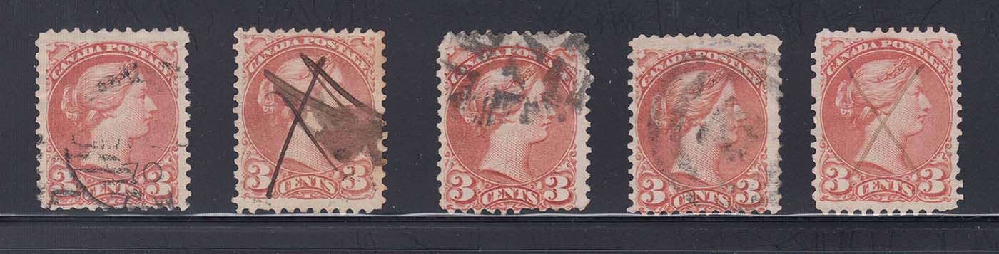


The first stamp on the following picture is dated OC 17 1870. The others are variations of the same Pale dull rose found mid to late 1870. I've seen people tag those as 37a.
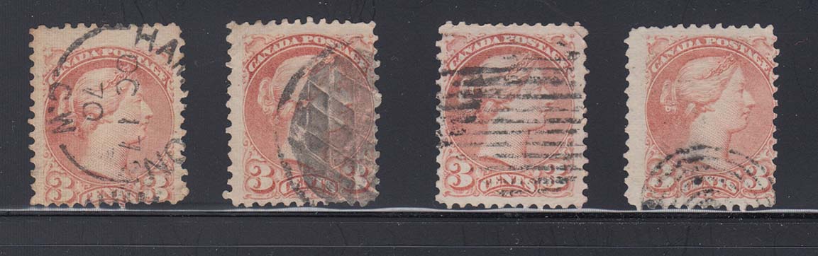


This stamp is probably a Dark rose on thick paper (37i) that can be found early 1871.


The first stamp is dated 1871. They both are shades of Rose-carmine (37a) typical of that year.
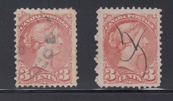


The first stamp is dated SEP 72. Both stamps are the Rose red shades from late 1871 through 1872 - early 1873 (still 37a).
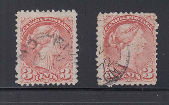


1873 begins to show the shift towards orange and marks the end of the first Ottawa period. The left stamp is dated AP 3 1873. It's color is just a bit less rose / just a bit more red than the two previous 1872 stamps I've shown. I would still call it Rose red (37a), but some would say it is 37c.

The right stamp is dated JY 7 1873. I don't know if it will show on monitors, but there is not much rose left anymore. Orange is showing through and I think it is Dull red (37c).
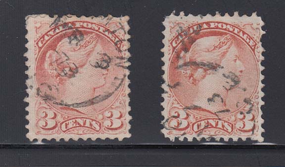


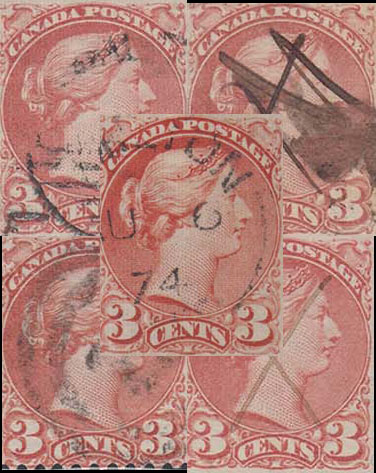
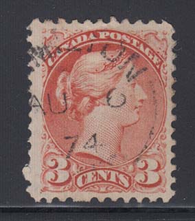
This last stamp is dated AU 6 74 and is Orange-red (plain 37)


Compared to one another :
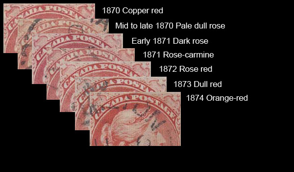


Please keep in mind that there might be mistakes in what I have shown. It is my opinion, based on references and observations I have made, and it is the state in which my collection is in at the moment (and anyone that collect Small Queen knows how stamps move from one page of the album to another over time. It sure does in mine anyway! )

Hope this helps!
Send note to Staff  Go to Top of Page
Edited by Cjusz_911 - 09/27/2016 12:50 pm
Rest in Peace
Canada
5701 Posts
Posted 09/27/2016   1:24 pm  Show Profile Bookmark this reply Add BeeSee to your friends list  Get a Link to this Reply
It helps greatly Cjusz_911 Those are excellent scans and information. I am at my office right now, and the color descriptions and scans look pretty good on both my monitors. It is enough to give me a good idea what the copper red looks like, and now I am certain I have one or more.

The multi-stamp overlay is nice. The only discrepancy I have is with the rose-carmine and the orange-red. On my monitors I cannot see much difference between the rose-carmine and the rose and rose-red shades. And I see very little orange in your orange red.

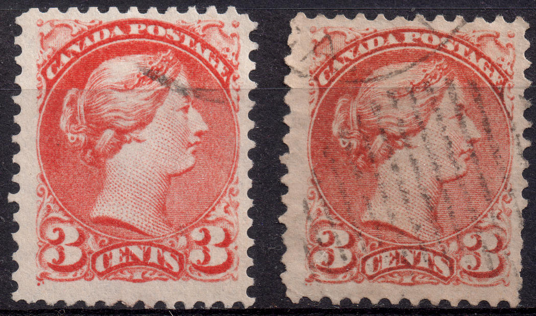
On my monitor, the left stamp displays plenty more orange (the right appears dull red). I showed these before in another thread.


Send note to Staff  Go to Top of Page
BeeSee in BC
"The Postmark is Mightier than the Stamp"
http://brcstamps.com ---- BNAPS, RPSC, APS
Rest in Peace
7742 Posts
Posted 09/27/2016   1:52 pm  Show Profile Bookmark this reply Add wert to your friends list  Get a Link to this Reply
Cjusz_911...Your bottom comparison stamps shows copper indian red..I believe it should be more of the colour of the stamp below.

Robert


Send note to Staff  Go to Top of Page
Moderator
Learn More...
United States
12330 Posts
Posted 09/27/2016   2:18 pm  Show Profile Bookmark this reply Add 51studebaker to your friends list  Get a Link to this Reply
When I see commercials for the latest and greatest high definition televisions on MY television they all look the same...
Send note to Staff  Go to Top of Page
Valued Member
39 Posts
Posted 09/27/2016   3:05 pm  Show Profile Bookmark this reply Add Cjusz_911 to your friends list  Get a Link to this Reply
Thanks BeeSee.

To be perfectly honest, the difference between the Rose red / Orange-red and between the Rose red / Dull red doesn't show on my screen either. I see the Rose-carmine different from the others though.

But in my album, the difference can be seen. To be perfectly honest, I think that all the shades from 1871 - 1872 are closely related. Let's not split hair and say they are the same color whether they are rosier or redder. They are 37a.

The 1874 orange-red is a funny stamp. If I put it in my first Ottawa album pages, it immediately stands out as orangish. But when I put it in my Montreal pages, it looks red. Maybe it would be better called a Red-orange!

Your stamps look different on my monitor too, but not by much. The left hand one looks deep orange with a red tinge (and I would go as far as to say it looks like a 41 vermilion shade to me). The right one looks redder, but too deep to be called dull. But that's my computer screen!

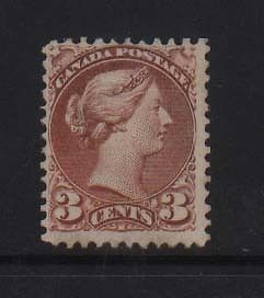
Wert, the stamp you posted looks like a very deeply oxidized brown on my screen, more like a 41!

The 1874 stamp of my post is very different from the 1870 ones, but maybe that doesn't show on your monitor. Here's a small montage of 4 Copper Red 37b behind the 1874 Orange-red (sorry, Red-orange! )


Ah! Small Queen colors. Looking at them for too long has the same effect as emptying a liter of very cheap wine : headaches!
Send note to Staff  Go to Top of Page
Edited by Cjusz_911 - 09/27/2016 3:28 pm
Moderator
Learn More...
United States
12330 Posts
Posted 09/27/2016   3:27 pm  Show Profile Bookmark this reply Add 51studebaker to your friends list  Get a Link to this Reply
So if I start with one of the images in this thread, view and save it on three different computers but using Photoshop with the same configuration, the resulting 3 images will all look exactly the same and have the same colors?

No, they would not look identical nor will they have an identical number of colors unless I have the exact same video IC components on the motherboards and am using the same video drivers on each of the three computers.

At best we can only make some broad, relative (relative = when stamps are all scanned and saved together in a single image) statements on stamp color. The closer the colors, the more assumptions and qualifications we have to make.

Orange colored stamps are especially prone to color changes over time. Sulfur in the atmosphere combines with the lead component in the colored pigment to form a metallic sulfides. The black metallic sulfide basically 'tarnishes' and this darkens the color.

Collectors need a good reference collection, a good eye, and some good ambient lighting to make definitive identifications. (And keep in mind that color guide(s) and color names authored 100-150 years ago were done without the benefit of LED, fluorescence or perhaps even electric lighting.) And we also know that any stamp image on a single computer monitor can look like a different color depending upon the ambient light in the room. I see a stamp as one color on my tablet under office lighting but it looks like a different color when I walk outside with the tablet.

We need to keep these points raised for the newer hobbyists in these color threads.
Don
Send note to Staff  Go to Top of Page
Valued Member
39 Posts
Posted 09/27/2016   3:44 pm  Show Profile Bookmark this reply Add Cjusz_911 to your friends list  Get a Link to this Reply
I absolutely concur with you here Don. Let's not forget the strong influence hardware have on scanning and displaying colors on a computer.

As for stamps changing color over time, I think there's a humbling lesson to be learned from J.A. Forbes exhibit on Colors, Shades and Perforations of Small Queens. Mr. Forbes succeeded in reuniting different blocks of 10 cents SQ that were once part of the same sheet but split apart (I guess to be better sold) some 40 years ago. When reunited, each block showed slightly to very different shades. They were once the exact same color...
Send note to Staff  Go to Top of Page
Rest in Peace
Canada
5701 Posts
Posted 09/27/2016   3:50 pm  Show Profile Bookmark this reply Add BeeSee to your friends list  Get a Link to this Reply
Cjusz_911, your 1874 stamp definitely looks different then the ones underneath it. I guess mine is oranger, if that is a word

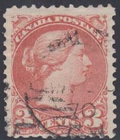
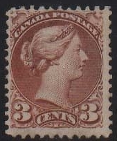
For convenience, I have placed the 3 copper-red Musketeers side by side to show the huge differences. Left to right, Hutin, Cjusz, and Wert:


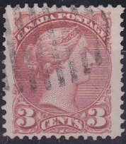
Hutin's looks rose, yours looks copper-red, and Wert's brown. I agree, Wert's stamp does look oxided.

I think what Don says about the TV's above can officially be applied to small queens
Send note to Staff  Go to Top of Page
BeeSee in BC
"The Postmark is Mightier than the Stamp"
http://brcstamps.com ---- BNAPS, RPSC, APS
Rest in Peace
Canada
5701 Posts
Posted 09/27/2016   5:30 pm  Show Profile Bookmark this reply Add BeeSee to your friends list  Get a Link to this Reply

Quote:
We need to keep these points raised for the newer hobbyists in these color threads.


Absolutely. Perhaps this forum should have something similar to the "How To's" on StampSmarter.

Send note to Staff  Go to Top of Page
BeeSee in BC
"The Postmark is Mightier than the Stamp"
http://brcstamps.com ---- BNAPS, RPSC, APS
Rest in Peace
7742 Posts
Posted 09/27/2016   5:37 pm  Show Profile Bookmark this reply Add wert to your friends list  Get a Link to this Reply

Quote:
We need to keep these points raised for the newer hobbyists in these colour threads.


That"s why I posted in the first place and hope lots others do the same..Knowledge.

Robert
Send note to Staff  Go to Top of Page
Page: of 2 Previous TopicReplies: 30 / Views: 5,108Next Topic  
Previous Page
 
To participate in the forum you must log in or register.

Go to Top of Page

Disclaimer: While a tremendous amount of effort goes into ensuring the accuracy of the information contained in this site, Stamp Community assumes no liability for errors. Copyright 2005 - 2026 Stamp Community Family - All rights reserved worldwide. Use of any images or content on this website without prior written permission of Stamp Community or the original lender is strictly prohibited.
Privacy Policy / Terms of Use    Advertise Here
Stamp Community Forum © 2007 - 2026 Stamp Community Forums
It took 0.25 seconds to lick this stamp. Powered By: Snitz Forums 2000 Version 3.4.05