| Author |
 Replies: 3,535 / Views: 373,578 Replies: 3,535 / Views: 373,578 |
|
|
|
Pillar Of The Community
United States
1112 Posts |
|
|
I've been working diligently updating the Limaye-based spreadsheet to follow the 1947 edition album. I've updated the spreadsheet to match the sequence of stamps for countries A-F as listed in the actual album, not the current names in the catalog. For example,. Netherlands Antilles is under Curacao in the C section because back then the album used Curacao for the pages. A very quick pass through my collection gives me the following coverage:
A 77.1 %
B 83.0 %
C 70.6 %
D 69.4 %
E 69.0 %
F 77.6 %
I'm pretty pleased with the percentages. Will be working on scanning more pages and updating the spreadsheet in the coming weeks. |
Send note to Staff 
|
|
|
Valued Member
United States
65 Posts |
|
|
Recently, I purchased several more orders of MNH topical stamps from 6 dealers, and have a total of 59 sets arriving soon. This will bring my collection total to 990 different sets when I receive all of these. I'm approaching 1000 sets, and its very exciting! This will help fill in my newly purchased 4th 64 page stockbook nicely. Very nice mix of topics. I've been buying from dealers overseas lately, as well. This is new for me, but the material can be too good to pass up! Postbeeld, the name of a new dealer of mine, has exceptional material. I'm waiting on my second order from them. Good times! Very fun hobby! |
|
Send note to Staff
|
|
|
Pillar Of The Community
Netherlands
6647 Posts |
|
|
@NicholasC, Quote:
For example,. Netherlands Antilles is under Curacao in the C section because back then the album used Curacao for the pages. The Dutch colonies in the Caribbean were known as Curaçao and Dependencies. Stamps were inscribed "CURAÇAO" until the late 1940s, when they became known as Nederlandse Antillen. |
|
Send note to Staff
|
|
|
Pillar Of The Community
United States
1112 Posts |
|
|
Yes, I know. My point was that things moved around in the later albums and catalogues and the Limaye spreadsheet I started with was organized according to the later albums and catalogues. So I am just putting things back in order of the 1947 album. I'm thinking I chose a poor example. Other examples: Belgian Congo are on pages labeled Congo. Korea was labeled Corea. I put Ethiopia back under Abyssinia. French Morocco back under France Offices in Morocco. |
|
Send note to Staff
|
|
|
Pillar Of The Community
United States
4521 Posts |
|
|
The history about how catalogs handled countries over the years is as interesting as collecting. I am not sure when Scott switched to Iran.
|
|
Send note to Staff
|
Al |
|
|
Valued Member
United States
88 Posts |
|
|
"The history about how catalogs handled countries over the years is as interesting as collecting."
It's certainly interesting. In my collection, I write up a short history of the entity and its stamps and insert that in my albums as the first page of the country. |
|
Send note to Staff
|
|
|
Valued Member
United States
88 Posts |
|
|
I just finished screening and organizing a large backlog of Germany stamps. There were a lot of duplicates, but I also filled hundreds of spaces in my Germany album, which was gratifying. There was one notable stamp, this souvenir sheet from the French occupation of Baden, Scott # 5NB4a. This was in an accumulation that I bought for about $20, tucked behind some full sheets of common German stamps. The 2024 Scott catalog lists this stamp at $90 in mint condition and an amazing $1,100 used. If I believed the Scott CV, this would be by far the most valuable stamp in my collection. (There is a slight wrinkle in the bottom left of the sheet.) But I'm very skeptical about that valuation. Why in the world would a cancellation (easily faked) add so much value to this stamp? If anyone has the valuation for this stamp in other catalogs like Stanley Gibbon, Yvert, or Michel, I'd be grateful to learn what they show as a valuation. 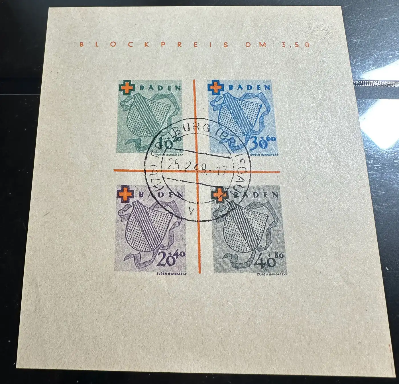 |
|
Send note to Staff
|
|
|
Valued Member
United States
399 Posts |
|
|
I've been collecting for close to 70 years, have a fairly eclectic collection, and since my kids have grown up and left home, and I no longer have to be financially responsible for them am now in a position to spend a bit more on stamps than in previous years. I have therefore bought a few single country collections curated by previous owners with varying degrees of completeness. Most of these are the countries of Northern and Western Europe, and if one collection had a lot of holes in it I might buy another one that had some of the missing ones. I thus ended up with a few albums with a fair amount of stamps, but, with me having cherry-picked them were "surplus to requirements". So, for the first time in my 7 decades of collecting I actually sold a couple of these collections. I went to a monthly bourse in my area, and after a few dealers turned my offerings down, one actually made me an acceptable offer, and I sold them. I even resisted the temptation to look around the bourse and buy something else, so I came home with the pile of bucks intact! |
|
Send note to Staff
|
|
|
Pillar Of The Community
United States
776 Posts |
|
|
Valued Member
United States
88 Posts |
|
|
Germania - Thank you very much for the link. I certainly am suspicious of this postmark as well. But would you mind telling me which letters look different to you? To my untrained, nonspecialist eye, I can't really see what the differences are. If you have a little more time for this, I'd appreciate it. |
|
Send note to Staff
|
|
|
Pillar Of The Community
United States
776 Posts |
|
|
snopes, here are a few things I see in your postmark: 1. the entire postmark almost appears to have been printed with an inkjet printer; lines are not solid and all the same thickness. 2. the "2" of "25" is a different shape compared to the "2" of the month. 3. the last digit of the year is deformed (8 or 9?). 4. the "7" of the hour is taller than the "1". 5. the "G" in FREIBURG is wider compared to the genuine. The "U" of BREISGAU is deformed. There are several other differences. You could align the two postmarks, one on top of the other, and set 50% opaque for the top image. Differences will stand out. 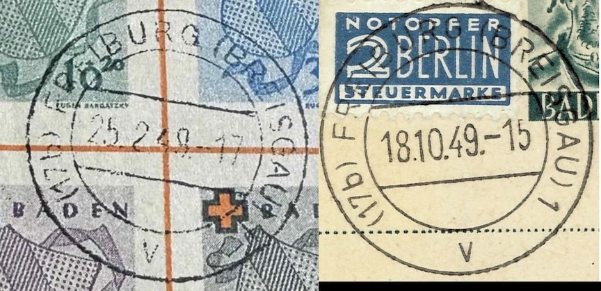 |
|
Send note to Staff
|
|
|
Pillar Of The Community
United States
7108 Posts |
|
|
Is not the inner ring "centered" high in the outer ring, as well? The gap between the rings is greater at the bottom than the top, to my eyes. |
|
Send note to Staff
|
|
|
Valued Member
United States
88 Posts |
|
|
Germania, thank you so much. That is very generous of you to donate that much time (and expertise) to this.
I see everything you're saying now. The one quibble I might have is that I'd suspect this might have been created with an old dot matrix printer, rather than an inkjet printer. Most inkjet printers produce clear, sharp, unbroken letters.
It's an interesting question why the two "2's" don't match. That wouldn't make sense with any printer. I wonder if maybe this postmark was somehow created by hand.
Again, thank you. And thanks to you too, Cjd. |
|
Send note to Staff
|
|
|
Pillar Of The Community
United States
822 Posts |
|
|
I just got in a copy of Scott 2010 P-SL for 10 bucks for my Philippines Collection. I have a US specialized from 2008 but it's missing some stuff. I'll never get far enough to go past 2000. I'm mostly into the older stuff. Just like my US collection It stops at the introduction of forever stamps. |
|
Send note to Staff
|
Member of the Central Oregon Stamp Club.
Redmond, OR 97756 Mailer's Postmark Permit #1
APS 239403 |
|
|
Pillar Of The Community
United States
4521 Posts |
|
|
I have been working on some custom Philippines album pages for Spanish and US periods. Now, I need to proof them. 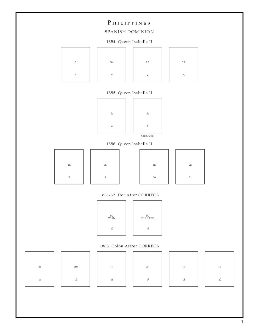 |
|
Send note to Staff
|
Al |
| Edited by angore - 03/03/2026 06:58 am |
|
|
Replies: 3,535 / Views: 373,578 |
|




 Posted 02/28/2026 7:36 pm


