| Author |
 Replies: 15 / Views: 3,707 Replies: 15 / Views: 3,707 |
|
|
Valued Member
Canada
74 Posts |
|
|
The top two stamps have perfs of 14 x 14 and thus SG6 or SG7 and I would love to know which. The used has an inverted w/m, which means the value difference between the dull purple and dull mauve is enormous. Could you experienced guys please give me your opinion. Shown purely for contrast is the lower stamp, perf 14 x 12.5 and presumably bright mauve. I have my fingers crossed and buttocks tightly clenched 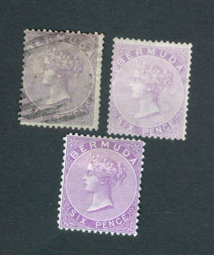 |
|
Send note to Staff
|
|
|
|
|
Bedrock Of The Community
Australia
38679 Posts |
|
|
Guess: (I am never confident with colours) Left Dull Purple - Right Mauve. Caveat: true depends on scanner. Here are Stanley Gibbons official colours (Dull Mauve not listed) Based on the below, your Mauve does tend towards the "dull" 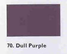 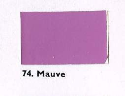 |
Send note to Staff 
|
| Edited by rod222 - 12/09/2016 11:31 pm |
|
|
Valued Member
United States
259 Posts |
|
|
Michael367.
IMO: The first stamp (top left, used) is dull purple, the second (top right) is mauve. Bottom stamp is bright mauve.
rod222.
Could you, please, tell me, how and where to get "Official Stanley Gibbons colors"?
In what form they could be had? Thank you in advance. |
|
Send note to Staff
|
|
|
Pillar Of The Community
United Kingdom
8579 Posts |
|
|
If you search "Stanley Gibbons colour key" (may be "color" over there) on US ebay, you should fund a local stockist. |
|
Send note to Staff
|
|
|
Moderator

United States
12330 Posts |
|
|
If it helps (as a relative comparison), here are examples from my album. Don  Doing color identification using images generated from different sources, viewed on different monitors, is very sketchy. Heck, doing color identification with stamps in hand and under different ambient lighting conditions is sketchy, never mind adding the digital aspect! |
|
Send note to Staff
|
|
|
Bedrock Of The Community
Australia
38679 Posts |
|
|
Quote:
rod222.
Could you, please, tell me, how and where to get "Official Stanley Gibbons colors"? If you follow Geoff's advice, you surely shall find one, Michael, tvrog, mine was in a suitcase of "junk", (not my word) purchased at auction. Stanley Gibbons opinion of the 100 most used colours. Form: Folded in 3 parts single page, double sided stiff cardboard.  |
|
Send note to Staff
|
| Edited by rod222 - 12/10/2016 04:46 am |
|
|
Moderator
United States
12330 Posts |
|
|
I do not recommend buying 'used' or older color guides. Pantone is an industry leader in color identification systems. I have a fair amount of experience with them and color matching various material against ISO Standards. We replaced our Pantone color guides every year because of the potential for the color chips to change color over time. Replacing them annually is the spec from most color guide manufacturers (I am not sure what SG spec might recommend). You can see Pantone's recommendation here http://www.pantone.com/help/?t=Repl...color-guidesOf course for more informal uses (i.e. home use) every year might be a bit of overkill. But also keep in mind that buying a color guide 'used' adds the problem that you don't know how it has been used and stored. If a user left it the book open under a window allowing it to be sun exposed for a few hour, all bets are off. Major color stand manufacturers usually also offer plastic/metal color guides, these have a longer 'shelf-life' than printed color guides. Don |
|
Send note to Staff
|
|
|
Bedrock Of The Community
Australia
38679 Posts |
|
|
To illustrate Don's remarks, there also exists this old Stanley Gibbons colour chart. Not my image, I have yet to find this chart on the internet. Would have been spectacular in it's day before the technology box. 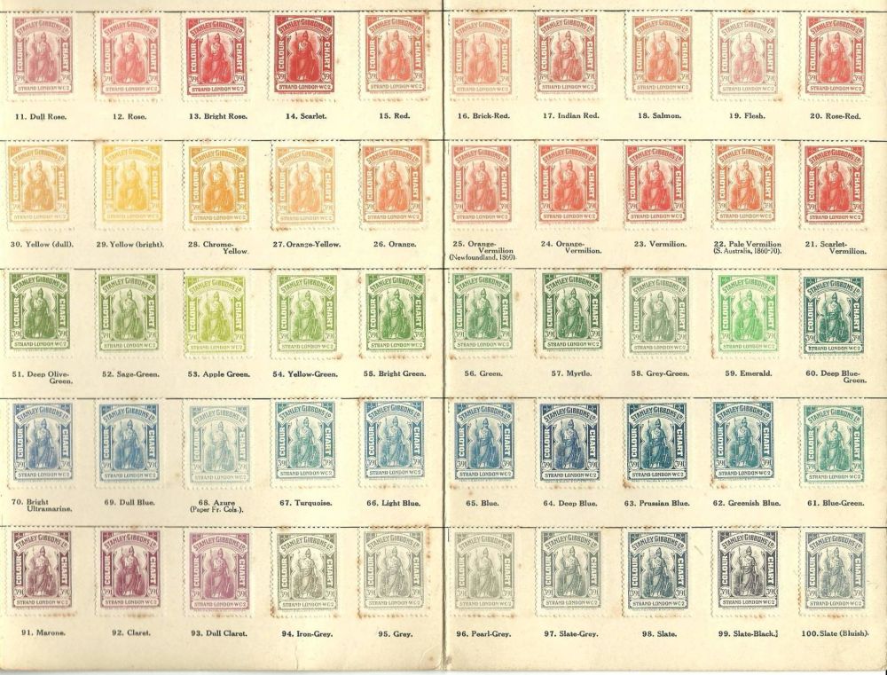 |
|
Send note to Staff
|
|
|
Pillar Of The Community
United Kingdom
8579 Posts |
|
|
The benefit of using the Gibbons key is that it's designed to accompany the Gibbons catalogue, if you're using that for your Commonwealth stamps. A comparison of catalogues from different publishers will show that there's no unifomity around colour and shade nomenclature. But, as Don says, keys don't make it as easy as the publishers may suggest. I do like Rod's image! |
|
Send note to Staff
|
|
|
Valued Member
United States
259 Posts |
|
|
GeoffHa. rod 222:
Thank you! I regularly use Michel Color Guide for classic German area stamps, and I have a fan-like Stanley Gibbons color guide (though this one seems to be tuned for bright modern shades of Machin type stamps only, which I stopped collecting). Having a more generalized SG color guide for older British Commonwealth stamps would be a big plus. |
|
Send note to Staff
|
|
|
Pillar Of The Community
Norway
1661 Posts |
|
|
Rod - that classic color chart is really cool, thanks for sharing. I guess it's difficult to replace that one every year  |
|
Send note to Staff
|
|
|
Pillar Of The Community
United Kingdom
1255 Posts |
|
|
Michael, in my experience the mauve colours are very susceptible to fading. This can be due to sunlight, washing during soaking or deliberate action. I have a similar quandry to yours in the identification of some of my Zanzibar stamps. A colour chart is of some help but you have to be very sure that the stamp is fresh before leaping to what could be a happy conclusion! As for the Gibbons colour key, it can be found here https://www.stanleygibbons.com/publ..._sub_type=97. I'm sure other suppliers will have their own versions. I use a 1979 version which seems to be OK (contrary to what Don has commented) as it's kept in the dark when not in use. Rod, that chart is a dream. Likewise I've never seen one like it. |
|
Send note to Staff
|
|
|
Pillar Of The Community
United Kingdom
568 Posts |
|
|
Quote:We replaced our Pantone color guides every year because of the potential for the color chips to change color over time. Replacing them annually is the spec from most color guide manufacturers (I am not sure what SG spec might recommend). You can see Pantone's recommendation here http://www.pantone.com/help/?t=Repl...color-guides If printing inks are that unstable surely this raises a huge question as to what you are comparing when dealing with stamps about 100 years old that have been stored under who knows what conditions. Especially whaen they must have been exposed to the highly polluted atmospheres pre WW2. The pigments used in stamp printing can be affected in various ways by sulphur compounds and others. As most inks were a blend of pigments what colours you are seeing now MAY bear little relation to when they were printed. Exposure to light is another major problem. It is easy to creat colour changelings of some stamps by light exposure. I am not saying this applies in this case but it is a major problem when comparing subtle shades from one issue. AQ |
|
Send note to Staff
|
| Edited by Anthraquinone - 12/10/2016 2:41 pm |
|
|
Moderator
United States
12330 Posts |
|
|
AQ,
Agreed. And of course Pantone wants to sell color chips.
The study of stamp colors is certainly an ephemeral activity. During any given print run the color may have not been consistent. Certainly over many print runs the colors varied.
The only way anyone can know exactly what a stamp color was when it was originally printed was to be there at the time of that print run. Inks, even the pure pigment they contain, are made with chemicals which change over time and in various environmental situations. We all are familiar with the more obvious of these ink changes; older orange stamps are notorious color changelings. They have heavy metals in the ink which tarnish and darken the stamp to a brown color.
And as GeoffHa pointed out; the naming conventions across our hobby are a total mess, there is no standardization of color nomenclature among catalog publishers.
Folks who study stamp colors today rely upon written descriptions from the era, assemble good reference collections, and build up years of experience.
Don
|
|
Send note to Staff
|
|
|
Bedrock Of The Community
Australia
38679 Posts |
|
|
Quote:
Folks who study stamp colors today rely upon written descriptions from the era, assemble good reference collections, and build up years of experience.
Don As illustrated here. Colour chart by W Orlo-Smith (circa 1930) for the Australian 1 penny red, (KG5 sideface) and all it's shades Reference collection : 100,000 1 penny red stamps. I posted the piece back in around 2001 on a newsgroup, and a member made a colour chart, to suit W Orlo-Smith's naming convention. His name escapes me. sadly. (the orig author of the colour chart) Here is his result................ 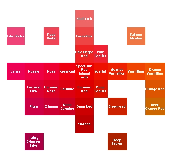 |
|
Send note to Staff
|
|
|
Valued Member
Canada
74 Posts |
|
|
Wow! Not only were opinions encouraging for me, but this also brought a wealth of views about colour guides. I, too, found one in the collection AND found it pretty useless for me. Thank you guys,
Michael367 |
|
Send note to Staff
|
|
| |
Replies: 15 / Views: 3,707 |
|


