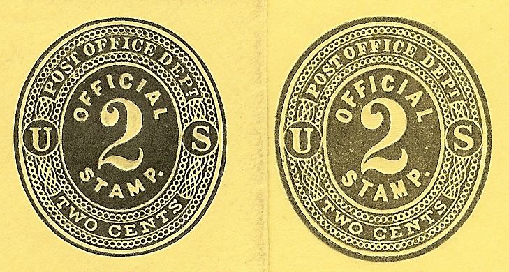
To add the discussion. Here are the 2 cent dies:
For all three denominations, the United Postal Stationery Society catalog focuses on the central numeral. It is "small, finely executed numeral" or "tall, heavy numeral", then goes on to provide the height of the numeral. Scott gives only the height measurement. Both provide catalogs illustrations, but I suspect most collectors do not look beyond he text to seek other differences, trusting the catalog to point out the major identifying differences. Collectors reach for their ruler. And I suspect that past catalog describers have tried to make differentiation of the 3 pairs of dies consistent across the series rather than dealing with each pair individually.
The challenge for a collector with just one example, perhaps heavily canceled, is to quickly and accurately determine which type he has - without measuring fractions of a millimeter. The design differences of the 3 cent make it easy, as has been discussed.
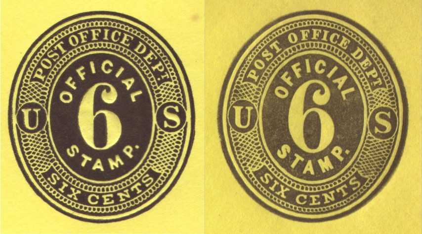
The 2 cent images above have the same squat vs tall lettering to "Official Stamp" - a feature all three die pairs have and one I find easy to judge against a catalog illustration without a ruler. The tail of the 2 is clearly thin vs tapered. And the period after the word "stamp" is under the loop of the P vs not.
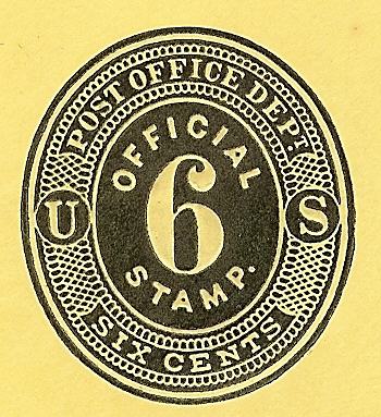
I have only one 6 cent die, but know it is the first die due to the squatness of the "Official Stamp" lettering.
Agreed, the catalog description would be more helpful with a different first-focus on the die differences requiring a ruler.