| Author |
 Replies: 21 / Views: 4,321 Replies: 21 / Views: 4,321 |
|
Valued Member
Sweden
151 Posts |
|
|
hello I just want to share a nice stamp whith a great casellation in combination!have a great morning!bye 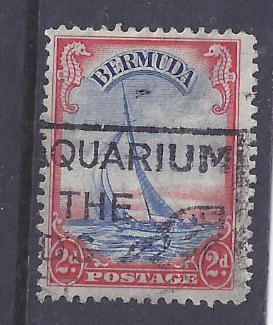 *** Moved by Staff to a more appropriate forum. *** *** Moved by Staff to a more appropriate forum. *** |
|
Send note to Staff
|
|
|
|
|
Pillar Of The Community
United States
1362 Posts |
|
|
Bedrock Of The Community
Australia
38679 Posts |
|
|
The Bermudas. That stamp is sometimes considered an "error" Boy's Life Magazine 1938 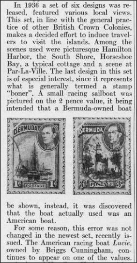 Slogan Postmark "Bermuda Aquarium / One of the / World's / Finest" 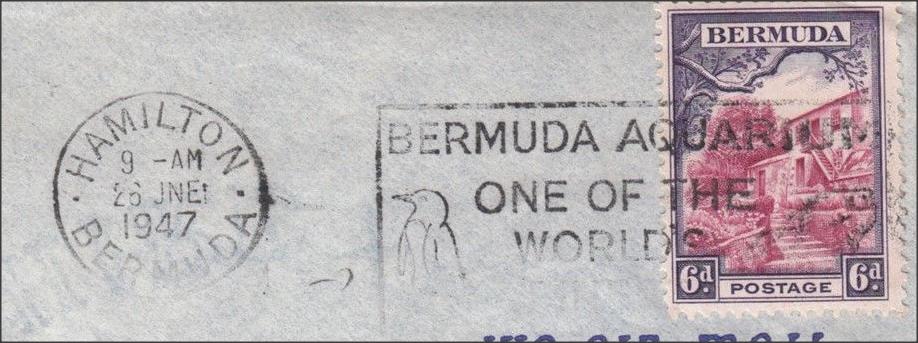 |
Send note to Staff 
|
| Edited by rod222 - 05/15/2017 10:59 pm |
|
|
Moderator

United States
4788 Posts |
|
|
Pillar Of The Community
Canada
1324 Posts |
|
|
I think the story is misguided. The stamp's intent was to show a sailing haven - which Bermuda is - and the nation of boat ownership is actually of no relevance. |
|
Send note to Staff
|
|
|
Pillar Of The Community
558 Posts |
|
|
my knowledge doesn't extend this far away from scandinavia - what's nice about the stamp? |
|
Send note to Staff
|
|
|
Pillar Of The Community
2013 Posts |
|
|
Rod222 with his cover prove that if you want collect cancels , covers is the way to go.. Quote:
....what's nice about the stamp? I don't know, it's a beautiful engraved stamp , the one magic70 show is the Scott 109a of 1940, it's the one with less value, they are 2 other color version, the 1936 sc# 108 witch is blue and black and the 1938 witch is brown black and blue sc# 109, this is the one who have real value. Magic70 find the cancel a great combination, but honestly it's the slogan part of the cancel, no date, not location.... 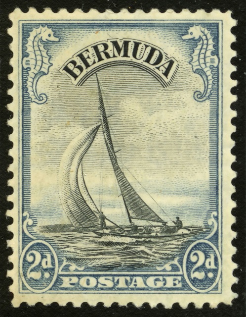 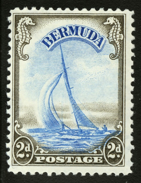 |
|
Send note to Staff
|
| Edited by area66 - 05/17/2017 02:15 am |
|
|
Pillar Of The Community
558 Posts |
|
|
@Area66 I can relate to beautiful engraved stamps
If you're interested in the design, as you show, unused stamps is the way to go.
if you collect cancels, covers is the way to go
but I may be poorly educated, because a cancel like this would be trashcan material in Denmark, the round Hamilton cancel would be a keeper.
that said I would have to agree, I too find this engraving and design to be really attractive, as many other commonwealth colonies, especially the african animal designs.
though I would never call the stamp shown a nice stamp, or great cancel I would simply bin it, and look for a better one. |
|
Send note to Staff
|
|
|
Pillar Of The Community
2013 Posts |
|
|
Sorsh, I agree with you, the cancel is not that great, but it's still a stamp with a street value of $ 1 , so I will not trash it or bin it as you said. |
|
Send note to Staff
|
|
|
Pillar Of The Community
2013 Posts |
|
|
I just found and purchase this on ebay,,,, 4 x Scott 109 ( 4 x $16 ) .. I like to put cover in the bottom of album pages I made , It's adressed to a person in US , . It's an intertesting serie, the 1936 have George V and the 1938 , same stamps but with George VI 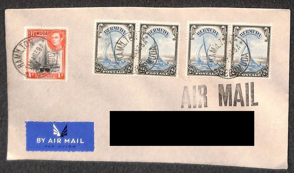  |
|
Send note to Staff
|
| Edited by area66 - 05/17/2017 08:38 am |
|
|
Pillar Of The Community
2013 Posts |
|
|
This tread make me spent .... I just purchase this nice FDC with all the 1938 on it 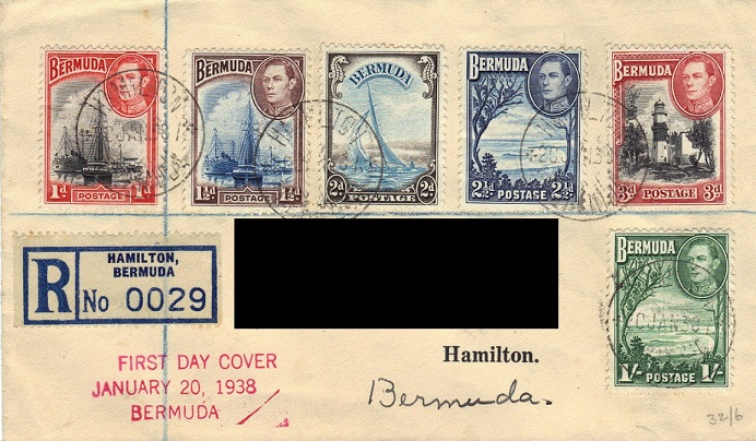 |
|
Send note to Staff
|
| Edited by area66 - 05/17/2017 08:09 am |
|
|
Moderator
United States
4788 Posts |
|
|
Pillar Of The Community
2013 Posts |
|
|
Humm all true the one at left is lower in resolution, am I the only one to see a difference in the face of KGVI ? Even the ship mat detail are different. The color is way off too, but can be the scan..... the one at right is a 1938 118a Rose-Red, the one of 1940 is dull red ..postmark on the one at left is from 1938... look like a litho vs engraved or....... 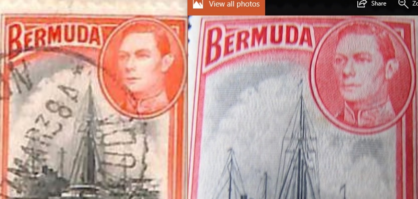 |
|
Send note to Staff
|
| Edited by area66 - 05/17/2017 11:03 pm |
|
|
Bedrock Of The Community
Australia
38679 Posts |
|
|
The scans are not good enough to comment on printing.
The 1d (One Penny) "Ships in Hamilton Harbour" come in 2 colours in 1938
Black and Rose Red (the more valuable issue) Line Perf 11.9
Variety (a) = Black and dull red Both Line Perf 11.9 or... Comb Perf 11.9 x 11.75
|
|
Send note to Staff
|
| Edited by rod222 - 05/17/2017 11:33 pm |
|
|
Pillar Of The Community
2013 Posts |
|
|
rod222, for the color I'm at work now , I don't have a GB only Scott 2013 and Michel 2005/2006 on my Laptop, as you see only Michel ( at left ) make a difference of date betwen the 2 colors I will get the stamp next week, but it's easy to see that something is wrong with the eyes, as an artist, I know the eyes is the most important thing to get right 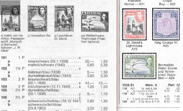 |
|
Send note to Staff
|
| Edited by area66 - 05/18/2017 02:34 am |
|
|
Bedrock Of The Community
Australia
38679 Posts |
|
|
Right, A66
I'll accept that, my reference was a 1965 Stanley Gibbons.
The perforation differences would remain valid.
|
|
Send note to Staff
|
|
|
Replies: 21 / Views: 4,321 |
|


