| Author |
 Replies: 13 / Views: 1,804 Replies: 13 / Views: 1,804 |
|
|
Rest in Peace
7742 Posts |
|
|
We all know on pre 1940 stamps large queens, small queens, arch, etc. that here are distinct colours shades..And my friend Jim made it known to me as he is probably the most knowledgeable person on pre 1940 stamps...May be some collectors should analyse newer stamps for colour shades... Some thing like these Scott 891 stamps..I have picked up at least 3 colour shades..The far right stamp is nearly a blue colour while shades of purple are the norm..Have fun finding more. Robert 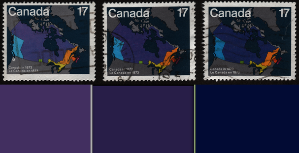 |
|
Send note to Staff
|
|
|
|
|
Moderator

United States
12330 Posts |
|
|
Hi Robert,
Using used stamps for color hue analysis seems less convincing than mint stamps which are less likely to be influenced by environmental factors. Have you taken a look at mint copies of this issue to see if the same hue differences exist?
Don |
Send note to Staff 
|
|
|
Rest in Peace
7742 Posts |
|
|
Quote:
less likely to be influenced by environmental factors Yes Don, that was a concern at the beginning of this analysis..I came to the conclusion that approx. 99% of covers/letters placed in the postal system came from standard white envelopes bought in many stores...So from that I gathered that envelopes would not have that much of an affect..Also notice the paper colour f each stamp is pretty much colour fixed and looking at the orange Province of Quebec also is different colours that match the middle part of the Canadian stamps. So I surmised that environmental deterioration probably did not have that influence towards the colour differences. Have not used mint in this analysis. Does that make sense Don. Robert |
|
Send note to Staff
|
|
|
Moderator
United States
12330 Posts |
|
|
Understood. I agree that the envelopes would not be much of a factor. I think that color fastness would be more impacted by light exposure and/or soaking in chlorine water (if they have been removed from envelopes). Perhaps folks can take a look at some mint examples and see if they also notice the differences you mention.
An interesting experiment would be to take a few mint stamps from the same sheet, scan them, then place one of them in direct sunlight for few days, then rescan to try to understand color fastness of these inks.
Don |
|
Send note to Staff
|
|
|
Rest in Peace
7742 Posts |
|
|
Quote:
more impacted by light exposure and/or soaking in chlorine water Hope you are wrong Don...just saying, because all the hard work old time collectors did identifying colour shades in stamps is hard work for nothing...I understand where you are coming from though. Take for instance L queens and S queens (early stamps)... Many colour identifiers and then the Jubilee series (later stamps) with little colour differences and then to Arch, Admiral (even later stamps) with again colour shades..Does not compute.. Robert |
|
Send note to Staff
|
|
|
Pillar Of The Community
United States
8956 Posts |
|
|
Robert, the other day I was working with some coil stamps. I had a batch of 9.3 cent stamps and I was trying to do some flyspecking when I noticed that about half the stamps had a different shade than the others. All were strips of stamps with plate numbers on them. At one point I took my Long Wave UV lamp and looked at the two piles.
Much to my amazement the different shades were caused by the paper, not the carmine rose ink they were printed with. The difference in shade was caused by the brighteners added to the paper! And these brighteners are not always the same amount, which in turn makes for slightly different shades.
I strongly believe that what you are trying above has way too many variables to mean anything.
Peter |
|
Send note to Staff
|
| Edited by Petert4522 - 06/26/2017 10:30 am |
|
|
Moderator
United States
12330 Posts |
|
|
Robert,
Nothing is immune from color fade over time; even pure pigments. This includes color guides. The better quality color guides are not printed on paper but rather are plastic or metal. But even these will fade over time; most manufacturers will update their color charts every few years.
Lightfastness is actually defined (you can hire companies who will test on this) and looks like this.
Poor lightfastness about 1 week of direct sunlight
Fair lightfastness about 1 month in direct sunlight
Very Good lightfastness about 4-6 months in direct sunlight
Excellent lightfastness about 9-12 months in direct sunlight
Note that direct sunlight light highly accelerates light fade but even in 'darkness' the maximum light lightfastness scale only goes to 100 years.
And even if we kept a stamp in total darkness, there are other chemical changes which are constantly affecting the color of something. The atmospheric environment can have a huge impact on colors over time. So the exact color or hue of a stamp that is 100+ years old has virtually zero chance at being the exact same as it was when it was first printed.
I am hopeful that at some point the technology to analyze ink chemicals will finally allow us to accurately understand stamp colors. When that day comes, I think we will all be surprised at how some stamp colors are classified.
Don
|
|
Send note to Staff
|
|
|
Rest in Peace
7742 Posts |
|
|
Moderator
United States
12330 Posts |
|
|
Robert,
I think you raised an interesting point and one that is worth pursuing further but the discovery should include a decent sample size (hundreds of stamps) including mint examples. Hopefully your post will result in folks digging into their stock book and seeing if they also notice the same hue and color differences.
Alternatively if someone could be located at the printing firm that produced these stamps and they could verify that different inks and/or processes had been used it would go a long way to explain why there appears to be hue differences. Do you know if all these stamps were printed by the same company? Perhaps that might explain possible differences.
And Peter's observation regarding paper differences is also quite valid, do you know if various paper types or other chemical applications might have been used during production for this stamp? Point is that lots more detective work needs to be done, this is the start of a journey not the end!
Don |
|
Send note to Staff
|
|
|
Pillar Of The Community
United States
7239 Posts |
|
|
Any comparison between color differences in classic definitive stamps and modern commemorative stamps is truly a comparison between apples and oranges. Some classic definitives had print runs of 10-15 years, with countless batches of ink of the same, or similar (close enough) ink, so that color variations were inevitable. Modern offset printed commemorative stamps have print runs of a few hours, making ink changes and color differences very unlikely.
Color degradation by exposure to light has been explored here. With the thin layers of offset-printed ink on modern stamps, fading and color changes can probably occur pretty quickly. |
|
Send note to Staff
|
|
|
Rest in Peace
Canada
5701 Posts |
|
|
I remember when Canada 890-893 were issue in 1991. Shades were noticed back then with the blue/purple colors, and were quite common. I had some mint examples - will see what I can find. |
|
Send note to Staff
|
|
|
|
Pillar Of The Community
Canada
1395 Posts |
|
|
Here are three of my SC 1159, 6 cent red fox low value Mammal definitive series (1988-1992) Three different shades, although the left and middle appear to be off paper due to the staple holes. However, if these two were on the same cover and used, then they are still different shades from each other. The right stamp is obviously mint based on the pure white border. 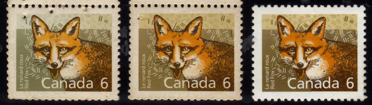 |
|
Send note to Staff
|
|
|
Pillar Of The Community
Canada
1395 Posts |
|
|
I understand the complexity of matching colours, especially on used stamps, but supporting wert's post, here's two more examples of various shading from my collection. November 15, 1978 - Ice Vessels SC 778- Northern Light 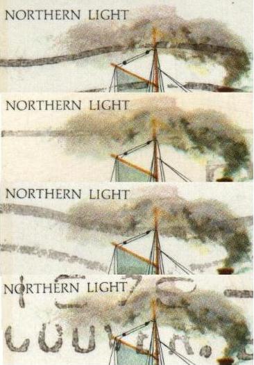 SC 779 - Labrador 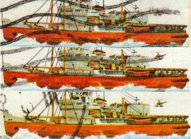 |
|
Send note to Staff
|
|
|
Pillar Of The Community
Canada
1395 Posts |
|
|
I've noticed shade differences for some time. One more example. SC 667 July 03, 1975 8 cent Calgary Centennial Grey-purple background 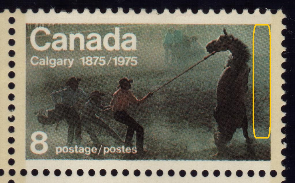 Grey-blue background 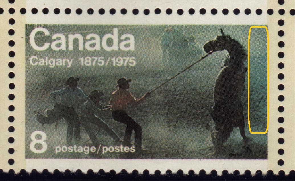 |
|
Send note to Staff
|
|
| |
Replies: 13 / Views: 1,804 |
|


