| Author |
 Replies: 10 / Views: 1,949 Replies: 10 / Views: 1,949 |
|
|
Pillar Of The Community
United States
1362 Posts |
|
|
|
|
Pillar Of The Community
United States
1362 Posts |
|
|
Pillar Of The Community

United States
538 Posts |
|
|
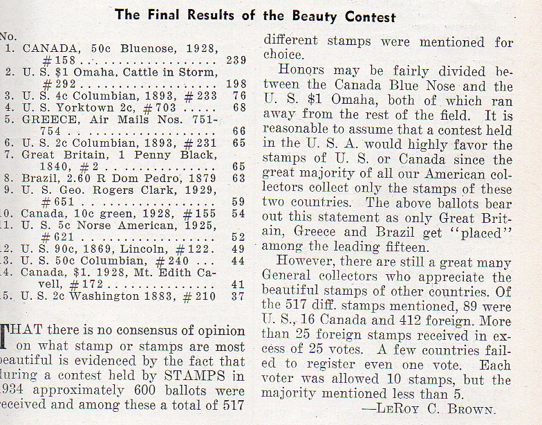
I can't disagree with #1 and #2 (perhaps in reverse order); after that, well, uh, some interesting choices and order. |
Send note to Staff 
|
|
|
Pillar Of The Community
United States
5894 Posts |
|
|
While I wouldn't call the 1869 90¢ Lincoln stamp ugly I wouldn't vote for it in a beauty contest. None of the Columbian stamps are particularly inspiring to me, though I agree the 4-cent stamp is the best.
I have actually been toying with an idea for a collection based simply on stamps which are most appealing to me. |
|
Send note to Staff
|
|
|
Moderator
1589 Posts |
|
|
A 1936 article. I wonder what would be the results asked today? Doesn't Linn's do a "favorite stamp of the year" context each year? Wouldn't that qualify as a "beauty contest?" It might be interesting to do a survey that limits the choices to the Linn's annual "most favorite" for a selected period of time. And that is just for U.S. stamps, right? Doesn't seem fair to not include foreign stamps.
And since "beauty is in the eye of the beholder" I will bet that a lot of choices will be biased toward one type or production process or another. Is it fair to pit off engraved stamps against the more modern photographical stamps? I can think of examples of each that I might find to be the "most beautiful."
Is this really a very meaningful exercise? |
|
Send note to Staff
|
|
|
Pillar Of The Community
United States
1818 Posts |
|
|
I find some of the choices pretty funny. They definitely reflect a time and a place. 122, most beautiful stamp? lol I'm a US collector, but I suspect a vote on this forum would have few if any US in it. 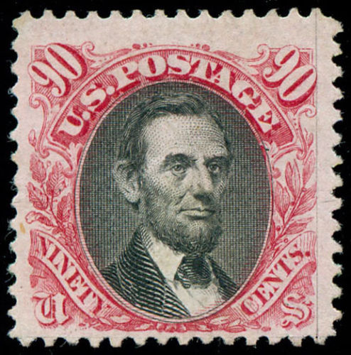 |
|
Send note to Staff
|
|
|
Pillar Of The Community
United States
6661 Posts |
|
|
Is the US Scott 210 really listed in a beauty contest? Or are the last 5 the worst looking? I would have tossed in one or 2 commonwealth nations since they had some very nice engraved designs and colors. How about the Great Britain Seahorse or the £1 PUC? This one has always been one of my favorites.  |
|
Send note to Staff
|
|
|
Pillar Of The Community
United States
538 Posts |
|
|
No, I don't think those last 5 are intended to be the worst looking according to this contest. I think the last 5 are just the continuation of the "beauty" list - with the "1" cropped on the left from 11,12,13,14,15. |
|
Send note to Staff
|
|
|
Pillar Of The Community
United States
1818 Posts |
|
|
Valued Member
United States
299 Posts |
|
|
I would second stallzer's thoughts. I have seen some awesome stamps amidst the Commonwealth zone. My favorite is the one below - I have always admired the way the lines contour the stamp 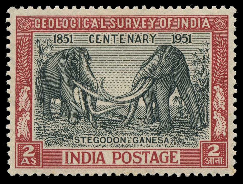 |
|
Send note to Staff
|
|
|
Valued Member
Denmark
445 Posts |
|
| |
Replies: 10 / Views: 1,949 |
|