So, I have put everything I could find together, near to same size for comparison but not perfectly matched:
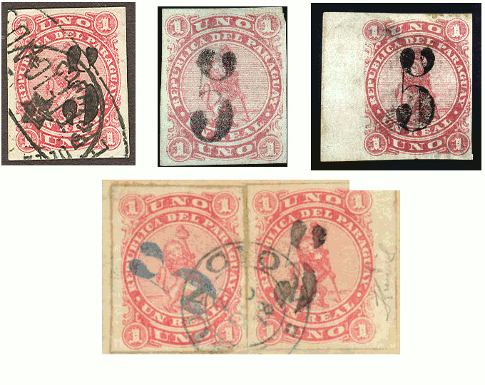
- Upper left is from the APS certificate site, a reprint, showing the typical breaks/cuts and heavy inking.
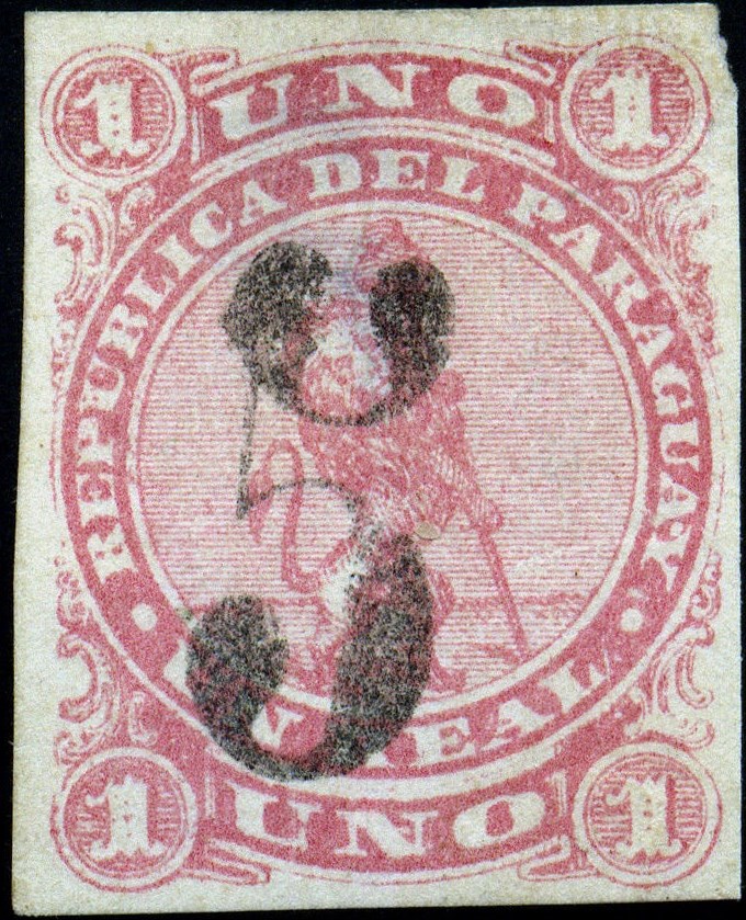
- Next is your first scan. Immediately, it's too big to be correct. The lighter inking makes clear the space between the lobes at the top of the "5" is too wide. I was wrong about my initial guess.
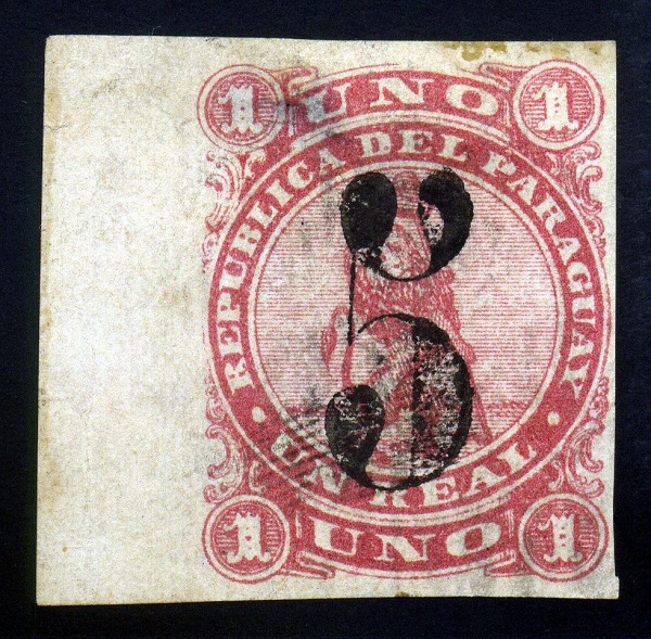
- Then comes your second scan, which matches well with the reprint. Don't worry about the bars at bottom left; that's part of a fingerprint. What I don't like is the ink is heavy like the reprint, whereas the catalogs say "grayish black ink". Also the upper right "ball" is rounder than the reprint or genuine, which look more triangular.
- Bottom scan is from an auction with a 1999 PF cert and the #4/the small piece has a Kneitschl signature. If you look hard (this scan is near maximum size), the fine lines of the "5" are mostly there and very thin. And there's the grayish black ink.
It is a surprise that your scan #2 has no breaks in the fine lines. A wild guess (here we go) is that there was more than one reprinting done, with the breaks perhaps deliberately done to deface the "5". Then a request for more overprints came along and the deface die was used. Again, pure speculation.
So first scan fake; second scan reprint or fake, I'm fairly positive.
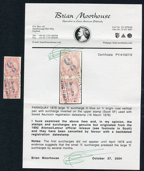
Note that #5F does not have the same handstamp. The top lobes are bigger. It's otherwise pretty close to a #4 black overprint. And perhaps the shade of the basic stamp is a clue; both genuine ones look to be in the bright rose shade.