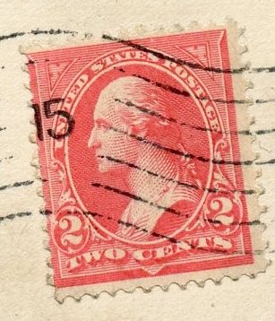
While actual colors are very difficult to determine from scans posted on the internet, my first reaction is that the shade of your stamp is nothing like a rose carmine (Scott 267c) but closer to a slight variation of the normal carmine shade.
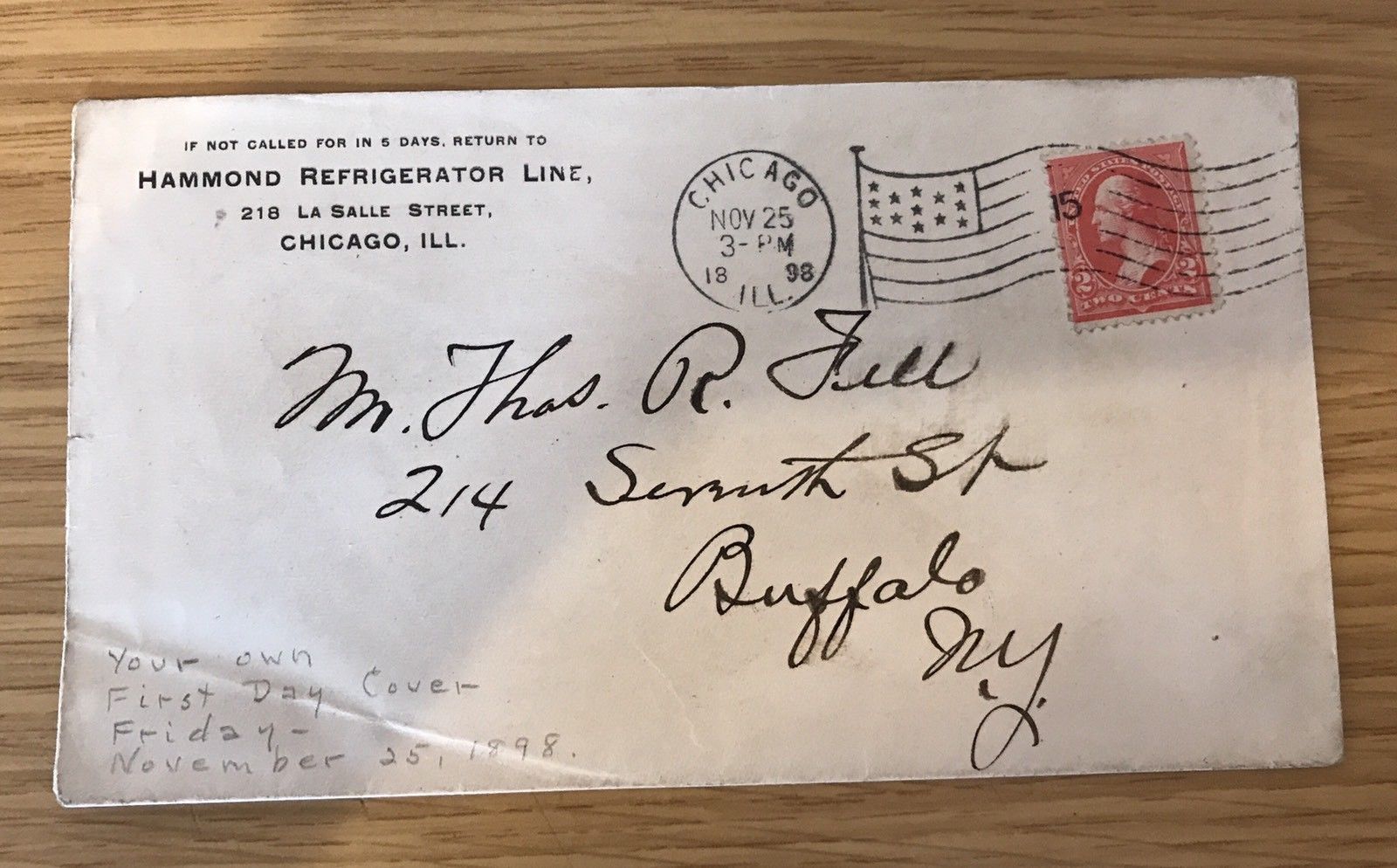
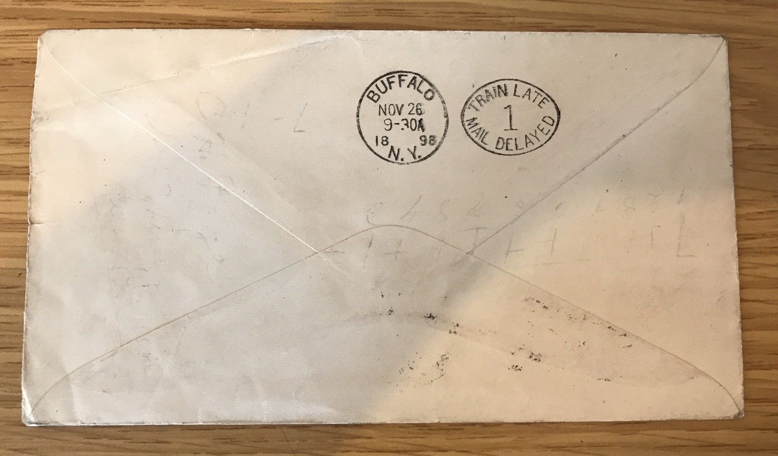
yeah, I know... I have the advantage of having it hand and not in scan; it's a Deeeeep and Bright Rose-no "Red". I'm just wondering why someone would docket the cover like he did before he mailed it. The original skin goes over the penciling and matches the rest of the cover
There is no real way to know what the writer meant, but I do not think that the phrase First Day Cover was in use at the time of mailing. The scan is of my 279Bc, lets see how they look on this chatboard.
FDC's were an idea at the Time of the Columbian Expo, and afterwards. The date was the day after Thanksgiving. Since the color of the stamp was oddball and striking, it may have been noticed for the first time by someone who notices things. Maybe.
wtcrowe: I've done thousands of scans and photographs over the last 20 years, and there is one Unmistakable Conclusion: Scannings and Photographs of "Red" (whether Original Mint Red on a Copper coin, or in a tint of a stamp), is usually compromised in one fashion or another when seen on-line
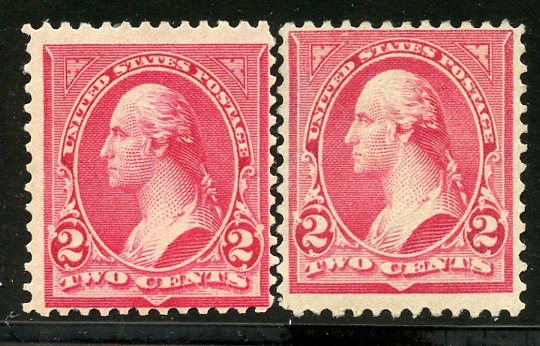
The stamp color very close to mine is the Canada 1897 3 Cent Jubilee, called "Bright Rose". If you open your Scott's US Catalogue, look at the A164 9 Cent Jefferson as seen in the picture. That is the color of my stamp
Disclaimer: While a tremendous amount of effort goes into ensuring the accuracy of the information contained in this site, Stamp Community assumes no liability for errors. Copyright 2005 - 2026 Stamp Community Family - All rights reserved worldwide. Use of any images or content on this website without prior written permission of Stamp Community or the original lender is strictly prohibited. Privacy Policy / Terms of UseAdvertise Here