Stamp Community Family of Web Sites
Thousands of stamps, consistently graded, competitively priced and hundreds of in-depth blog posts to read


Stamp Community Forum
 
Username:
Password:
Save Password
Forgot your Password?

This page may contain links that result in small commissions to keep this free site up and running.

Welcome Guest! Registering and/or logging in will remove the anchor (bottom) ads. It's Free!

Why Is O22, Interior Dept. 24 Cents, So Different From Other Stamps In The Series?

 
To participate in the forum you must log in or register.
Author Previous TopicReplies: 5 / Views: 4,643Next Topic  
Valued Member

United States
333 Posts
Posted 09/15/2017   12:26 pm  Show Profile Bookmark this topic Add ddreisba to your friends list Get a Link to this Message


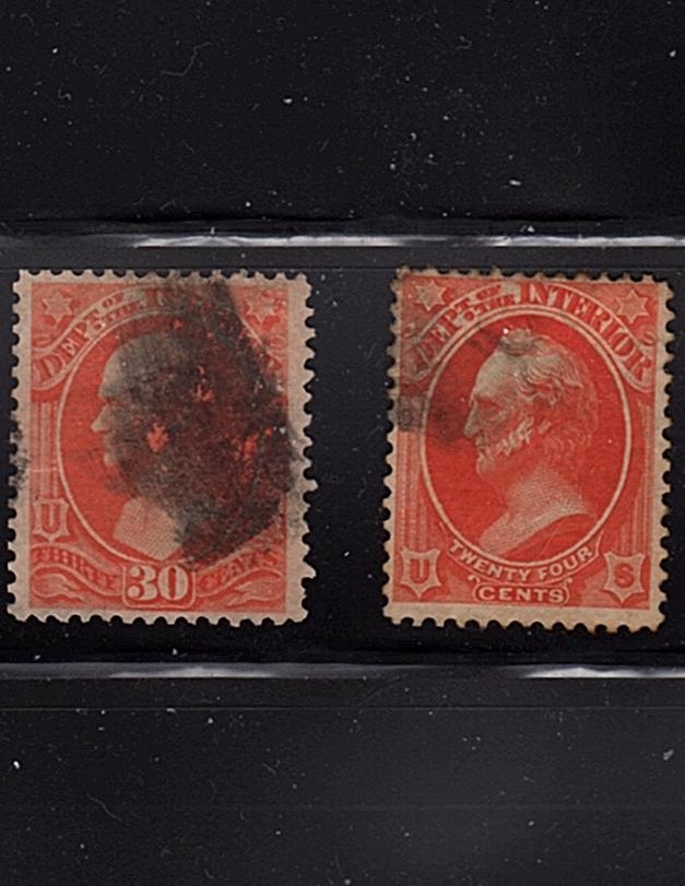
O22, on the right, seems much different from other stamps in the series, e.g. stamp on left, and from the picture in Scott. For example, no numeral. 24 cents is written out. On other stamps, the numeral appears to denote value. Any idea why?

Don
Send note to Staff

Bedrock Of The Community
12671 Posts
Posted 09/15/2017   12:48 pm  Show Profile Bookmark this reply Add rogdcam to your friends list  Get a Link to this Reply
The officials used the plates from the "banknote" series of stamps. Look at the designs of 145-155.
Send note to Staff  Go to Top of Page
Bedrock Of The Community
United States
10783 Posts
Posted 09/15/2017   12:49 pm  Show Profile Bookmark this reply Add revcollector to your friends list  Get a Link to this Reply
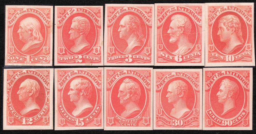
Compare the lettering of Dept of the Interior on the six cent to all the other values; they are different as well. I suspect that artistic interpretation is the reason.
Send note to Staff  Go to Top of Page
Pillar Of The Community
United States
3258 Posts
Posted 09/15/2017   6:09 pm  Show Profile Bookmark this reply Add littleriverphil to your friends list  Get a Link to this Reply
In order to finish 93 face different plates in less than 3 months, it was decided to use the current series bust and values. Using those elements, the rest of the design was engraved around that beginning, one of the reason why officials vary in size.

All the values of all the departments are very similar to the regular issues.

http://chronicle.uspcs.org/pdf/Chro...168/6204.pdf 5 pages

http://chronicle.uspcs.org/pdf/Chro...169/6233.pdf 18 pages

The real Interior odd ball is the two cent. In the top label the words OF THE angle up rather than follow the curve of the label as every other values does.


Send note to Staff  Go to Top of Page
Edited by littleriverphil - 09/15/2017 6:12 pm
Valued Member
United States
333 Posts
Posted 09/17/2017   10:26 am  Show Profile Bookmark this reply Add ddreisba to your friends list  Get a Link to this Reply
Thanks for the info>. I thought at first it was a fake.

Don
Send note to Staff  Go to Top of Page
Valued Member
Malta
156 Posts
Posted 07/29/2018   1:27 pm  Show Profile Bookmark this reply Add Halfpenny Yellow to your friends list  Get a Link to this Reply
Fitting both the text "TWENTY FOUR CENTS" and the numeral "24" in the design would have been difficult since the text is too long to fit in comfortably, so the designer/engraver probably chose to omit the numeral..
Send note to Staff  Go to Top of Page
  Previous TopicReplies: 5 / Views: 4,643Next Topic  
 
To participate in the forum you must log in or register.

Go to Top of Page

Disclaimer: While a tremendous amount of effort goes into ensuring the accuracy of the information contained in this site, Stamp Community assumes no liability for errors. Copyright 2005 - 2026 Stamp Community Family - All rights reserved worldwide. Use of any images or content on this website without prior written permission of Stamp Community or the original lender is strictly prohibited.
Privacy Policy / Terms of Use    Advertise Here
Stamp Community Forum © 2007 - 2026 Stamp Community Forums
It took 0.16 seconds to lick this stamp. Powered By: Snitz Forums 2000 Version 3.4.05