Perfect - 1/3 it is then! Great stuff. Thank you very much perf12 - your are always most helpful, must be a special place in stamp-heaven for gentlemen like yourself
Un piquage à cheval normal (dont nous donnons les cotes) doit se situer au tiers du timbre (classique et anciens francs), au quart (après 1960), ou au cinquième (grands formats).
i.e. one third for classic stamps and stamps in old francs, one quarter for stamps after 1960 or one fifth for large formats.
Well, I am thinking off it as 'over-inking', tough that not be the correct technical description when printing in typography.
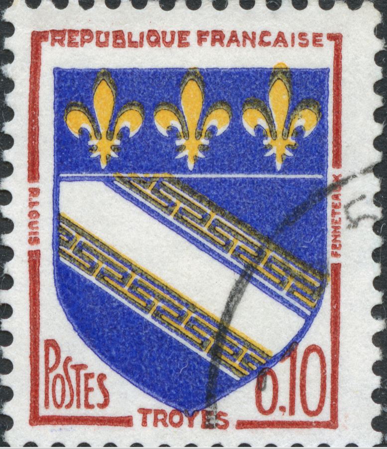
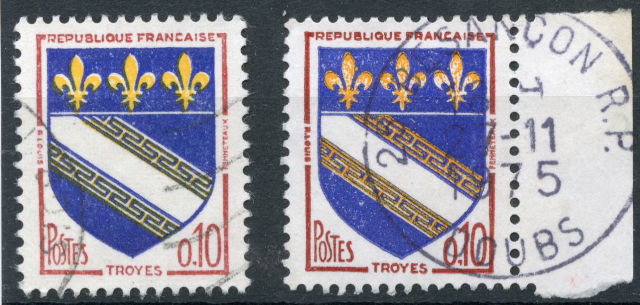
The top single stamp in your OP seems to me to not only have the yellow colors misaligned (with the white lines it was supposed to fill), it also appears to have much more of the yellow ink than the others, so much it seems to 'float' and give a 'wet', bolder and less defined pattern. Similarly the bottom single in the OP seems to have more brown ink than the others, so the letters in 'Republique' get blurred/undefined and the top loop of the 'B' appears to be almost filled with ink, unlike the 'B' in the other 3 stamps.
The opposite effect - too little ink - seems to be the case for the blue parts on the top single stamp in the OP.
I suspect new plates for brown! And I was hoping that someone would explain to us how to interprete "overinking" in this case...
I got really suspicious of typographed stamps having studied the 1935 Argentina definitives in which a really minute dot seems to survive where you may expect it to get lost at times.
Disclaimer: While a tremendous amount of effort goes into ensuring the accuracy of the information contained in this site, Stamp Community assumes no liability for errors. Copyright 2005 - 2026 Stamp Community Family - All rights reserved worldwide. Use of any images or content on this website without prior written permission of Stamp Community or the original lender is strictly prohibited. Privacy Policy / Terms of UseAdvertise Here