| Author |
 Replies: 72 / Views: 12,856 Replies: 72 / Views: 12,856 |
|
|
|
Valued Member
168 Posts |
|
|
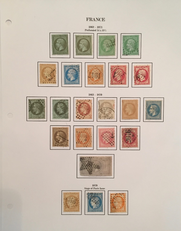
Fairly basic, but I like the layout. Added some labels from an old Scott International, because, why not? 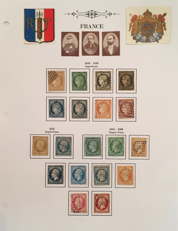 |
Send note to Staff 
|
|
|
Valued Member
United States
233 Posts |
|
|
Hi Mount-this, That is some pretty impressive early France CV. I'm surprised you don't have them in mounts, or do you? I was wondering how you got the portraits on the page? And what software did you use to layout the frames? Thanks! Wolf-==- |
|
Send note to Staff
|
|
|
Pillar Of The Community
United States
1624 Posts |
|
|
Pillar Of The Community

United States
4427 Posts |
|
|
It is easy to do if you have software that can group objects, distribute, and center. |
|
Send note to Staff
|
Al |
|
|
Valued Member
168 Posts |
|
|
Hi Wolf,
Thanks. They're not in mounts yet. I was just playing around with page design and printed out a sample and placed the stamps from my stock book on it just to see how they looked. I didn't do anything fancy; I just converted a Steiner page from pdf to powerpoint using a free app. In powerpoint I edited and arranged the layout how I wanted, because Steiner's layout universally sucks (nothing says, "I just wanted to slap this together as quick as possible," quite like the layout of a Bill Steiner page). Then I cut and pasted those into a word document where I typed the text in a font much nicer than that goofy one Steiner uses and added that ornament at top. I really just wanted to see how it would turn out. I have to say that I think it looks better than I expected. |
|
Send note to Staff
|
| Edited by Mount-this - 03/03/2018 3:54 pm |
|
|
Valued Member
168 Posts |
|
|
Pillar Of The Community
Canada
1449 Posts |
|
|
Nice stamps from France.....wouldn't it be practical? to add on the upper margin of each a description with color and on the lower margin, a Scott, Maury or other catalogue number !
But I really like your pages even though the stamps are not identified - Thanks |
|
Send note to Staff
|
|
|
Valued Member
United States
66 Posts |
|
|
I hope you sophisticated album makers will indulge me with this album page I created for my 4 year old grandson who has developed an interest in stamps. He loves subways, hence the Russian subway stamp in the header. He uses a glue stick to "mount" his stamps and the lines help him keep the stamps lined up. Dennis  |
|
Send note to Staff
|
|
|
Valued Member
168 Posts |
|
|
Hi Rene,
Thank you. I haven't added catalog numbers for two reasons: 1) I didn't like the way it looked & 2) It's more work to add those and I'm lazy. |
|
Send note to Staff
|
|
|
Pillar Of The Community
Canada
1449 Posts |
|
|
Mount-this, much respect for your answer.  Let's say that your software would automatically print out a square, compatible with the size of your stamp and also add details on top margin like: 2 c carmine and all you would have the option to do would be to add the Scott or Maury or SG # to the bottom margin. This would give you a page with details, ready to mount your stamp which would already be in your program inventory. You could automatically put a pic for the space fillers you intend to complete.....just a thought... René example of a New Brunswick custom page already shown in another thread 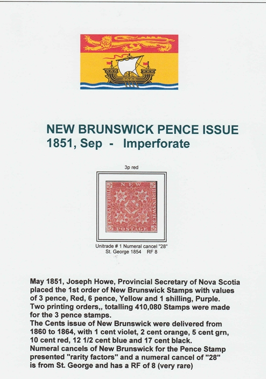 I do not do this kind of page on a routine basis....just to show you the details the stamp |
|
Send note to Staff
|
|
|
Valued Member
Canada
19 Posts |
|
|
Here is an example of a page from my Norway collection. I prefer keeping sets issued over a number of years together rather than keeping them to the year they were issued. 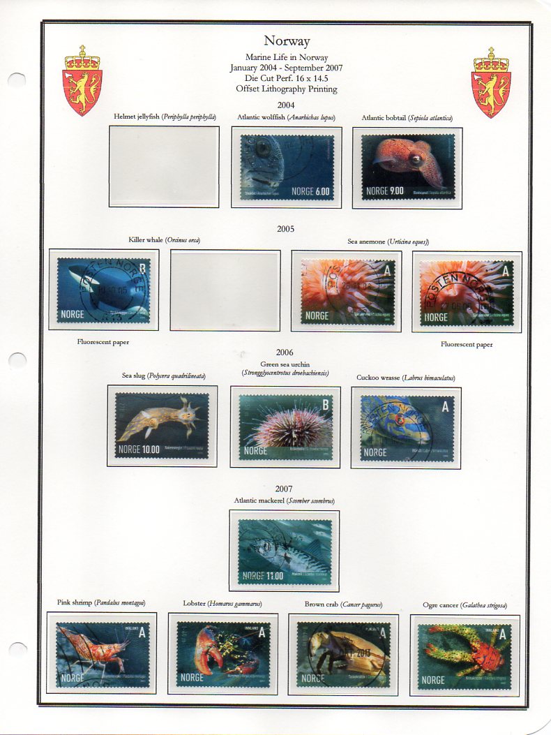 |
|
Send note to Staff
|
|
|
Valued Member
United States
233 Posts |
|
|
Hello All, I'm kind of surprised that there aren't more examples posted to this thread. I guess that means most use pre-prepared pages or Steiner. I don't have a problem with Steiner in general but if you use them as prepared, you are locked into his design. One thing about them is that the frames are pretty much sized properly so that saves you a bunch of work if you want to change the arrangement or typeface of the header. I am pleased that most of you use clear mounts as opposed to black. Unless you are meticulous about the mount placement it looks like it was done by a kid. Clear mounts are much more forgiving. So many options, so little time. I guess that's what the hobby so appealing. Cheer! Wolf-==- |
|
Send note to Staff
|
|
|
Valued Member
146 Posts |
|
|
Hello stampwolf Quote:
I'm kind of surprised that there aren't more examples posted to this thread A few pages from my Ukraine provisional stamps 1992/94 collection. 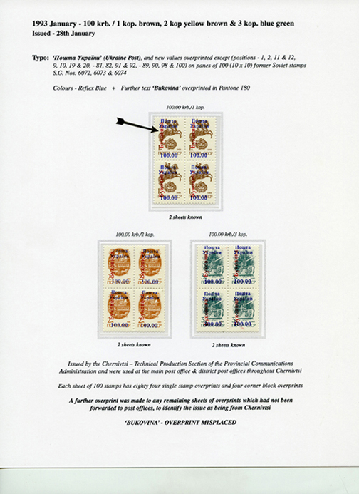 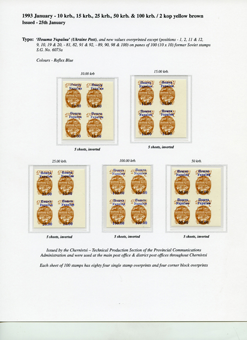 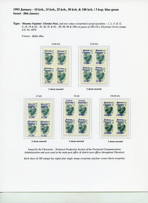 Andrew |
|
Send note to Staff
|
| Edited by agb - 03/04/2018 11:54 am |
|
|
Pillar Of The Community
2333 Posts |
|
|
I like the neat, sober aspect of Steiner pages and I use them for my private general collections.
But for my postal history, topical and post-mark collections I design my own pages using the program Microsoft Publiher, that allows you to also insert images.
I use that to put the title of the exhibit or the arms of the country/city on the right upper corner and to print the relevant pm that are on the hidden side of an item.
Anyway they're, by no means, worthy to be shown here. |
|
Send note to Staff
|
|
|
Valued Member
168 Posts |
|
|
Rene,
What software are you using for your pages? I've only been dipping my toes into the DIY album waters. I haven't committed yet to any particular design or even whether or not I will ultimately make my own pages for my collection. I'm conflicted about it and suffer from the typical world wide collector woes. For me, the layout of the album is extremely important. That's how we show off our stamps, and I want it to look good. On one hand, I like the layout of Scott, but the International albums are too sparse in coverage and the specialized albums too expensive (especially for the low quality ones Amos turns out now). I think Minkus Supreme generally has good coverage for a world wide collector, but I hate the cramped layout. I loathe Steiner pages. The coverage is far too over broad - seriously, unless you have the budget of Bill Gross, no one needs 23 spaces for the France 1849 - 50 imperforate Ceres issues, which gives far more coverage than the "mere" 9 stamps of the Scott catalog, one of which has a CV of $15,000 used - and the layout looks rushed and poorly considered. On the other hand, it's big time commitment to design your own pages for a world wide collection, and as previously stated, I'm lazy. |
|
Send note to Staff
|
|
|
Replies: 72 / Views: 12,856 |
|