Stamp Community Family of Web Sites
Thousands of stamps, consistently graded, competitively priced and hundreds of in-depth blog posts to read


Stamp Community Forum
 
Username:
Password:
Save Password
Forgot your Password?

This page may contain links that result in small commissions to keep this free site up and running.

Welcome Guest! Registering and/or logging in will remove the anchor (bottom) ads. It's Free!

Fake Two Pence Blue?

Previous Page
 
To participate in the forum you must log in or register.
Author Previous TopicReplies: 20 / Views: 3,154Next Topic
Page: of 2
Pillar Of The Community
Singapore
750 Posts
Posted 10/14/2018   11:00 am  Show Profile Bookmark this reply Add pennyblackie to your friends list  Get a Link to this Reply
The 2 stamps I posted look like they are printed from the exact same "plate" or template. If you observe the rays on the upper left corner of both stamps, they look the same. The wordings "two pence" at the bottom look fat compared to the real ones.
Send note to Staff  Go to Top of Page
Pillar Of The Community
France, Metropolitan
3745 Posts
Posted 10/14/2018   12:40 pm  Show Profile Bookmark this reply Add perf12 to your friends list  Get a Link to this Reply
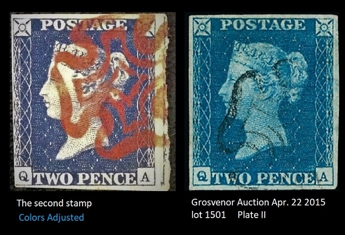
Well; there are some small différences in the 2 stamps.The Bottom left of the neck is
pointed rather than rounded as in the Grosvenor stamp.In the hair some spots are different.In the chignon for example.I don't know too what extent printing impressions
can change from one stamp too another with these stamps.The letters are bolder and brighter
than in the Grosvenor stamp.No bluish cast;but that is perhaps because the photo is in high contrast.The small vertical line in the top of the Q can be found in both stamps......

Send note to Staff  Go to Top of Page
Pillar Of The Community
Singapore
750 Posts
Posted 10/14/2018   1:01 pm  Show Profile Bookmark this reply Add pennyblackie to your friends list  Get a Link to this Reply
Perf12, thanks for the meticulous effort in showing the fake and genuine stamps. This could be an attempt at forging a plate 2. The fatter fonts on the fake stamp is pretty obvious even without looking at the neckline even though you have rightly pointed out the difference. The line at the 'Q' is interesting, I would have expected the forger to pay more careful attention to the size of the fonts rather than the line at the Q.
Send note to Staff  Go to Top of Page
Edited by pennyblackie - 10/14/2018 1:02 pm
Pillar Of The Community
France, Metropolitan
3745 Posts
Posted 10/14/2018   1:22 pm  Show Profile Bookmark this reply Add perf12 to your friends list  Get a Link to this Reply
Some cliches the neck can be pointed;so beware of that.As far as the letters go ;this could be an optical illusion from the photo which is not calibrated too the true colors.

see in the block the different neck tips.
Send note to Staff  Go to Top of Page
Edited by perf12 - 10/14/2018 1:23 pm
Pillar Of The Community
France, Metropolitan
3745 Posts
Posted 10/14/2018   1:45 pm  Show Profile Bookmark this reply Add perf12 to your friends list  Get a Link to this Reply
Send note to Staff  Go to Top of Page
Page: of 2 Previous TopicReplies: 20 / Views: 3,154Next Topic  
Previous Page
 
To participate in the forum you must log in or register.

Go to Top of Page

Disclaimer: While a tremendous amount of effort goes into ensuring the accuracy of the information contained in this site, Stamp Community assumes no liability for errors. Copyright 2005 - 2026 Stamp Community Family - All rights reserved worldwide. Use of any images or content on this website without prior written permission of Stamp Community or the original lender is strictly prohibited.
Privacy Policy / Terms of Use    Advertise Here
Stamp Community Forum © 2007 - 2026 Stamp Community Forums
It took 0.13 seconds to lick this stamp. Powered By: Snitz Forums 2000 Version 3.4.05