|
This page may contain links that result in small commissions to keep this free site up and running.

Welcome Guest! Registering and/or logging in will remove the anchor (bottom) ads. It's Free!
To participate in the forum you must log in or register.
| Author |
 Replies: 14 / Views: 2,716 Replies: 14 / Views: 2,716 |
|
|
Pillar Of The Community

723 Posts |
|
|
|
I am looking to create a modern mint custom EFO album, where I will make custom pages using a laser printer, or print up labels/descriptions, and put them on a page. I will lead with, I don't know what I am doing yet I have read a lot of posts on here, so let me try to use words I've picked up and go from there :)
Few questions:
Do most people who use quadrille paper, then use mounts or is there another method based with interleave protectors?
Presentation in Vario pages - do the stamps move around a lot? Do the pages bend? I would want really stiff stock that feels rich, and is stamp safe (is acidity a concern for mounted stamps?) I might have pages that have 2 commemorative stamps on it, but I don't want a lot of distraction. (unused placeholder rows). Goal is to get rare stamps to speak for themselves.
I'd like a binder, preferably non traditional, that has a lot of rings so pages lay flat for good presentation. Ideally something very trendy and modern looking, versus classic stamp album look. I don't want cream colored pages or vinyl materials. Think industrial/grays, etc.
Any guidance would be amazing, and I appreciate everyone's help in advance.
|
|
Send note to Staff
|
|
|
|
|
Pillar Of The Community
United States
886 Posts |
|
|
As far as stock sheets go, in my experience the brand VARIO PLUS is what you want, instead of the normal VARIO sheets. Quite a bit more expensive, but stiff compared to the standard Vario sheets. Another brand to look for might be HAGNER, which are also stiff-like. I don't think, in the archival sense, you have too much to worry about with either VARIO or HAGNER.
My main problem with stock sheets is that they collect dust, smudges, etc. in time, unless you use binders with dustcases. I like the Lighthouse brand of binders (Vario F&G I believe) which look nice and come with dustcases. Again, kind of pricey. In any case, I would not use stock sheets unless my binders had dustcases. Neither would I use a stockbook without a dustcase, for the same reasons...
I like the look of printed pages, and when you design your own you have unlimited options when it comes to presentation. When you factor in the cost of mounts, etc. it is probably similar to the cost of a quality stock page.
Everyone has their own opinions, but what matters is that you like the result you have chosen! It is good, if you can, to decide these things from the very beginning, so you won't have to change things around a lot later on when you discover that some other form is more to your taste. I find the whole presentation method to be one of the more vexing issues in collecting... If you search around on this forum you will perhaps gain some ideas from others.
John
|
Send note to Staff 
|
|
|
Pillar Of The Community
United Kingdom
8602 Posts |
|
|
I don't think you'd ordinarily print on quadrille, rather than plain. The quadrille provides an easy means of positioning stamps without a printed format on the page. Personally, I generally use mounts on quadrille pages for unmounted mint, hinges for mint or used. I usually create borders for the stamps with pen/ink. I don't usually use interleaving, except on black leaves. |
|
Send note to Staff
|
|
|
Pillar Of The Community
United States
1565 Posts |
|
|
I use quadrille pages, as supplements to my regular Scott Big Blue international pages. More expensive stamps go in mounts. I do use interleaving as I generally place stamps on both sides of a quadrille sheet. |
|
Send note to Staff
|
|
|
Valued Member
South Africa
229 Posts |
|
|
"Everyone has their own opinions, but what matters is that you like the result you have chosen! It is good, if you can, to decide these things from the very beginning, so you won't have to change things around a lot later on when you discover that some other form is more to your taste." I agree with jhonsim03, best to sort out your pages look and feel to your liking I use AlbumEasy to do my pages and I wanted to change my layout it was a bit of a mission and to go through hundreds of entries to change two numbers, so do a lot of ground work before designing your pages, think about fonts, borders, stamp borders, descriptions etc. paper colour. I settled on 160gsm card in a very light buff, and 4 ring A4 binders in black the design a cover type. I am looking for 120gsm paper to write my info pages on, still deciding colour though leaning towards a very light grey. lots of examples of pages on the site I took ideas I liked from pages here. 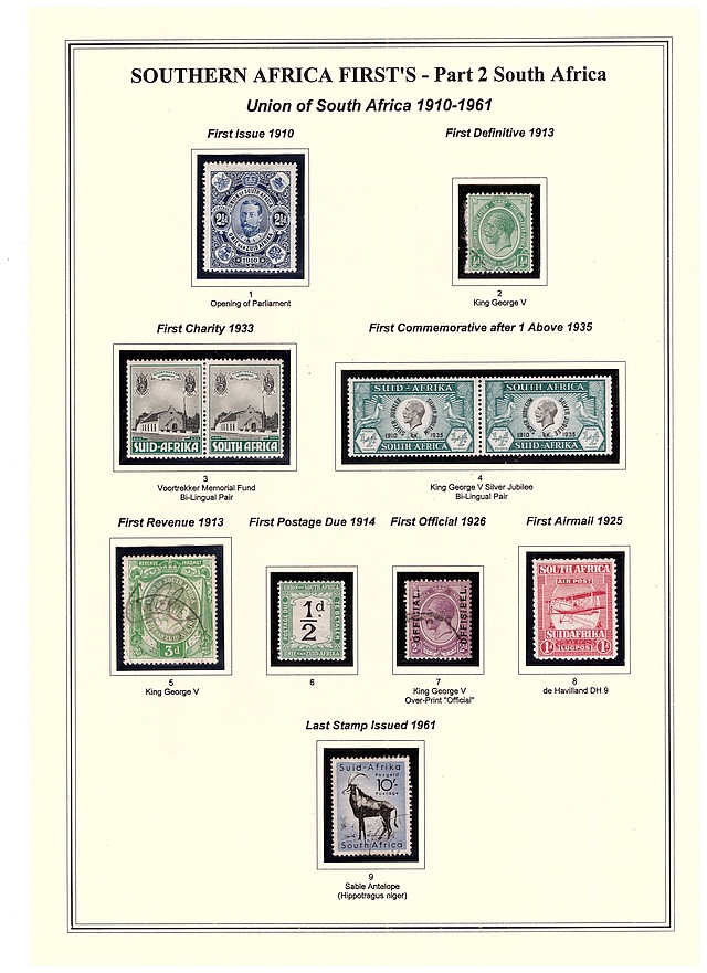 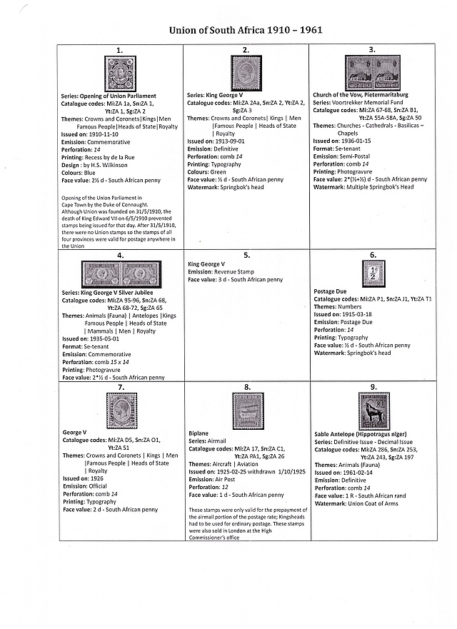 still tweaking pages. |
|
Send note to Staff
|
Regards Ray |
| Edited by Perfin_RK - 11/12/2018 12:57 pm |
|
|
Pillar Of The Community
694 Posts |
|
|
rismoney, I collect state revenue tax stamps, which means I basically have to create any pages I need. I have just recently started making pages to consolidate my collection/hoard residing on stock pages, red boxes with 102/4/6/7 cards, binders, etc. Not the easiest way perhaps, but I simply use Word and created my own template and have now done several pages this way. By putting a box for each stamp, it makes it easy to put on the mounts and keeps everything looking nice. I make the boxes 4mm larger than the size of the stamp (not design - so a 20 x 15mm stamp gets a 24 x 19mm box). I use Hawid clear top opening mounts. I actually like black mounts better, but the mounts are very squirrely and it is really difficult to get them all perfectly lined up and square. Seeing one not aligned with the other drives me crazy, so I resigned myself to use clear mounts so I don't have to be perfect and can live with it. Another few mount tricks: - I have found it is much easier to put the mounts on after the sun has gone down and I can position the light for an oblique angle - makes it easier to see where the clear mount is, and isn't - Use a Q-Tip dipped in water and start from the center of the bottom of the mount and wipe out to the edge, come back in and do it for the other half. I only wet about 5mm for the small mounts and 10mm for the larger mounts at the very bottom. Haven't had an issue with any mounts falling off yet. DON'T DO THIS WITH STAMPS IN THE MOUNTS!!
I use 110 lb card stock from Staples and it runs through my HP P2035 laserjet printer as long as I use the front load tray. I have a Kadomaru PRO trimmer for the page corners as well. Makes it much easier to get them into document protector pages and looks nice as well. I think I got it from Amazon delivered for $12? Has three sizes in one trimmer - I use large. I have to say I have really enjoyed working on this and when you make a hingeless album page and it is completely full, it really looks good! The following scan is one of the very first pages I made - DC Liquors: 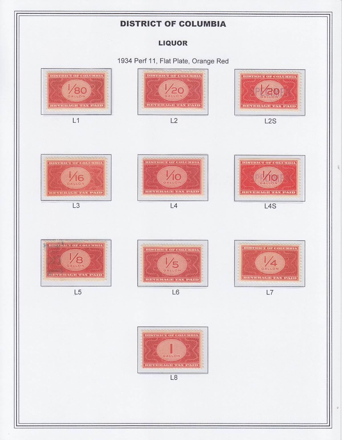 |
|
Send note to Staff
|
| Edited by StateRevs - 11/12/2018 2:54 pm |
|
|
Pillar Of The Community
723 Posts |
|
|
StateRevs, I do really like the simplicity and clean lines of your layout! Some people might think you could have easily gone with 4 or 2 stamps per lien, but the whitespace is what makes it so sweet.
It draws your eye to the denomination and actual stamp design itself, rather than anything else.
Since my collection is more topical than Scott ordered, I have a lot more flexibility around arrangements but this is good food for thought.
Historically I used Showguard black mounts, and had the same experience with putting them on the page. Also as a kid, I wet both sides, and stamp removal was tedious to get it out of the album. The Hawid top loader looks like it might be a good fit.
My follow up question is about binders. Is there a recommendation regarding 10-20 ring binders? As I have been reading more about them, I think this will best allow the pages to lay flat.
|
|
Send note to Staff
|
|
|
Pillar Of The Community
723 Posts |
|
|
I do appreciate everyone's input. It's very helpful. Does anyone print their own fake quadrille lines or is that just stupid, and a potential for toner to get closer to the stamp?
There is something I like about the retro home grown look of an architectural font on grid paper, but I don't have the handwriting to support it. I also like the thick stock, on a potentially darker paper. Going to see if I can run a mock page through and see what I come up with.
|
|
Send note to Staff
|
|
|
Pillar Of The Community
United States
618 Posts |
|
|
I design and print my own pages using PowerPoint templates that I created to match the standard and sometimes non-standard ShowGard/Scott mounts. There has been a lot of trial-and-error when I design pages. I've missed some issues and had to go back and add them. I also expand my collection parameters from time to time, so when I add new varieties to pages already designed and printed it means going back to the proverbial drawing board. I print them on a variety of colored 110 lb cardstock and store them in Lighthouse Grande binders with slipcases. Hope this helps. Scott  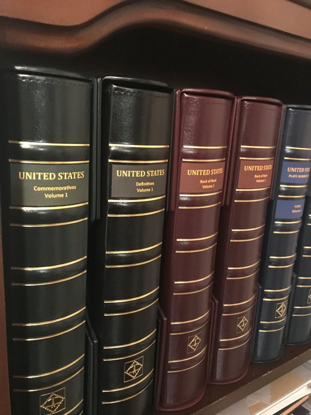 |
|
Send note to Staff
|
|
|
Pillar Of The Community
694 Posts |
|
|
When I first started, I wasn't sure what my printer could handle.
I went to the print section at Staples and asked for a few examples of different weight papers to test in my printer before I started buying reams of paper that wouldn't work.
The nice young lady handed over several sheets for me to test.
Keep in mind heavier paper doesn't wrinkle from the mounts like lighter paper does. |
|
Send note to Staff
|
|
|
Pillar Of The Community
Canada
877 Posts |
|
|
Quote:
I don't think you'd ordinarily print on quadrille, rather than plain. I agree. If you print your own custom pages, most graphics programs (I use CorelDraw) will let you place a grid on the on the image for design purposes. After that is done, it is not only redundant, but it also detracts somewhat from the design in servals ways. Here's an example of one of my pages, previously posted on the Australia forum: 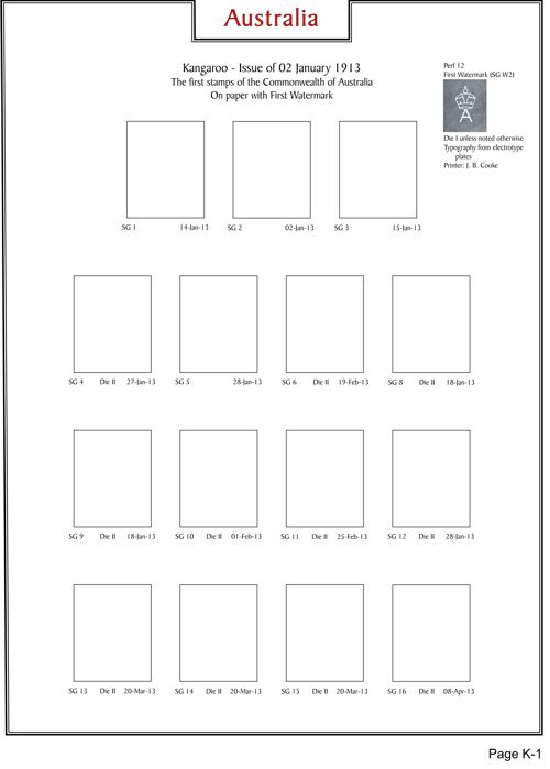 |
|
Send note to Staff
|
|
|
Pillar Of The Community
1337 Posts |
|
|
To me, most computer-printed pages are too crowded, too cramped on the small pages that don't allow enough breathing room for the stamps. Today's collectors may not be familiar with the way older, classic albums used to look, but they had wider margins and most were not cluttered with stamp boxes placed right up to the border. Look at the page layouts on Lighthouse or Scott pages. When I Iook at all the computer-printed pages people are so proud of today, I very rarely like them. I do realize it may be an economic issue, wanting to reduce the cost of albums so more money can be spent on stamps. That's a very wise approach as most albums today are astonishingly expensive, sometimes costing a thousand dollars for just one country. Hence the "print yourself" type of album pages. That's a very good thing. But print them on larger sized paper and put them in album-sized binders, used ones if need be. Give your stamps some room.
Vario pages add all that vinyl to your "album experience," and I'm not too keen on that. I don't much like the heavy weight of the pages, don't like the glossy plastic look, and they seem to attract dust, hair, and finger prints in ways that regular album pages do not. But if you're not so bothered by that, it's a real option -- if you can keep the stamps from constantly moving around. Mounts are a better way to hold stamps in place. At least the split-back style of mounts do that. The open on three sides type of mounts allow stamps to move around just like on Vario pages. That's not only annoying, it can damage your stamps.
As mentioned above, clear mounts are much easier to make look good on an album page. Most people use black-backed mounts to gain the benefit of the nice-looking black frame around each stamp. The drawback is that lining up black-backed mounts neatly is not easy. I've seen many album pages ruined by mounts that were not lined up. It's as if the collector couldn't keep their hand steady. Pages with misaligned mounts look amateurish. This is much more likely with black-backed mounts. Clear mounts aren't as noticeable when they aren't perfectly lined up. Which mounts do album manufacturers put on their pages? Clear mounts. That should tell you something.
Most of the great stamp collections were housed on blank or quaadrille pages and written up by hand. Neat handwriting is not required, especially if you can print. But using your own handwriting, which you can improve with just a little practice, will personalize your collection tremendously. I own a few collections that I purchased with handwritten pages, and I find them wonderful. They're much more personal. The collector adds their own notes or comments, identifies varieties, add arrows and so on, and the whole presentation just looks like a "real" stamp collection by a real person instead of computer printed or standard album pages with little personality. Quad pages allow lining up the stamps more carefully. Blank pages look just as good, if not better, but you'll need to make a little more effort to get everything lined up. |
|
Send note to Staff
|
| Edited by DrewM - 11/22/2018 01:55 am |
|
|
Pillar Of The Community
United States
978 Posts |
|
|
Hi rismoney
After I collected for a year or so I went to quadrille pages exclusively. Also, everything is in Showgard mounts. I needed more pages so I went to a 'mom and pop' local printer. I ended up with custom quadrille sheets for less than the big office supply stores. I am not counting the type set cost.
Therefore, I recommend going to your local print shop, not an office supply.
As mentioned, I prefer the quadrille route. I specialize and with quadrille I can put varieties of a stamp on a page, covers, etc.. Also if a set contains both regular and air mail, both go on the same page. With quadrille pages one can pretty much do what one wants. With printed albums you are restricted.
Jerry B |
|
Send note to Staff
|
|
|
Pillar Of The Community
United States
4441 Posts |
|
|
I am another fan of clear mounts for many of the reasons DrewM. t gives a very clean look. Missing spots do not stand out and placement/cutting is less of an issue. I use Steiner pages and with clear mounts I can see the printed stamp borders. You can slso mix hinged and mounted so blends better.
I have used Prinz/Scott mounts (black or clear) since they work the same and tend to be less expensive. |
|
Send note to Staff
|
Al |
|
|
Pillar Of The Community
Canada
877 Posts |
|
|
Quote:
To me, most computer-printed pages are too crowded, too cramped on the small pages that don't allow enough breathing room for the stamps I guess I was brought up differently. I believe there is a certain beauty in showing all stamps in a set on a single page. Now I realize that this would not even be possible with some issues, e.g. UK Machins. The Australian page I posted earlier includes just the base issues of each value to prevent it from becoming cluttered. With many of these stamps from the KGV era, sub-types and varieties will often warrant one or more pages of their own. Here are a couple of pages from my father's collection: 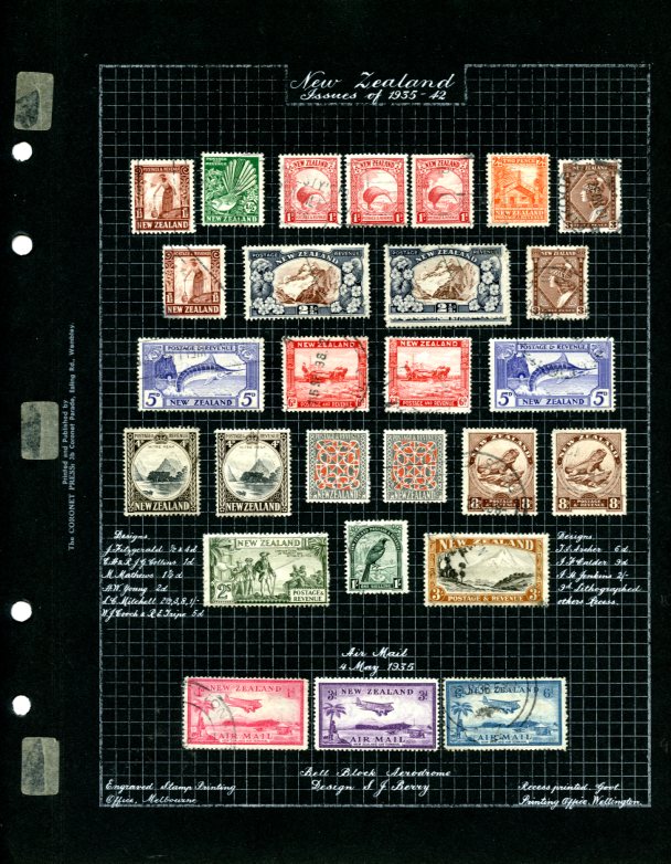 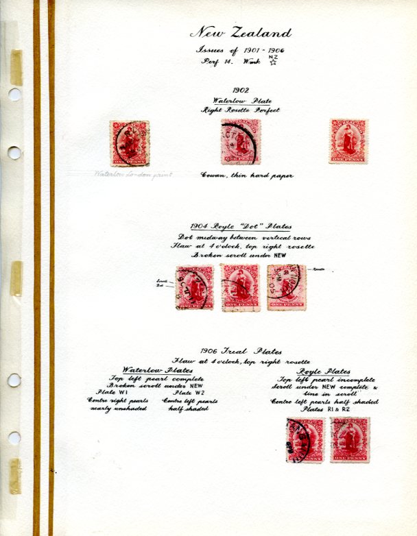 Dad was a member of the Scottish Philatelic Society and, after winning the cup for his displays several years in a row, he was quietly asked to let someone else have a chance. I believe these tao pages show that there is a place for the "big picture" as well as for more detailed presentation. |
|
Send note to Staff
|
|
| |
Replies: 14 / Views: 2,716 |
|
|
To participate in the forum you must log in or register. | |
Disclaimer: While a tremendous amount of effort goes into ensuring the accuracy of the information contained in this site, Stamp Community assumes no liability for errors. Copyright 2005 - 2026 Stamp Community Family - All rights reserved worldwide. Use of any images or content on this website without prior written permission of Stamp Community or the original lender is strictly prohibited.
Privacy Policy / Terms of Use Advertise Here |
| Stamp Community Forum |
© 2007 - 2026 Stamp Community Forums |
| It took 0.24 seconds to lick this stamp. |
 |
|
|
|


